|
I was commissioned for a portrait by a dear friend, and despite wanting to complete it earlier, I ended up prolonging it for over a month. Previous portraits I have created have been of the society I live in and as much as I have loved painting those faces, I never required for them to look like any one person or carry their spirit. They have been faces I constructed from my imagination with traces of multiple characteristics I saw around me: in the media, in my home, on the streets. This portrait was extremely difficult as it was crucial that it carried the subject's strength, fragility, focus and beauty. And because I knew her so very well, no matter what I did just didn't seem to work. I finally completed the piece a few days ago and since it was a very special painting, I decided to make it my very first fine art print. I can't tell you how excited I am about it. The print is on canvas but I'm also going to have it printed on fine art paper to see how it turns out on a different surface. :) The sample I had printed is on A4 but the fine art paper will measure 16x20 in. Here's the artwork and then of course another 'in situ' image' :D 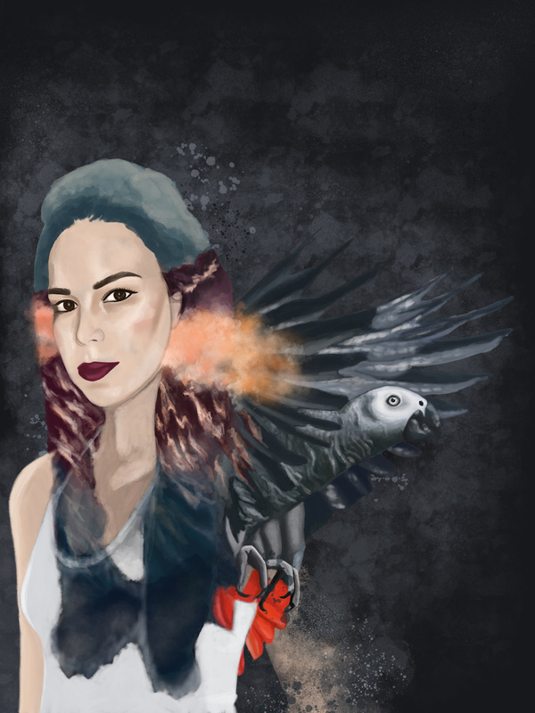 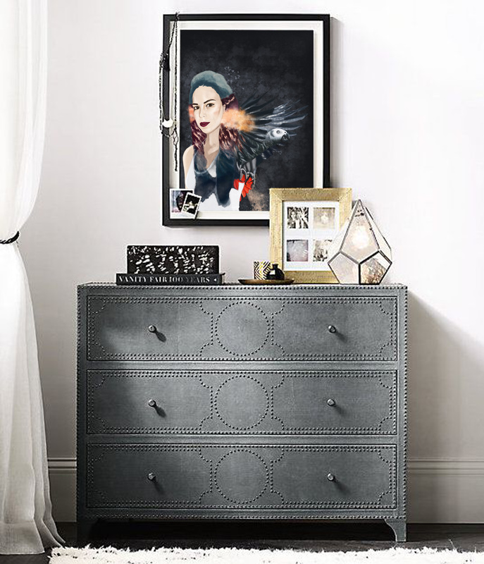
0 Comments
Picasso once said 'I've reached a point where the movement of the thought interests me more than the thought itself'. I love the idea of tracing a thought and its journey back to its inception and working on this colorful piece yesterday was a similar experience. Over the past few months, I've watched my palette change and I was ready to retrace the journey back to when I began painting on canvas again in March. The colors on my canvas reflected the first piece I created this year but bolder, with stronger brush strokes and a pinch of drama. Even the ideas and thoughts that went into creating this piece changed so drastically in the process and following those were such a treat. Here are a few shots of the journey for this particular piece. I named it Intermezzo. 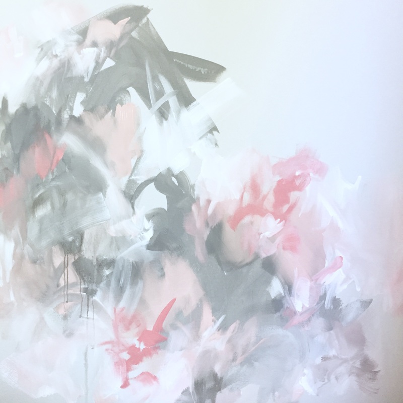 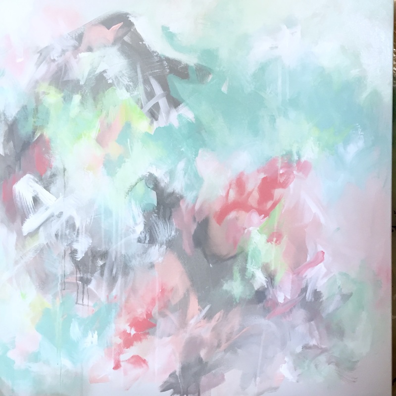 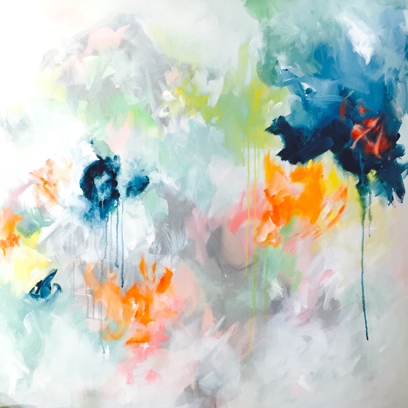 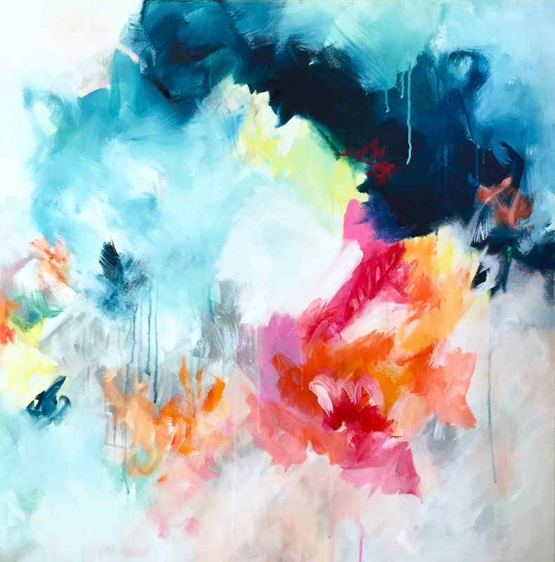 I started my painting journey for the year with a colorful and happy palette. As the months went by, I moved on to more neutral palettes and 4 months later, was obsessed with moody tones. A couple of days ago, I was sitting in the studio just going over my journey and realized how much I miss all the colors, and decided that I'm ready to start the cycle again. You know that sorbet they serve between the entree and main course called the intermezzo, which is meant to refresh your palate? Creating this piece yesterday felt so similar to that. There was a freshness, an energy and balance it brought back into the studio and I'm super pumped to get back into it. Here's what it looks like now. I wonder what it will look like tomorrow :)  I was working on the second part of the Green diptych yesterday, and realized that it was easier working with the color this time around. This could have been just due to the fact that I had an idea of the palette I was working with and a finished piece to reference to during the process. But it definitely felt better to know that I was moving in the right direction. The second piece, however, is far moodier compared to the first. The colors are less playful and certain areas are darker. Its still not complete, but I'm hoping to be done with it today. Will post updates tomorrow. For now, here's the piece :) 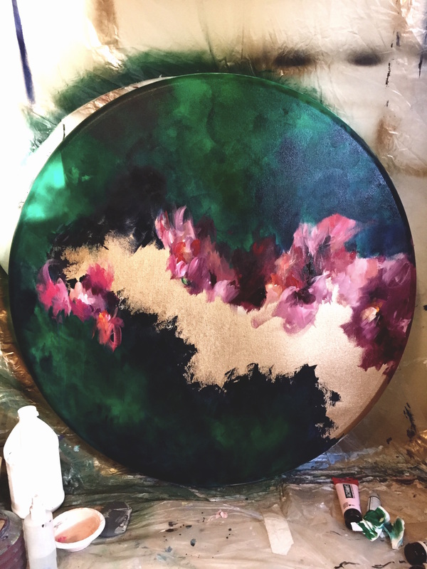 I've always felt like I'm extremely self aware. Decisions, actions, reactions; all of these things were thought through and I was aware of the thought processes behind them in my life. With art, however, I never understood how my approach was so different. I can understand letting loose and just going with the flow but to allow myself to lose complete control is something I didn't even know I was doing. Until recently. My past few paintings have been very special to me. Its been a phase where I was subconsciously working on moodier pieces without even realizing that I was. It was after the diptych I just created that I realized how my palette has shifted so drastically in such a short span of time. I can't explain why this happened and I'd be lying if I talked about experimentation and trying different things because I wasn't consciously doing so. It literally just happened. Take a look at this shift through the pictures below. I can't believe this happened in just 4 months. 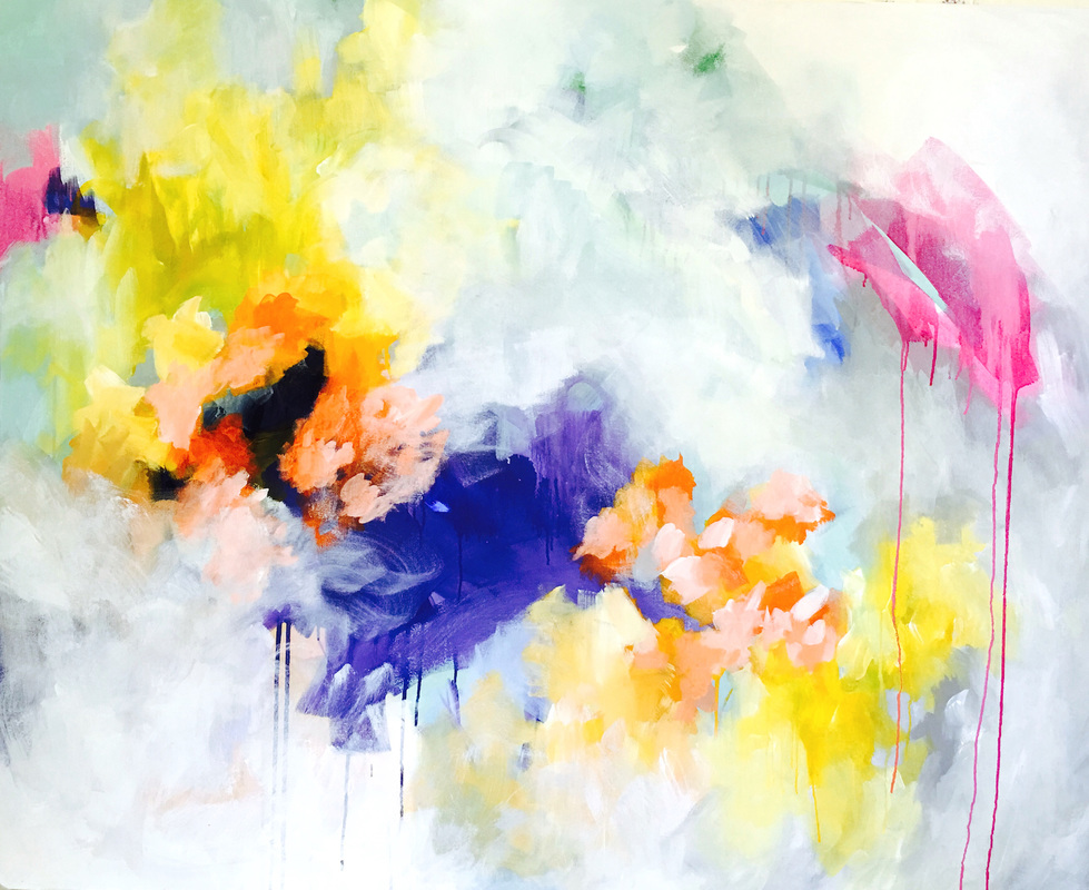 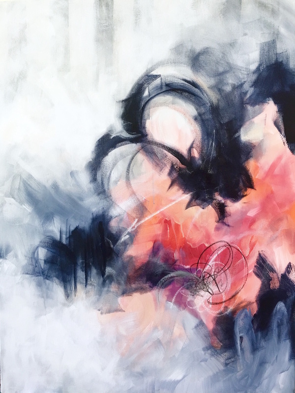  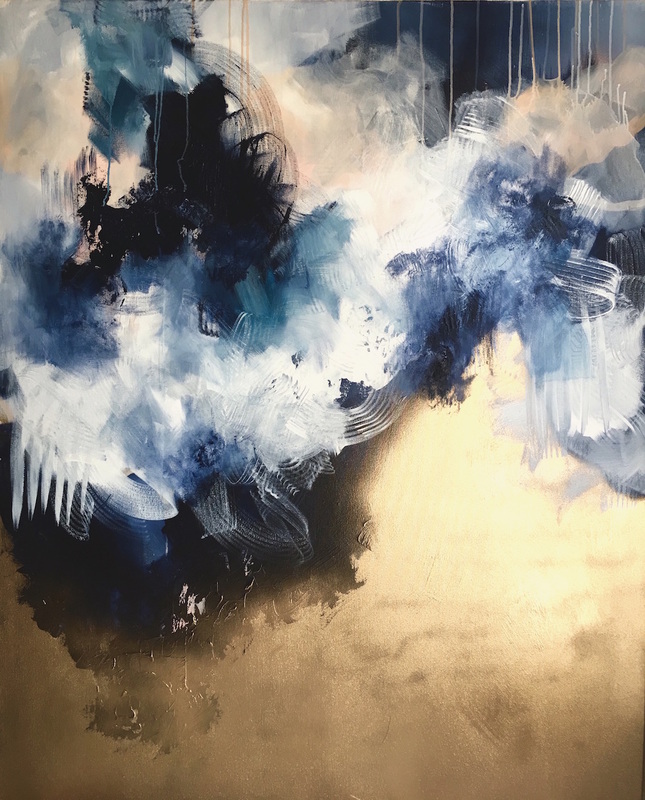 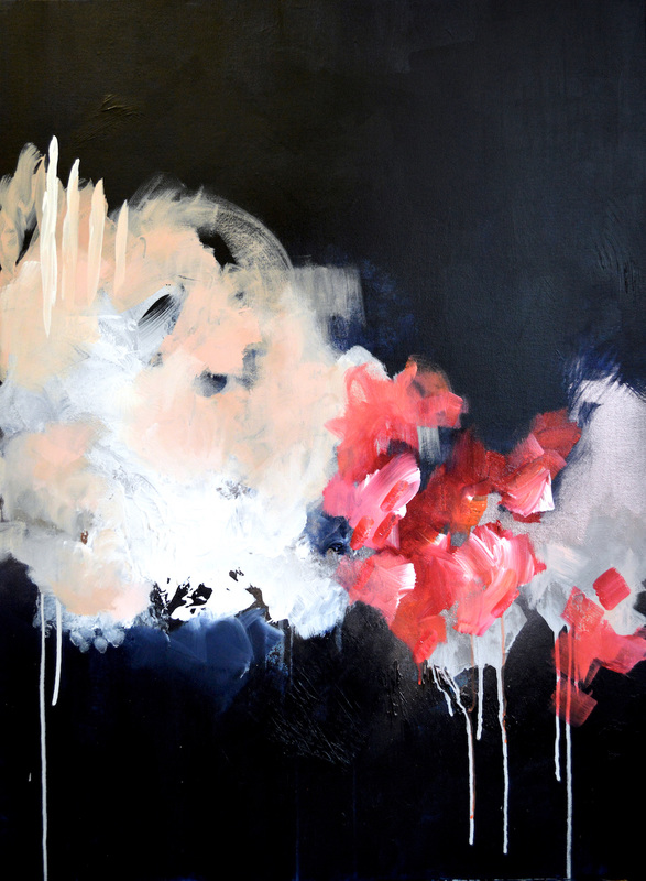 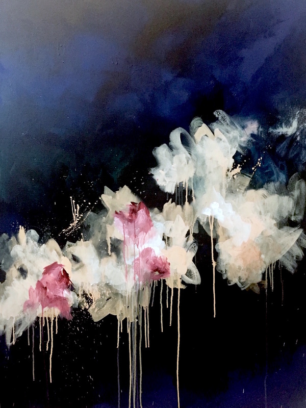 Yesterday was one of the longest days in the studio as I struggled with the green round canvas. Originally, I wanted to use the painting as an art pitch for a restaurant in a hotel in Chicago, but I was advised that its far more difficult to sell irregular shaped pieces as opposed to standard squares and rectangles for commercial spaces. I had dropped the idea but I kept staring at that round canvas and I had already applied my first coat of green. So I thought I'll go ahead and make it any way even if I don't pitch it this time around. Yesterday, however, once I started moving forward with the piece, and even enjoying it, I tried photoshopping it in a rendering of the restaurant, and I felt like it fit the brief perfectly. In the brief, the client listed that they want a green floral painting, so I had decided to create a diptych on round canvases to be displayed one above the other. I'm almost done with the first piece and have laid down the first coat in the second. In the rendering below, I've photoshopped the same piece twice but at the end, the paintings will have different compositions in the same color palette. Here is the rendering  What I enjoyed after taking a look at the rendering above was how the peaches and blushes complemented the seating and bar area on the right side of the image. There's a copper/blush palette (which I've always loved) and I liked how they reflect the palette in the paintings. Also, I decided to go with a deeper green as opposed to a vibrant Emerald like in the left hand side of the rendering. I felt like the dark green was richer and sexier and would help the floral composition pop. Below is an image of the work in progress where details are clearer. 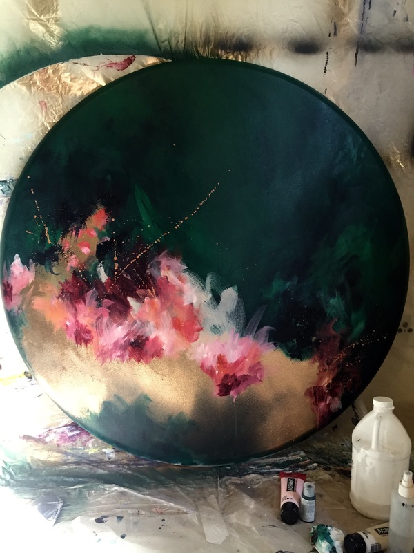 Green is a color that still haunts me till date. I've always struggled with placement and usage of that color and for years, I've tried to overcome it and own it in my artwork. Never been successful though. I can't think of a single painting where I've been able to voluntarily give it space on my canvas. There have been several instances where I've started with a lot of conviction and decided that this would be the piece where I would work with that color no matter how much I dislike it. Yesterday, I started a similar piece and at the end of the first day, I just wanted to throw the canvas out the window. There could be an additional reason: not only did I choose to create a green piece but also the canvas that I selected was a 40 inch circle. I've never worked on a round canvas before and the size is pretty big too so that made it more difficult with the additional surface area. For the base, I picked a dark green with a yellow hue, which almost looks like Hooker Green but maybe slightly lighter in shade. I sat back and admired the color for a while before I tried working into it and resented it every second. One of the things I did wrong was try to mix the warm and cool. It just confused the composition. My sister told me not to give up last night and work back into it. How long can I run away from it? I'm so determined to do what I want to do with this painting. It needs to be dark, and moody with pops of color. And mainly, it needs to be green. Here's the canvas right now. Hopefully, the piece will take a turn. 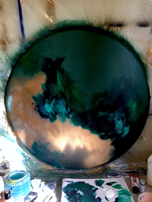 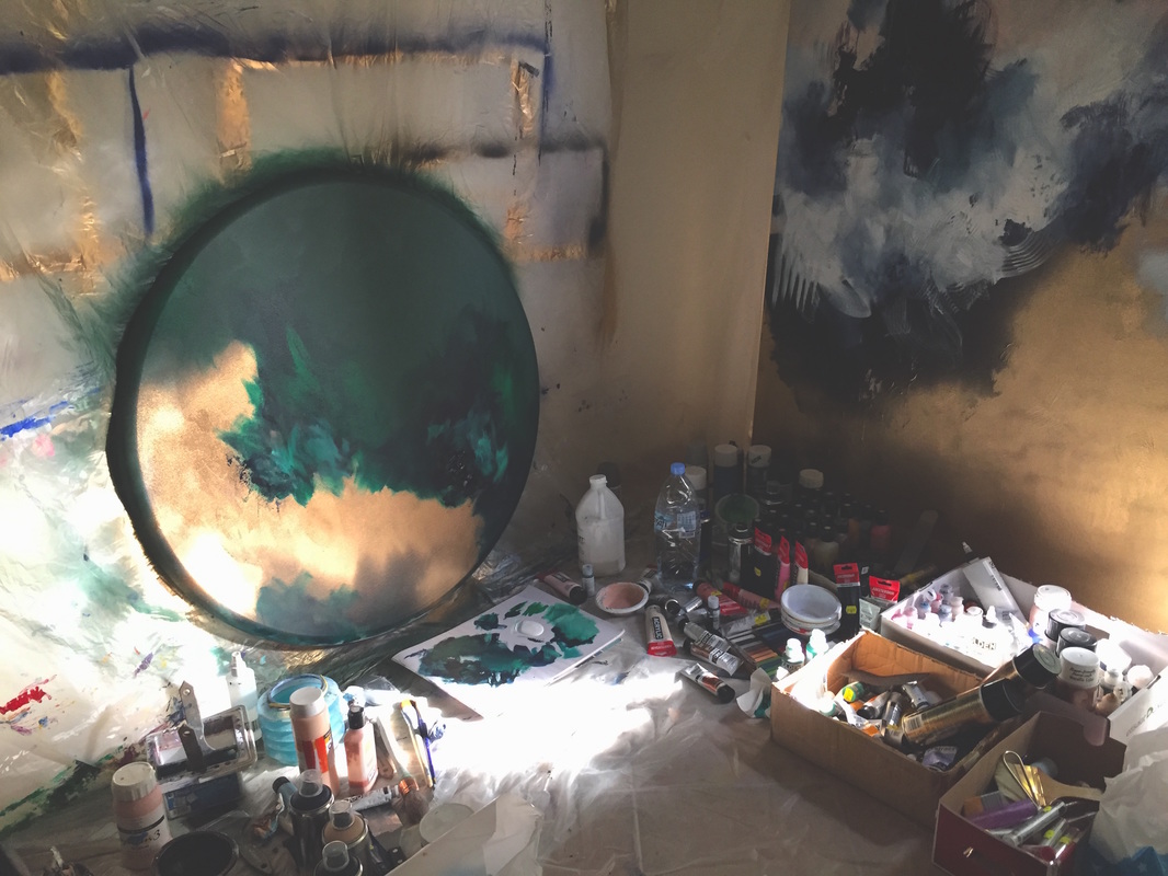 After a few days of struggling with the second part of the diptych, the piece is finally done. It measures 6x4 ft in total and is spray paint, acrylic and ink on Fredrix canvas. Here's what the diptych looks like. So pumped :D 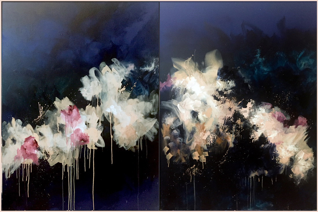 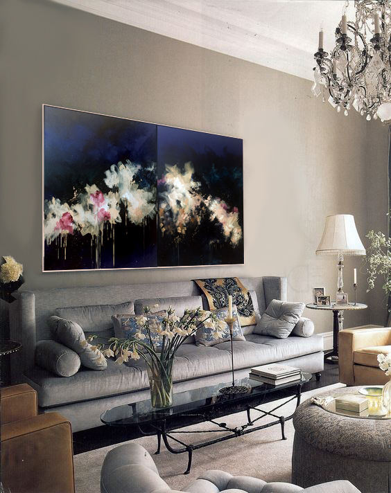 There's a brand new project on Indiewalls and I loved the space from the second I saw the brief images. The project posted is of an office lobby in the meatpacking district. The clients are looking for 2 pieces (for two separate lobbies) to go behind consoles, which I'm assuming are reception desks. The space is super clean, modern, masculine and has an awesome industrial vibe. The walls look like they're exposed concrete in the renderings and and the console is curved and looks like it has copper tones. I'm absolutely loving the design aesthetic and have been working tirelessly to create a surface on my canvases that would complement the texture on the walls and the console. Here are the brief images. 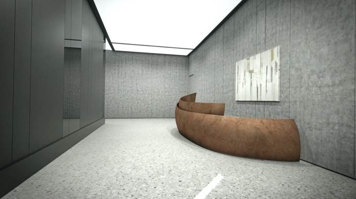 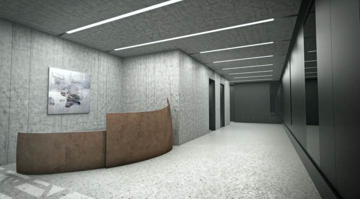 I generally work well vertically than I do horizontally so I thought working on a multi-paneled painting would be something that could work in the space. At the moment, I have 2 canvases measuring 36x48 in each (so 6x4 ft). Initially, I thought connecting the two pieces and making them a continuation of the other would be something I would be doing. But, as I'm moving forward with the piece (and you know how they usually have minds of their own), I'm beginning to enjoy the thought of them being disconnected in terms of composition but the hues would be similar. Framed together, they would bring contrast, movement and drama to the space. Although the images of the paintings in the renderings are in light neutrals, I thought a darker background would allow the painting to hold its own instead of blending into the wall. I decided to go with warm blues and my favorite Payne's Gray for the background, and the focal areas are in a modern neutral palette. So far, I have used a beige spray paint with a light blush in ink and acrylic. Here's what the first panel looks like as of now. I'm still thinking of a color to add the wow factor on this panel before I move on to the next. Another thought was that I would be willing to add a third panel to the artwork if the client would require something longer on the wall. 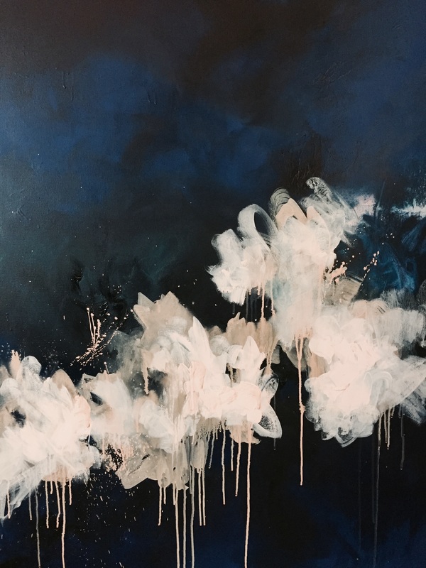 I had to do an 'in situ' image. You know I love those :D 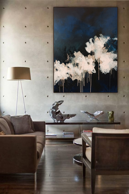 Fingers crossed for moving forward. I really want this piece to work out. Will write updates tomorrow.
Follies, a piece that I've been working on the past few days has probably been the most frustrating piece I've worked on in a while. I think it was the pattern on the dress that drove me insane. That amount of detail, and feeling like you aren't really making any progress was what got me. I wanted the pattern to look like decorative tile and there were at least 6 colors in each part of the pattern, which I had to work into. Once it was done, however, I was very pleased with it. I'm not sure if its the silhouette that I like, or if the pattern is what makes it, but the elegance of the piece as a whole makes me super happy. I'm going to submit it for a test print run to see how it turns out. Here's the piece and how it would look in situ. Images of interiors taken from Real Living Magazine and Restoration Hardware 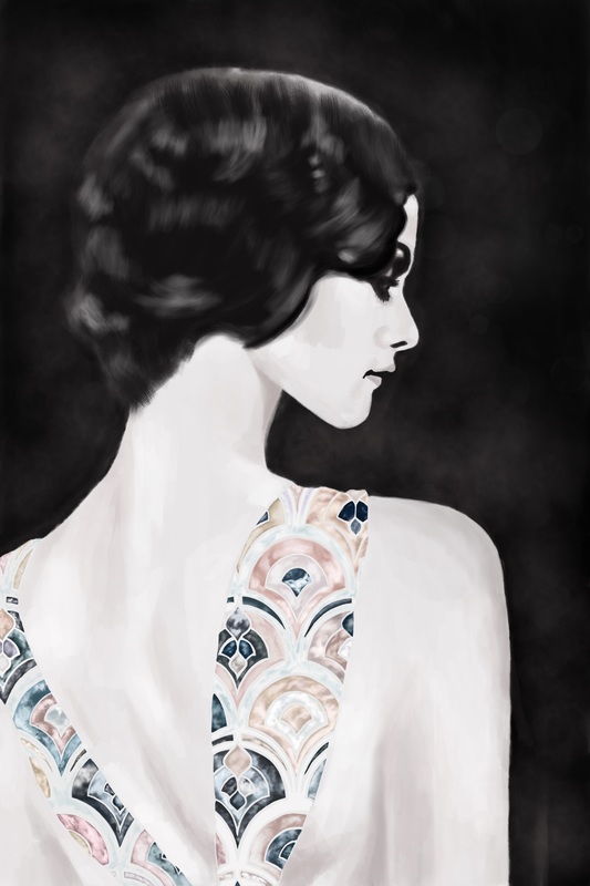 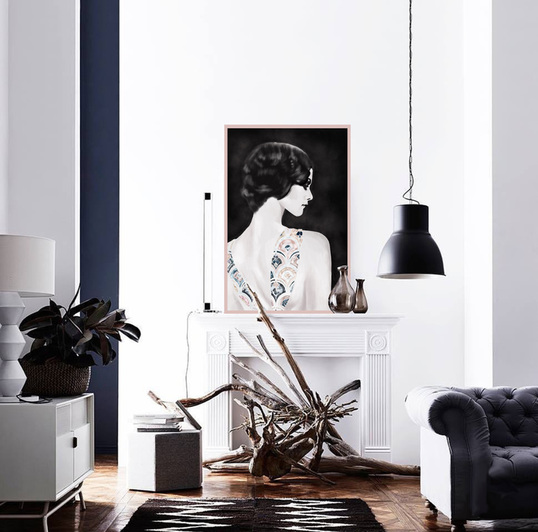 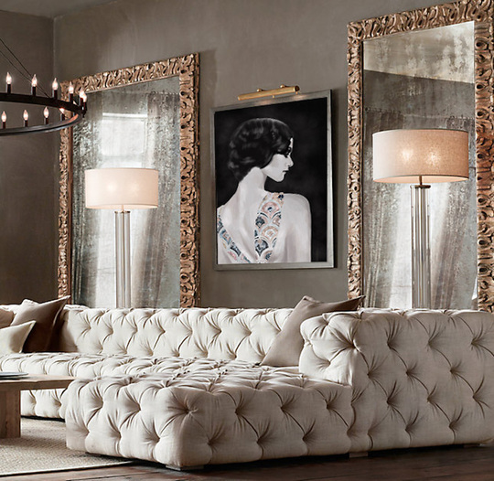 |
JournalArchives
March 2019
Categories |
 RSS Feed