|
The past few weeks have been dedicated to creating a triptych for a hotel here in Dubai. The client had requested to draw inspiration from previous works and layout. I was a little nervous because we were talking about blowing up the artworks by doubling the size and working with gold on those sizes is usually pretty expensive and challenging. One of the concerns I had was to maintain depth in the gold areas of the canvas because it would end up looking super flat if 12sqft of the canvas was in plain gold. Such a large area had to have some texture and movement and not just the shine. I sent across 2 overall sketches to the client before they decided to proceed with a particular option. Here's the option they decided to move forward with. 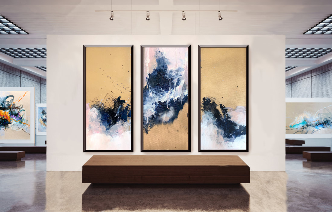 The approach was to create two corresponding panels on either side of the triptych and then a kind of 'disruptor' in the center which would force the viewer's gaze to shift upwards and then downwards again. I had 3 canvases measuring 3x6ft each so the total size of the triptych would be 9ftx6ft (!!) I have to say, it was an extremely exciting commission. I decided to spend the first day spray painting the canvas and letting it dry. Had to do it outdoors in my balcony and with the recent weather in Dubai, it was really rough with the wind, the rain and all the dust. Something that should've taken me a couple of hours and under 4 cans of premium chrome spray paint ended up taking almost double (extremely expensive for cost and time). The application of the paint wasn't time consuming at all since I had my primary sketches for each panel. It did get a little tight in my studio so maneuverability was tough and getting around the sides of the canvases was difficult. The greatest challenge, however was 'finishing' the piece. The abundant gold was extremely fragile and it needed to be sealed and protected because the slightest contact could create marks and scratches. I decided to move forward with a liquid varnish and applied it just as I have applied it so many times before. The reaction was insane. It was almost like the gold was tarnishing when it came into contact with the varnish. Once it dried, I had to actually re-spray paint the entire panel (thank god I only varnished one canvas and not all 3). The next day, I tried a different type of a varnish which worked so well. Everything was packed and delivered to Creative Minds for pick up a day before the deadline and I'm absolutely thrilled by the end result. Here they are!  
0 Comments
I had painted my staircase late last year and decided to go with Benjamin Moore's 'Bavarian Forest'. But before I selected that color, I had bought a ton of samples that were just laying around the studio unused. Didn't want to waste them so thought to try them out on canvas - and what a fabulous way to put them to use in the end! The 'eggshell' finish brought out a wonderful varnished finish and since they're water-based, I could mix them very well with the rest of my acrylics. The consistency was fantastic too (just the way I like it) and SO pigmented. Now that I'm done raving about the actual paint, let's talk about how flustered I got with the actual painting. After creating two artworks that I was happy with, this third piece took a long time to settle down. And I'm going to blame all the frustration on the fact that I decided to start the piece with a moody green.  The initial layer was absolutely fabulous. Most of the time I just want to say its finished right after the first layer. There's a certain 'raw and unfinished' element that is always my absolute favorite stage of a painting. The exposed canvas, the perfect blend between inky and textured gets me each time. But I know that there is far more to come so I keep on going. This time though was super rough. I knew what palette I wanted to go with but there were so many things I adored about the first layer that keeping them was so tough while still deciding on my final composition. I hesitated to layer, held back so many times to add anything and then ended up with something really ugly like this: 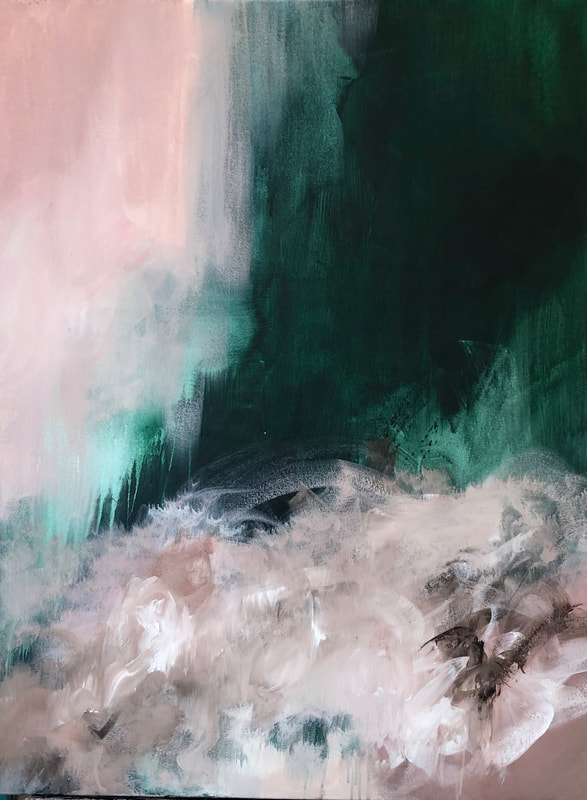 As you can see, it looks confused, muddy and plain messy. And not messy or chaotic by intention. It was painful to sit in front of it every day. That's when I had to tell myself to not be afraid of losing the elements that I was holding on to from the previous layer. Ended up softening the bottom area and actually covering the exposed canvas on the left side. And boom! Everything changed instantly. The added contrast, softer surface and pure white did a lot of fixing for me. So much so that it is my current favorite piece! Titled 'The Space Between Us' and here she is 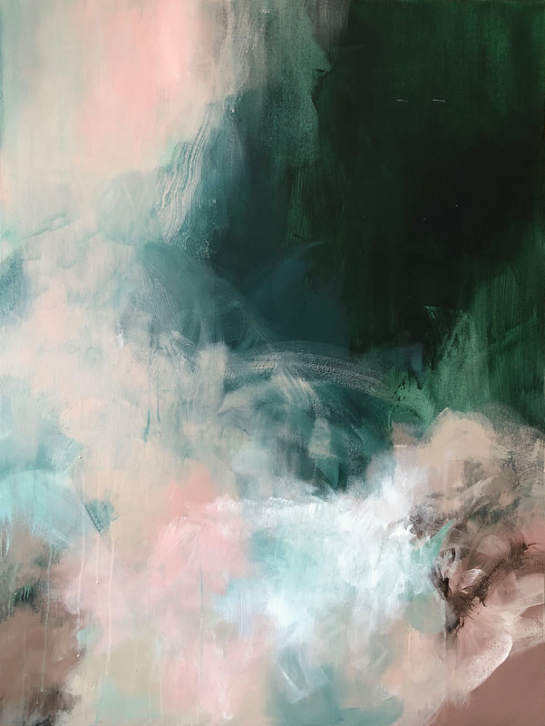 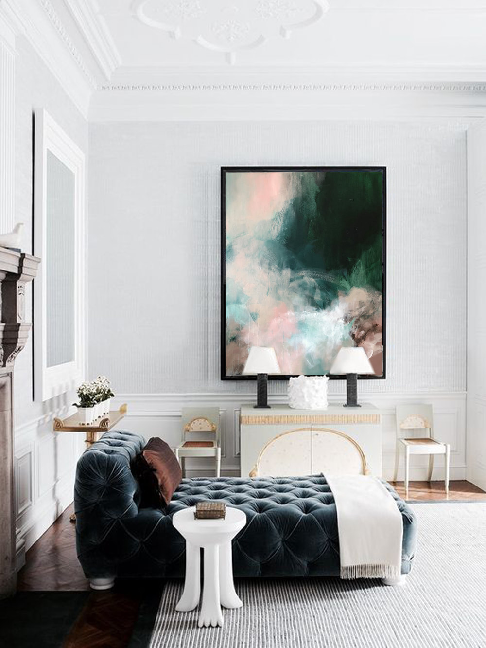 It's crazy that we're just a few days away from March already. And that it's 2019. I still can't get used to writing 2019 anywhere yet. The month of January was super slow in terms of creativity. It's as if I couldn't focus in any one direction. In February, I started penning down some thoughts and ideas of where I wanted this year to go and the past couple of weeks have been the rocky start of my journey. There's something so intimidating yet exciting about the beginning of each year. Even if we don't believe in resolutions, some of us subconsciously feel like it could be a new beginning of a new chapter. It is the start of a new year after all. I fall prey to it every time, and end up spending around 1-2 months planning out everything. All that goes to s*@% by the time we hit Spring or Summer at the latest. This year wasn't any different. The only thing that I could give myself credit for is putting an end to it earlier than usual. Even if it was just be a couple of weeks. :) There was something that I read a few years ago that has lit a fire in my belly ever since. Here is how it goes: There was this ceramics instructor. He divided his class in half and instructed one half to create as many vessels as they possibly could until the end of semester. He instructed the other half to think and ponder over how they would create the absolute best vessel and then have it ready by the end of semester. By the end of the semester, which half of the class do you feel ended up actually creating the absolute best vessel possible? I have tried to apply this to my work ever since. There are some artworks that end up being complete garbage which I then revisit when I'm ready and there are some that I feel take me to the next level. And that feeling of moving up in my own eyes is unbeatable. There are a few artworks I feel did that for me in the past few years. Milestones. Here's to all of them and excited to hit my next one. This year hopefully. For now, here's a piece I recently completed. It's moody and mauve. 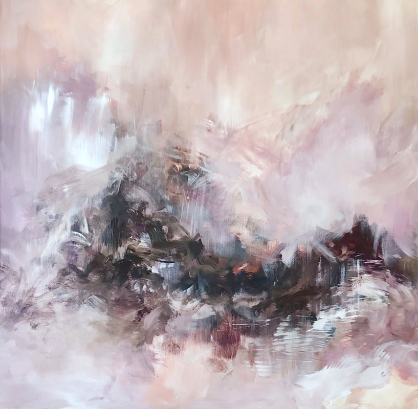 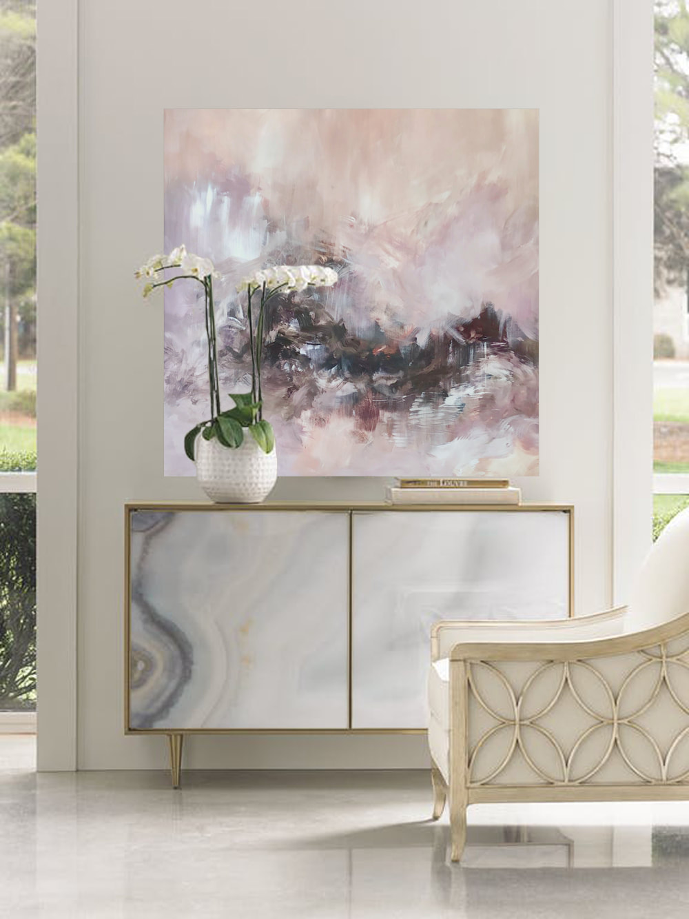 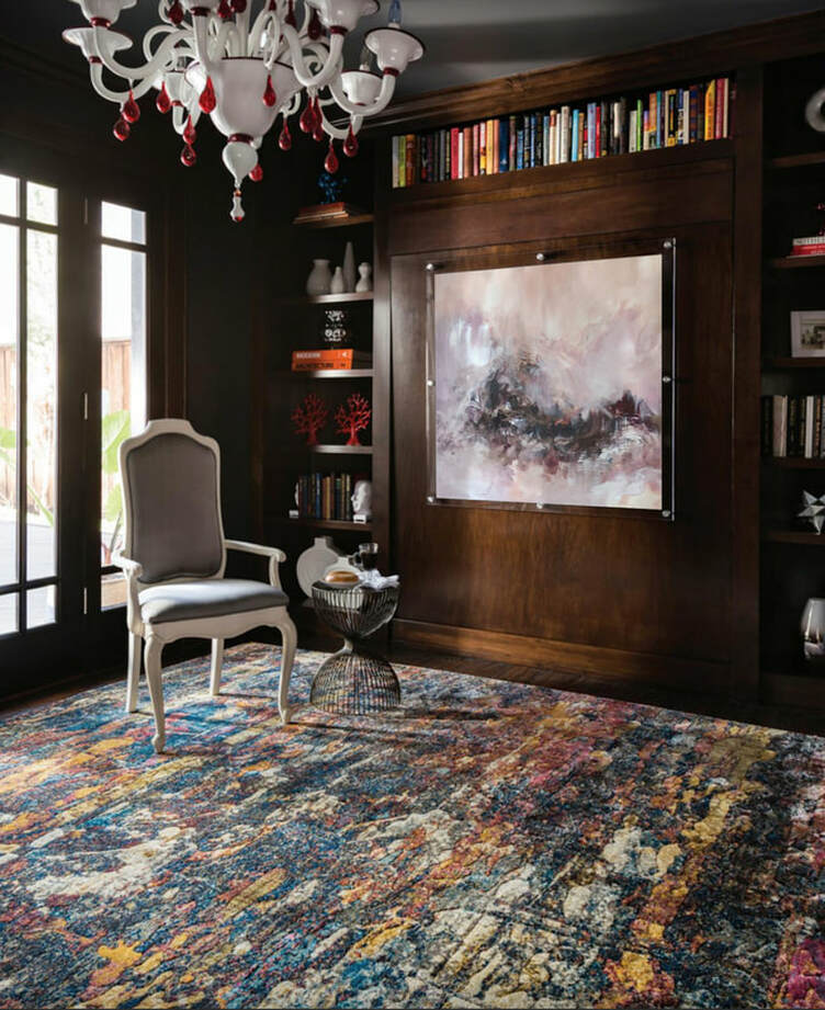 The past few months have been extremely rewarding. I've been working tirelessly to create a solid portfolio and explore new processes that have been shelved for at least 2 years while I tried to get my bearings in the art world. Decided to push myself harder than usual and boy was it awesome. My previous post was about the installation of an entire wall of blue. I then moved on to neutrals - loads of blush, grey, gold, black and white with hints of umber. They worked very well for my clients and in turn I pushed myself to create more in those palettes. I just dropped off 10 new works at the gallery earlier this week and have been brainstorming about my next move forward. During brainstorming sessions in my studio, I did end up completing a piece, which I feel has to be my most favorite artwork ever. It's one of those where you can't explain the magic. The magic that just flowed and while it might be liked by some and disliked by others, it will always remain that one piece where you were absolutely sure that every square inch of that canvas was compelling for you as an artist. I recognize it. I see it. It's present and I surrendered to it as cheesy as it sounds. But I've been floating around the studio ever since I completed the artwork and while this blog post doesn't have an image of the artwork, I will post it in the days to come after I take it all in. I started a larger diptych in the studio today. Two canvases, 48x60 each so in total, the artwork will be 96x60. One of the canvases in the diptych is being recycled so it does bring its own baggage. I'm hoping that will work in my favor but here it is so far. I'm pretty sure I'm going to call it 'The Calm Before the Storm'. PS how awesome is the light and shadow? 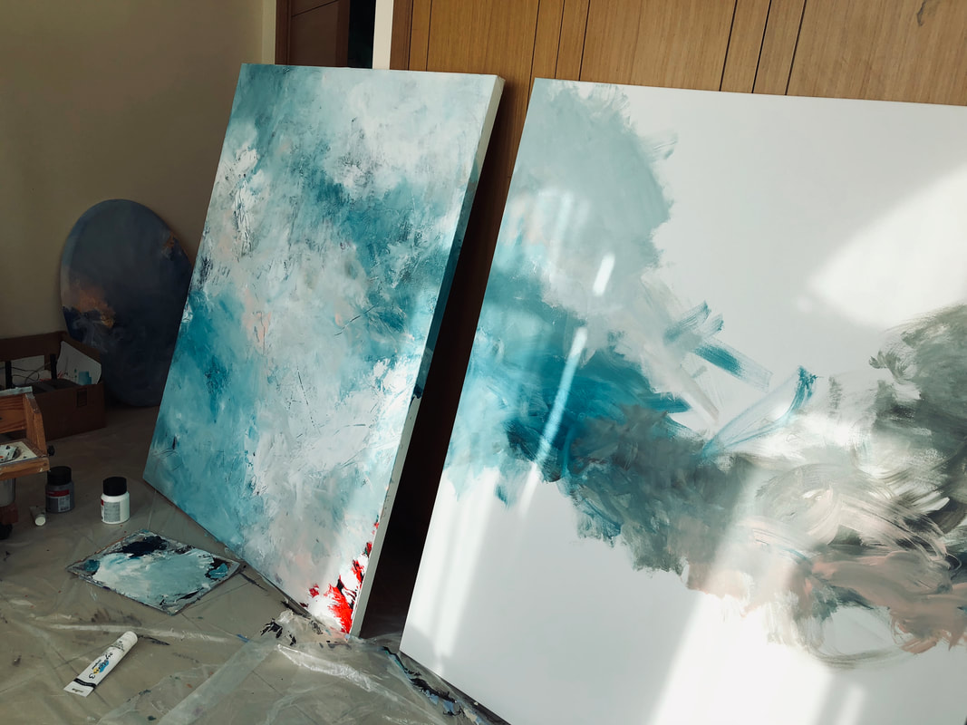 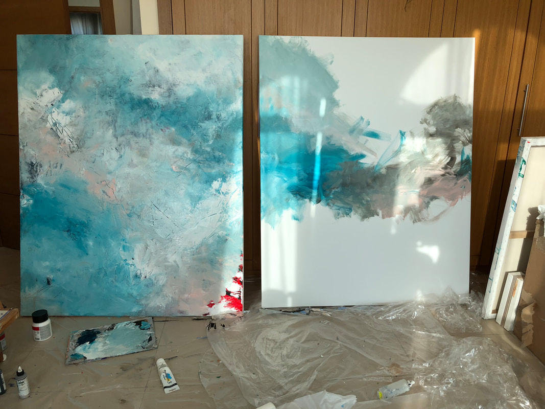 I spent the day installing an entire wall of blue themed paintings at the gallery the other day and it truly was an experience! Sorted through a few older pieces and walked in with 10 new canvases to put up 24 artworks on that wall in total. From moody Prussians, and dark Payne's Greys all the way to Minty-Turquoises and Cool Cobalts, the wall has it all. Here are a few shots that I took during installation. There was something about seeing a constant blue across the entire wall with specks of pink, orange, purple and all other colors as well. Next palette: Neutrals. 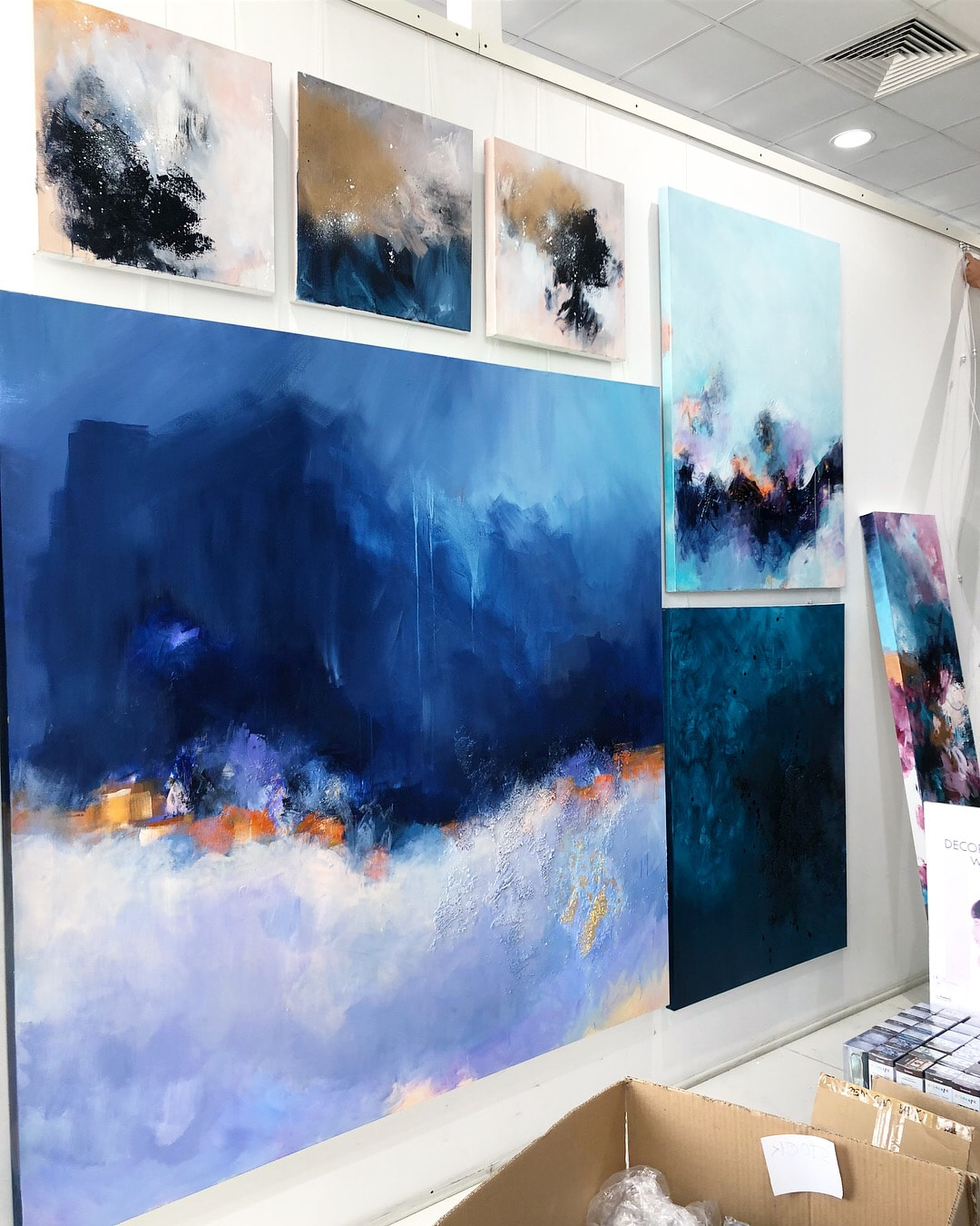 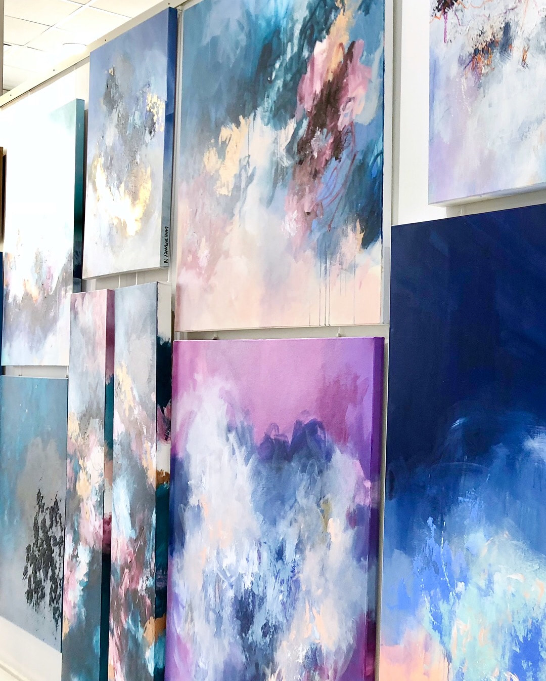 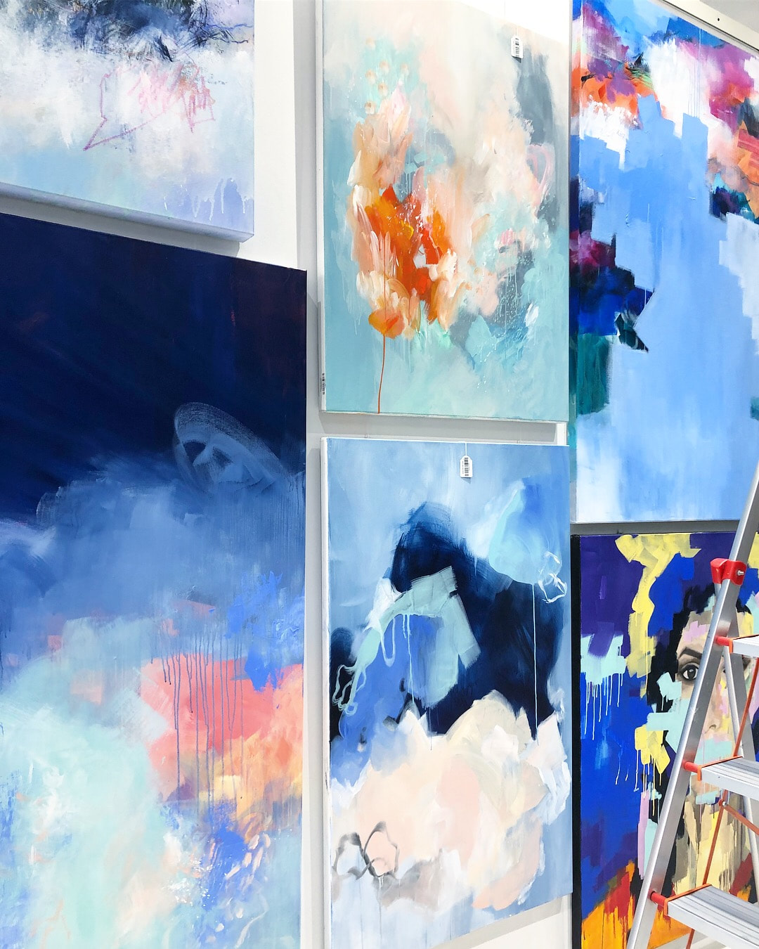 I've witnessed a huge shift in palette. It's as if I can't seem to pick out any of the brighter more playful colors. There is an instinctive urge to reach out for moodier tones and I can't seem to put my finger on why that is. So, I've just decided to run with it and it truly is a thrilling experience. I started working on this new abstract (untitled at the moment) and there were just two things I had decided before beginning the process: 1) it was going to be moody 2) there had to be a LOT of movement. I battled it out for a few days when I started to mix tones of Pthalo and Prussian and at the end, it just turned out be relatively monochromatic. My first ever! :D I'm so pumped that I immediately jumped to 2 additional canvases while the first was drying and those are almost done too. Can't wait to share. In the mean time, here's my hero fresh off the easel. 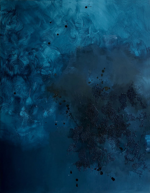  Every painting so far has been a journey of its own. Each with its own struggles, frustrations, ambitions and highs and lows. I can't seem to recollect a single artwork that hasn't put me through complete defeat and misery at some point, and perhaps its these countless battles that push me to create more. A more recent one was this last artwork I was working on. I had just returned from an island vacation - completely refreshed, rejuvenated and ready to work. Started working on a commission and was simultaneously trying to feed my soul with a painting titled 'Freezing Point'. (the title suggests the complete opposite of what I was attempting to bring to the canvas after my holiday). It started off as a diptych inspired by the seascapes and horizon I witnessed for 2 whole weeks but somewhere down the line, both canvases began to separate themselves from each other. No matter how hard I tried to keep them tied, they wouldn't listen or respond. This was the very first time that a diptych didn't work for me. While one of the canvases was turning out to be a vibrant piece filled with joy, the other was sleepy, tired and boring. Murky colors and the lack of movement frustrated me until I decided to separate them. If I were to be completely honest, I did end up releasing a lot of the frustration on the painting during this fight but it ended up being something that stunned me at the end. I think what I took away from this month long journey was the lesson of flexibility. Many of us want our artworks to turn out a certain way. We follow our vision while learning from our journey to achieve it. The things we learn, however, don't always have to be technical. Here is Freezing Point along with an 'in situ' image. 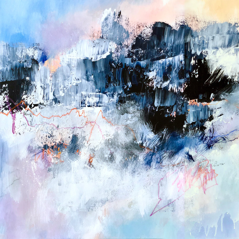 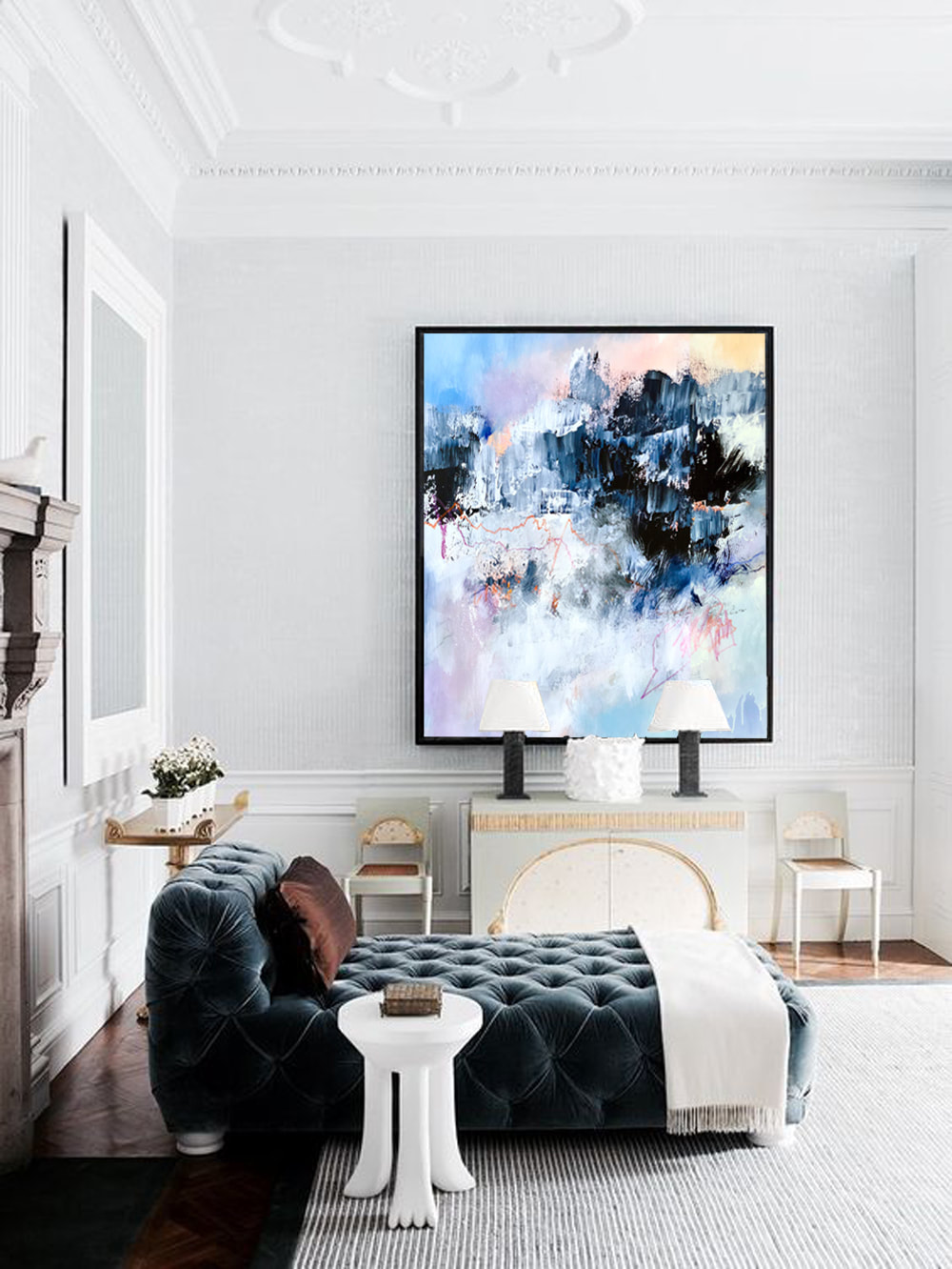 It's been years since I've picked up black for any sort of application in my artwork. I think its been a decade to be precise. When I was working on my series titled Dreamcatcher in 2008, I remember being terrified of color and black used to be my safety net. I'd turn to it for a lot of things: line work, drama, and contrast to name a few. Over the years, I started to confront my fear of color and began to learn how to place them on a surface side-by-side. Once that process had begun, I started to let go of black as a color and looking back, I can't believe how long its been since I unconsciously abandoned it altogether. I remember trying to create my own black or the darkest hue on my canvas by mixing tirelessly. The process is what I enjoyed the most and I let that color slip away. If I were to be honest, getting carried away and pushing something out entirely probably wasn't the best option. I think I should learn to balance things out a little more. Anyhow, here's what I did with it today. Titled 'U-Turn' I used watercolor, markers and oil pastels. It's something very close to my heart and I don't thin I want to see this one go. Ever.  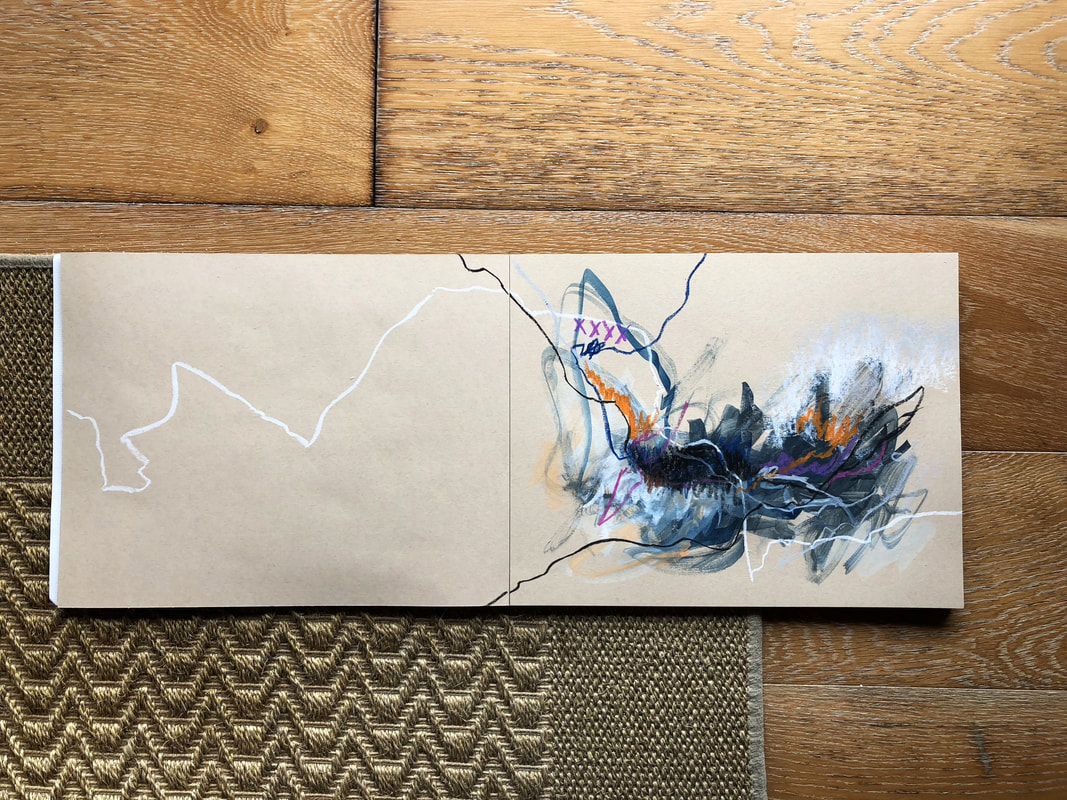 2018 has been a crazy year so far. And while it has been enriched with travel, meeting new people, education and so much more, I've really fallen behind with my artwork. There was a lot of push-and-pull the past few months. Juggling with thoughts and ideas and looking for new avenues and direction. So far the search has been fruitless and I decided it was time to hit the canvas while continuing my search simultaneously. One of my most favorite artists once said 'You're only as relevant as what you created today' and that is something I've tried to live by as it truly resonated with me. In retrospect, however, I've failed miserably the past few months and am starting to feel a little irrelevant. Having said that, I've really thrown myself back into the grind and have been trying to play catch up. Been struggling with palettes, composition, and basic fundamentals when it comes to painting but I strongly believe its just a matter of time. Here's one of the pieces that depict my struggle to get back on track. It really is an interesting piece. I often used to call it the 'cursed canvas' because I've had to cover up 4 paintings, which were all complete garbage so there are 4 layers of entire works buried under this painting. The images are in chronological order. 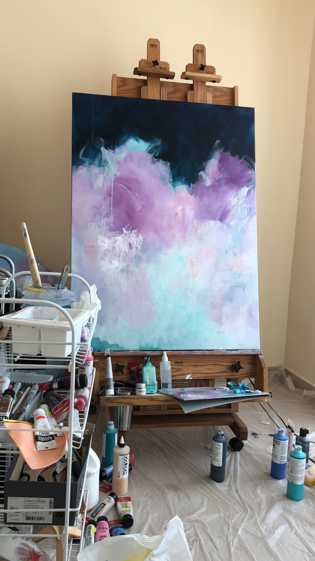 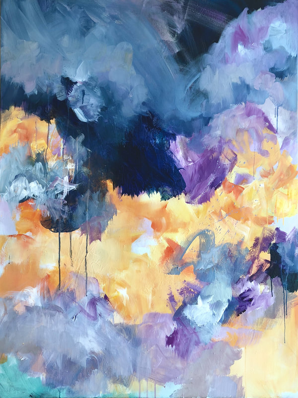 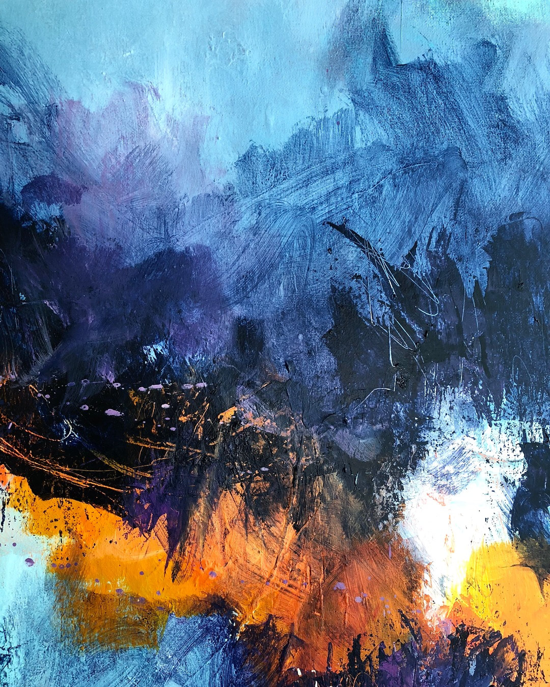 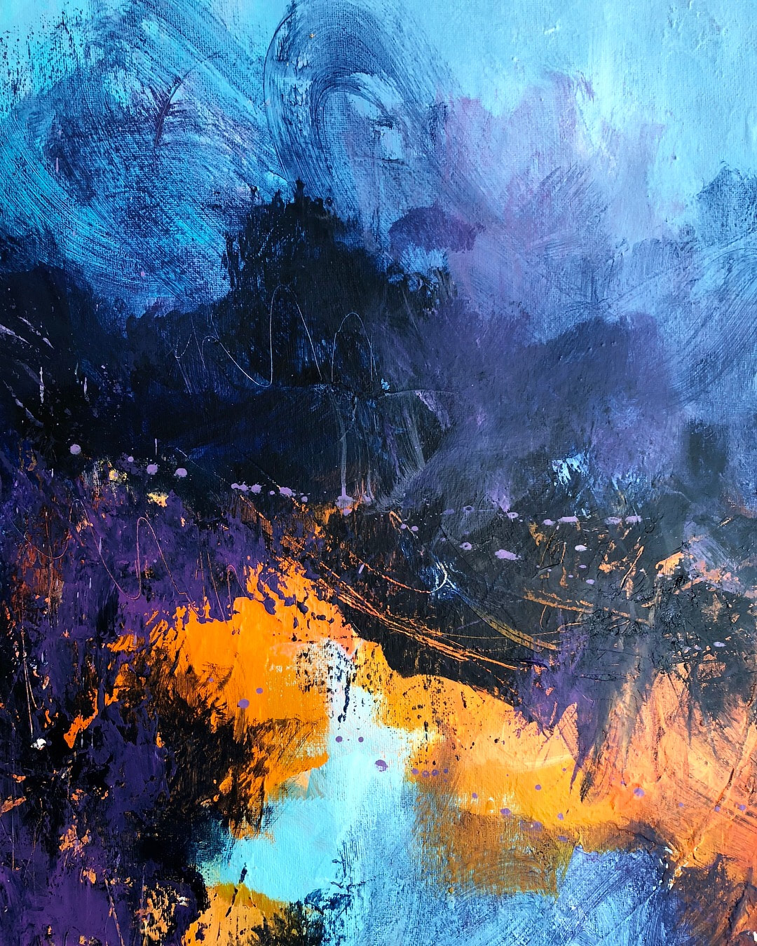 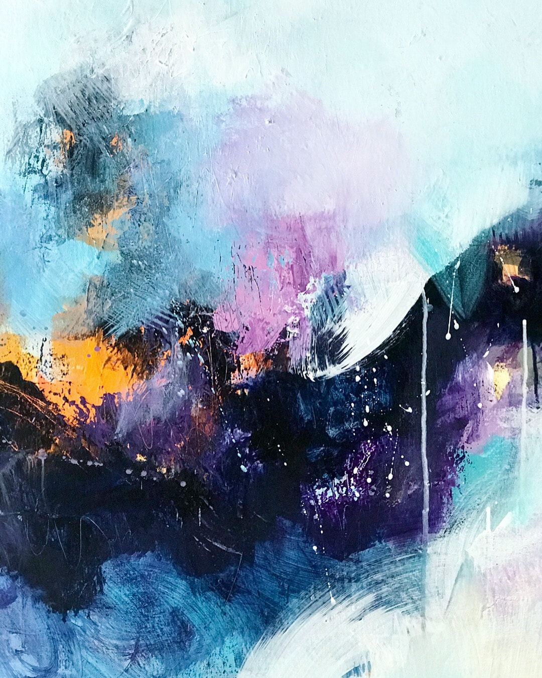 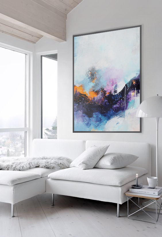 This is one of those paintings, which remind me why I do what I do. After almost 6 months of feeling lost and unsure, this baby put me back on track. I felt like I let out everything I wanted to with this painting. The Permanent Maroon and Payne's Grey against the Copper looks more beautiful in person. There is texture and dimension as well which is lost in photography. Titled C for Coordinates, I used acrylic on canvas, and the size of the canvas is a 40 in square.  |
JournalArchives
March 2019
Categories |
 RSS Feed