|
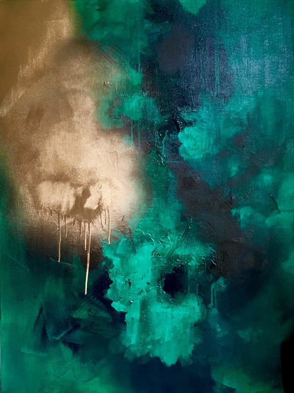
I posted about this green I was struggling with for the past couple of days, and even yesterday, it just didn't seem to work. Maybe it was my reluctancy to work with jewel tones. For some reason, they just don't work in my head. The Emerald green was stunning, but I couldn't bring myself to make it work with any other color on that canvas. So I decided to break my heart and cover the painting with a coat of white. All those hours, days and paint gone out the window. I started fresh with a palette I'm more comfortable with: neutrals.
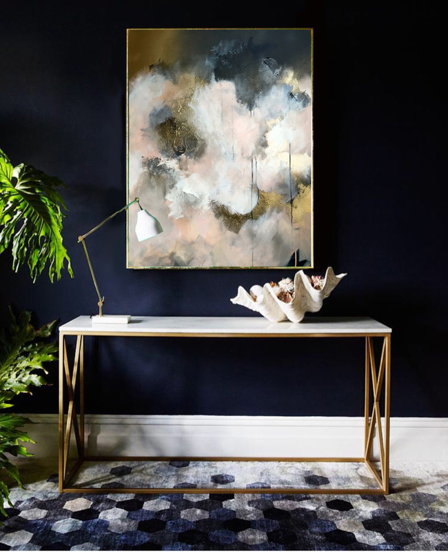
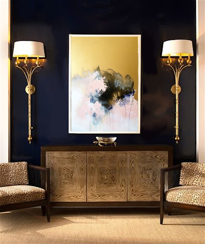
What I did differently this time was instead of a single focal point on the canvas, I decided to create a textured surface which called for attention in different areas. There was no sudden drama in a specific area of the canvas, and there was a balance in the movement. It definitely relaxed me and kept the stress away but I think I'm ready to head back to my crazy colors and challenge myself once again. Here's what the piece looks like in situ
0 Comments
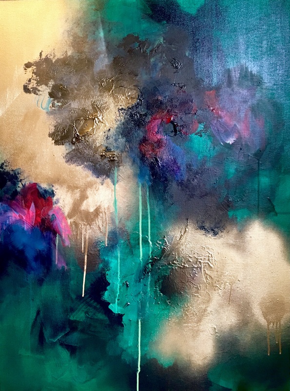
Yesterday was another terrible day in the studio. Nothing was working, and with each layer of paint applied, I was getting more frustrated. It was the time that I was wasting and of course the paint that I was pouring down the drain that was getting to me the most. My only goal for the past few days has been to create a green painting, which I can learn to love. I've always had trouble with that color and how much of the canvas I would allow it to own and it was time that I confronted it and found MY green: the shade that worked for me. Initially, I thought a dark, rich green, like a rich mix of Emerald and Viridian was what I wanted. I laid down a glaze of the paint over a prepped base of texture and other color, and I loved what I saw but as I began to add other colors to the piece and build on the green, everything just fell apart. I even brought in some gold because I was certain that the gold would work well with the green, but it didn't change the fact that the green wouldn't play well with others at all, and I wasn't sure if it could hold an entire painting on its shoulders.
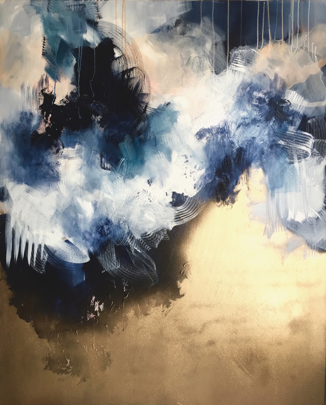
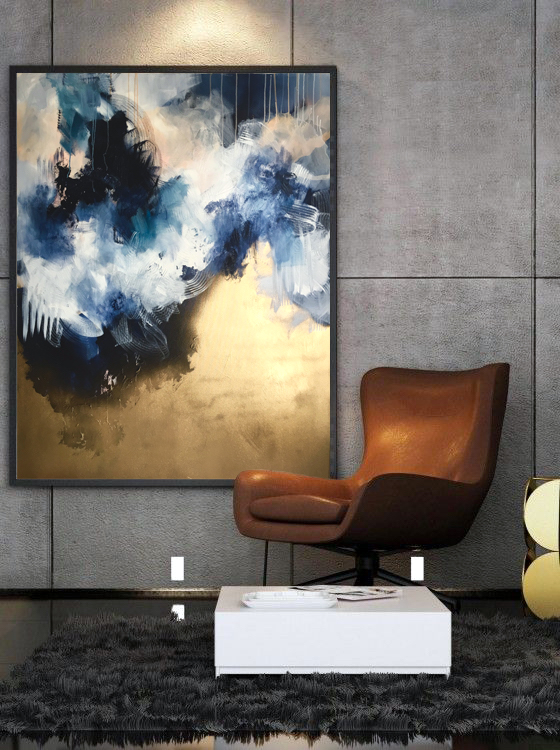
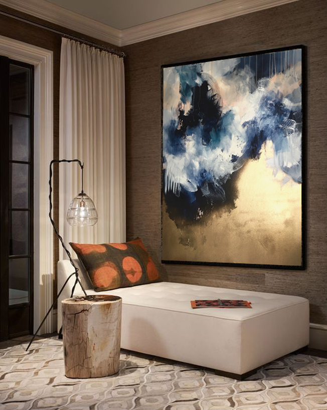
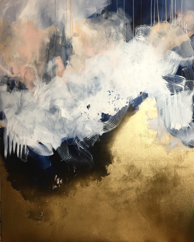
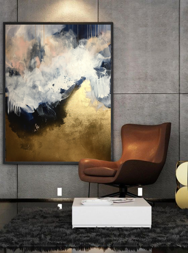
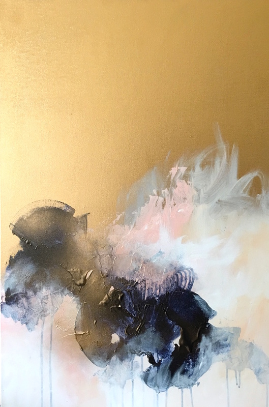
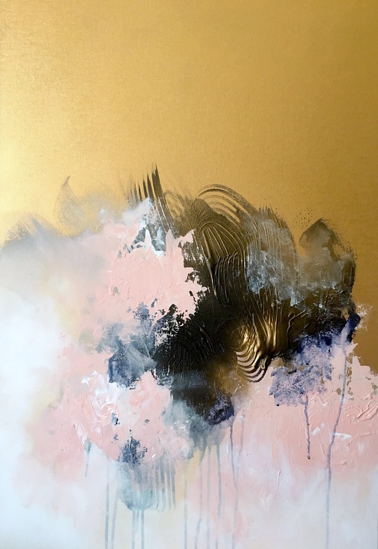
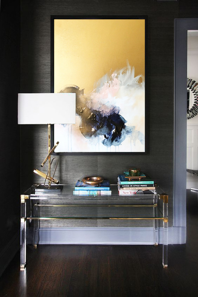
At some point, I decided to reverse my perspective and just think of it as 'no bad day in the studio is a failure because instead of what I failed to achieve, I've ended up learning 100 different things that don't work and that knowledge is power'. It definitely helped me through the day as I kept trying to make the piece work. Here are a few shots of its journey and I hope I can bring some life back into it or I will end up shelving the painting. Maybe it isn't time to form that relationship with Green as yet. After a long game of tug of war, 'Lets Go Back' is finally complete. The painting was inspired by vintage Chinese scrolls and landscape paintings and I used a 14 karat gold spray paint for the bottom half of the piece to add elegance and a sense of luxury. The palette is very neutral and it was pitched for the main space in a suite. I still have to make its counterpart since the client is looking for 2 coordinating pieces but I will wait to hear feedback first.
When I started the painting, no matter what I did just refused to work. Something simple like turning the canvas upside down gave me a fresh perspective and allowed me to work into the newly found composition. I like how the drips look like they're defying gravity and the lines offer something valuable to the entire piece. I mixed my two favorite blues: Payne's Gray and Prussian and they sit well with the blush and sand tones. Here is what the piece looks like now and I photoshopped it into two separate rooms to provide a sense of size and what it could look like in situ. I think it just needs a simple black floating frame to complete it. I've been working hard on an art pitch for the main space of a VP suite. The hotel is in Texas and the design aesthetic is a Western and Asian fusion. The direction I decided to go in was to create two pieces, which would be at a fair distance from one another but on the same wall, both measuring 48x60in and both inspired by vintage Chinese scrolls of landscape art. The key element in the paintings is the 14 karat gold that will offer a vintage Chinese feel to the piece. There is a lot of brushwork and I have used palette knives as well to create additional texture and movement. So far, I've stuck to a neutral palette: Payne's Gray, White, Blush, Sand, and Light Gray but I feel like the painting still needs a pop of red, orange, coral or purple for the finale. Here is what it looks like as of now and I've photoshopped it into an interior space with a similar palette to see how the colors sit in the environment. I've also photoshopped the same piece twice into the rendering provided by the client in the brief to view how it works there. Lots more to do but its definitely exciting to be working large again.
I was browsing through some new projects and there was a super interesting one where a hotel is looking for artworks for the public spaces, vice presidential and presidential suites. The brief was very specific and the budget was also divided very well. What interested me the most about this project was the fact that I could work on a larger painting, and incorporate Asian design aesthetic into the piece. This is something I haven't done before and would definitely be a challenge.
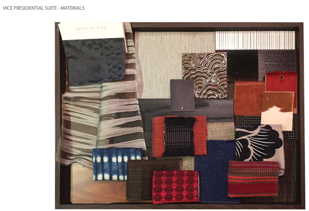
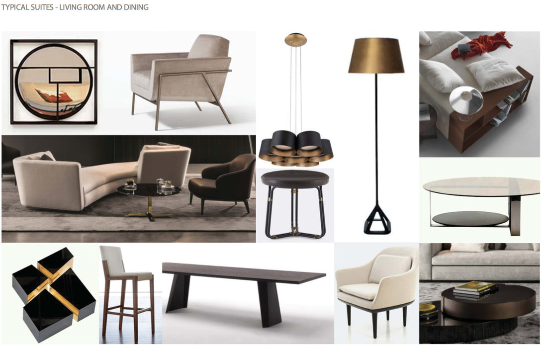
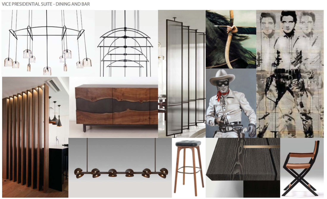
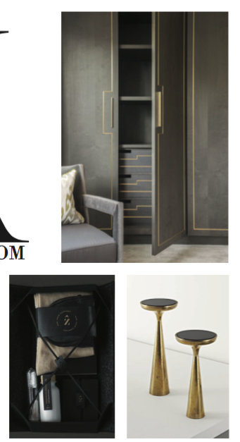
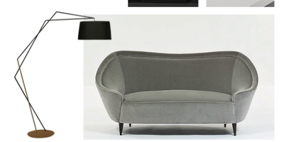
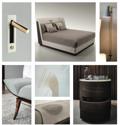
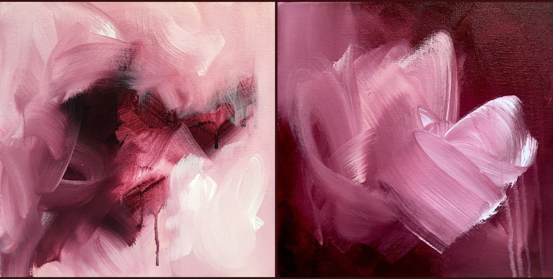
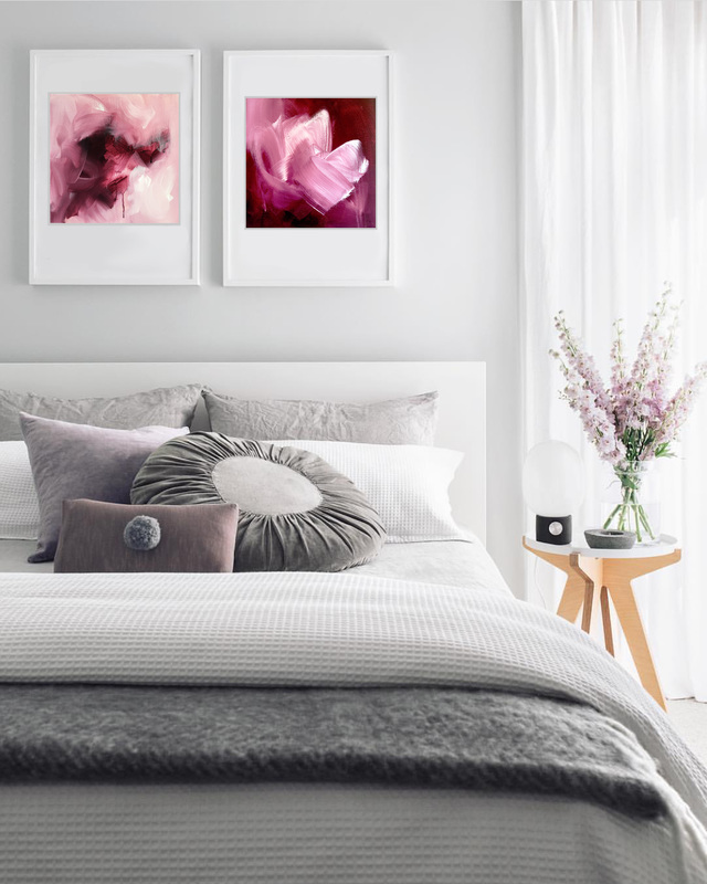
I decided to start with the pieces for the main space of the vice presidential suite. The client is looking for 2 large-scale paintings for this area and they mentioned how they would like a circular motif reminiscent of brush strokes/lassos. I'm not sure if I would want to cover the entire canvas with a single stroke or would I incorporate the motif in the form of a seamless pattern in areas of the canvas. Something I definitely want to do is work with Japanese motifs. I think there is such beauty to their design. Another idea that occurred to me was since there are 2 paintings on either side of the door and they would have to complement each other, a tall Japanese abstract landscape would be a lot of fun and have great impact. The colors would definitely be earthy and neutral with pops of deep reds and oranges like in the fabrics. Thats something I would want to explore today. The finishes and materials used in the suite are also stunning. Here are a few images from the brief. There are a whole new bunch of projects posted on Indiewalls and just browsing through them makes me drool. I was thinking how at the beginning, working to a brief offered less flexibility and how it was difficult for me to limit myself to a concept. Today, that has changed drastically. Its exciting to work towards a concept and it allows me to challenge myself each time. A project that I pitched to yesterday was for artwork for guest rooms of a hotel in Dallas. In the brief, the client explained that they were looking for something 'fresh and clean with a little whimsy'. The hotel is located close to upscale shopping so they were looking to incorporate fashion into the artwork without it being in your face. Here is what their mood boards look like The first thing that caught my eye was the modern neutral palette and I adored that. The grays, soft blushes and hints of gold is what I live for these days. I wanted to offer something that would complement this design aesthetic. Something simple yet striking which wouldn't overwhelm the guests. I ended up pitching my maroon diptych which was originally a color study of this stunning permanent maroon by Golden paints. After pitching those, I'm thinking of creating more artwork for this project but incorporating gold and blush as well. Here's what my pitch looked like
Two pieces of good news: I received my artist contract for 'Passing Through' which is going on its own little adventure to Boston and is going to set the mood in the lobby of a luxury condo complex. I also heard back from the Boston Long Wharf Marriott project, and I just sent hi-res images for test prints for 400 guest rooms. Both 'Sway' and 'I See a Square' were sent. It has been an awesome week so far :D There was a lot that I had to figure out the past couple of days. I've never had to package my art a certain way nor have I shipped a piece of artwork to another country before so I had to figure out logistics of sending such a huge piece (4x6ft) stateside. Here are a few challenges I faced:
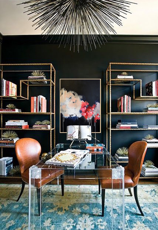
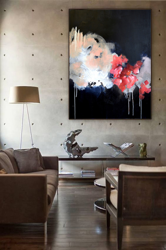
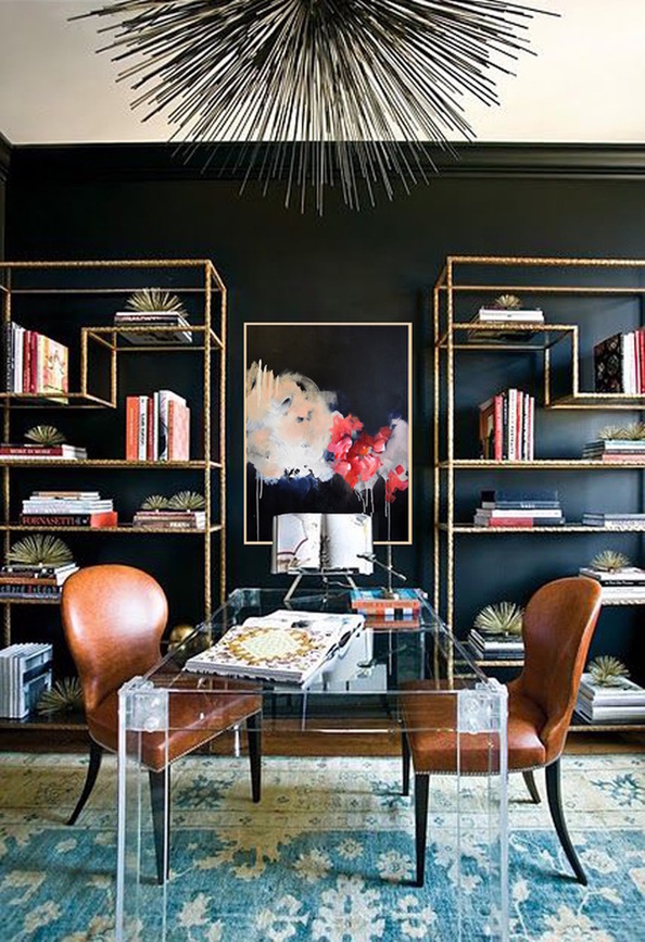
1. Un-stretching the canvas: it would cost far less to send the painting rolled in a tube as opposed to stretched on bars so I had to un-stretch the piece. The quality of the canvas was amazing so to take it off the bars was a 1000 calorie per hour workout. Firstly, I didn't have the right tool and being in Dubai, it was difficult for me to find something affordable that would remove upholstery staples. I discovered this amazing hardware store in DIP called Speedex. It must have been a 30,000 sqft store hidden in the area. I bought the tool for 7 dirhams and rushed back to the studio to begin. It took me around 2 hours to get all the stapes out since I had to do it manually and there wasn't a power tool I could find. 2. Lining the canvas to protect the surface: Plastic and a lot of paper have acid in them and if you cover a canvas with material that contain this acid, the piece can yellow over a period of time. There's a specific kind of acid-free paper that artists use to package their work for shipping or storage, which of course isn't available in the UAE. Since this would be a short trip (2 days as stated by FedEx), I decided to use what was available to me in that size. 3. Finding the actual mailing tube: I couldn't imagine that you couldn't find a store with mailing tubes in those sizes anywhere in the city!! I went to a whole bunch of places and even checked online but the only tubes available were drafting tubes which had a much smaller diameter and were shorter in height than what was required. After running around, I arrived at this tiny place that sold packaging supplies. The guy felt really bad for me I suppose so he dug through his garbage and found a tube, which was 58 inches tall and had a 3.5" diameter. I bought the covers (which luckily fit the tube). Apparently, its a standard size so if you're ever looking for covers of a larger diameter or smaller, you won't find them in the city. 4. Not being able to bubble wrap the piece: I secured the painting by lining it with the plastic and then rolled it around a long cardboard tube I took from inside a roll of bubble wrap, and then taped the plastic overlay with masking tape. When I tried to put a single layer of bubblewrap over the piece, it wouldn't fit in the tube! So I had to remove the bubble wrap and slide the piece into the tube directly. 5. Usually, when you mail paintings in a tube, a lot of people suggest that you double the tube and slide the current tube into a larger tube for extra protection. But there is a real dearth of these tubes in the country. I even sent out emails to manufacturers in Al Ain asking them where I could buy them in retail but haven't heard anything as yet. 6. Another thing I learned was how to photograph my artwork for prints, which was awesome. I invested in a DSLR camera as a couple of years ago with the intention of using it for photographing my artwork. I never made prints nor have I really sold any work since so it was amazing to finally whip it out and put it to work. I bought these super cool daylight lamps from Creative Minds in Al Barsha, which allow me to paint at night in my dimly lit studio so I placed the lights at a 45 degree angle on either side of my drawing (which I taped to the wall using masking tape). This allowed the light to be evenly distributed and avoided one side being darker than the other. There was also no glare on the piece. As frustrating as it was to run around looking for these supplies, and finding out that there are so many things that just aren't available in this country, it was an amazing learning experience. The first time is always difficult but the more you do it, the easier it gets. Priority number 1 is to stock up on shipping supplies which I will order online and have shipped here. I pitched another 2 paintings to this super cool project titled Luxury Suites on Indiewalls. Here are the pieces and this is what they look like photoshopped into spaces. Loved seeing how 'Run With Me' would look in two completely different environments. I personally love the moody black wall with the gold shelves. The painting looks perfect in that setting but its really cool to see the piece larger in a muted setting.
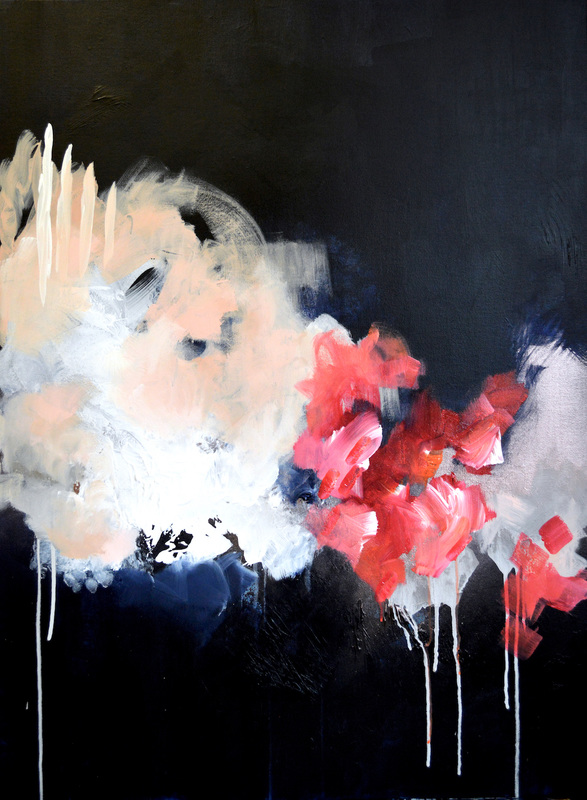
I am so thrilled to have completed this beauty yesterday. She's another favorite of mine and she's very unique. She's dark, mysterious and extremely moody but there are moments of pure joy that stem from her nonconformity. Initially, I wasn't sure where the piece was going after I left the studio the night before. I loved the blues and the brights underneath the layer of darkness but when I got back to the studio yesterday, instinctively, I covered the rest of the canvas in the dark Payne's Gray. At the beginning, nothing seemed to work. The metallic Rose Gold, the blush, the sand tones. Everything was being rejected. Slowly, I began to see composition, movement and everything getting along. The corals and pinks came right at the end to seal the deal. What really got me in this piece was how much the thought traveled and changed before the end. What I wanted was exactly this but perhaps with something different. And what I ended up with was exactly what I wanted but completely different. That almost doesn't make any sense at all. I also ended up finding the perfect interior space and design aesthetic for her. She's called 'Run With Me'.
I've come to realize that the times when I have all the supplies at my disposal, I have a tendency to carry on doing what I am doing because there is this awesome rhythm I find and I keep trying to build on that. So if I'm experimenting with a certain medium or surface or idea, I keep pushing them to their limits until I feel like I'm satisfied with what I've achieved. Then there are other times, when a key ingredient just isn't available. Usually these ingredients are external. For example, I'm almost finished with my gold paint and none of the art stores have any more in stock. With a quarter can remaining, I'm becoming super stingy with what I have left. That left me in such a mood yesterday because that rhythm was just broken. But its in moments like these, where I end up pushing myself to exploring new ideas and trying different things.
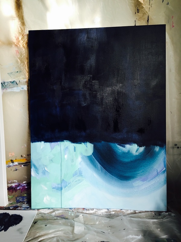
For a while now, I've been thinking about trying to work with darker colors and allowing them to take over more of the canvas. Just for the sake of trying something I haven't tried before and seeing what it does. I had an abandoned painting sitting in the corner of the studio. Its a decent size: 30x40in and I knew I had to get back to try to fix it at some point. I want at least three quarters of this canvas to be covered in my beloved Payne's Gray and there is this stunning Rose Gold that I haven't used much that I want to apply to this piece. Maybe a little copper along with a few other warm colors? I'll find out today. Here she is as of now looking fun but mysterious. |
JournalArchives
March 2019
Categories |

 RSS Feed