|
I know I said I wouldn't do this for a little while but I just couldn't help it. While working on my third piece, which is taking slightly longer than its predecessors, I had to see how they would look in a colorful environment. This could be one of my favorite setups. I love how the mint and turquoise complement the couch and how the overall colors look great against a slightly darker wall. Take a look 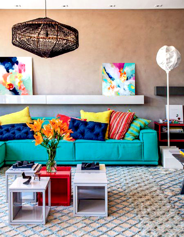
0 Comments
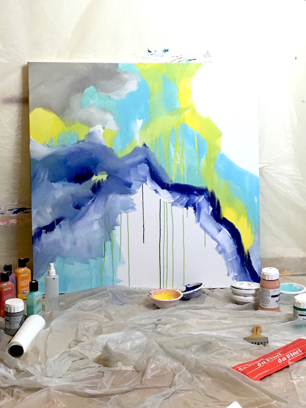
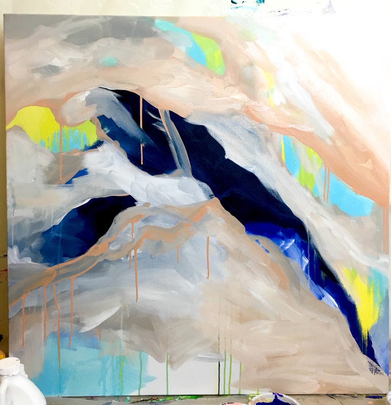
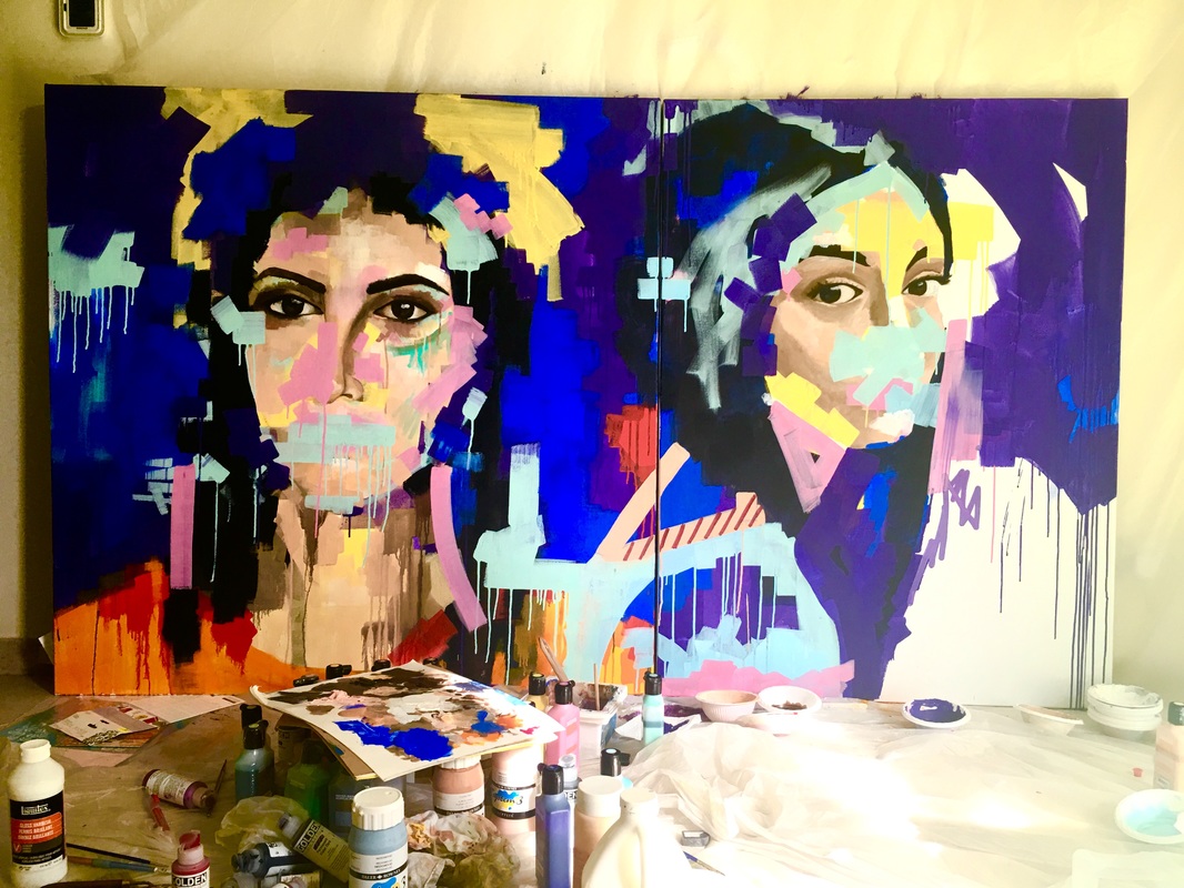
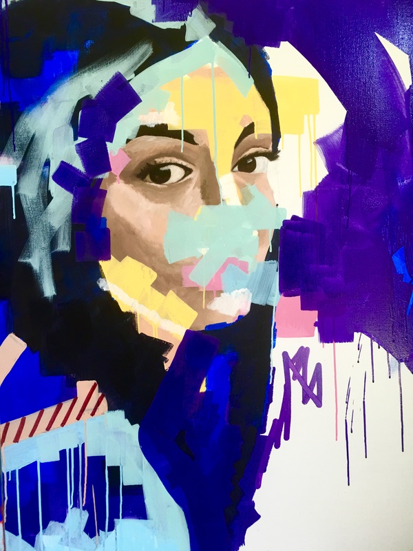
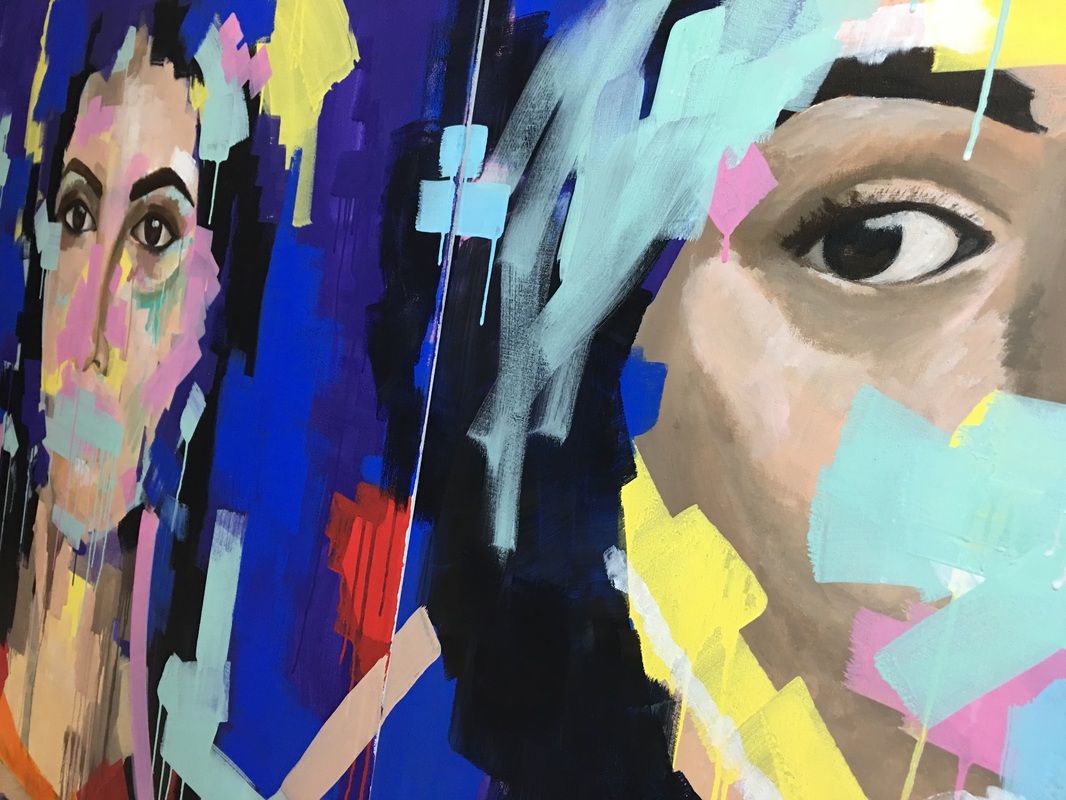
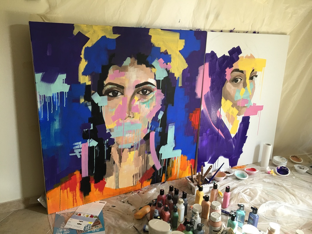
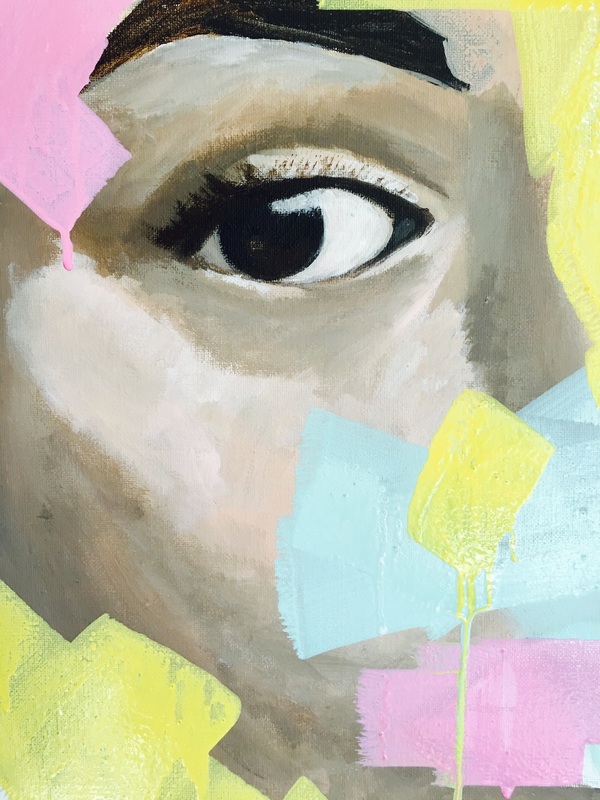
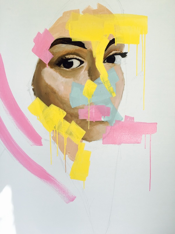
The second part of this commission seems to be a lot more moody. That could be because I've stretched the process over quite a few days. It looks so different every time I look at it or take a photograph and I'm truly enjoying the movement of the thought. Here is the piece along with a few detail shots 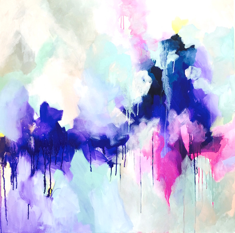 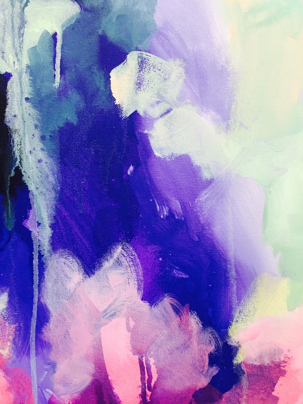 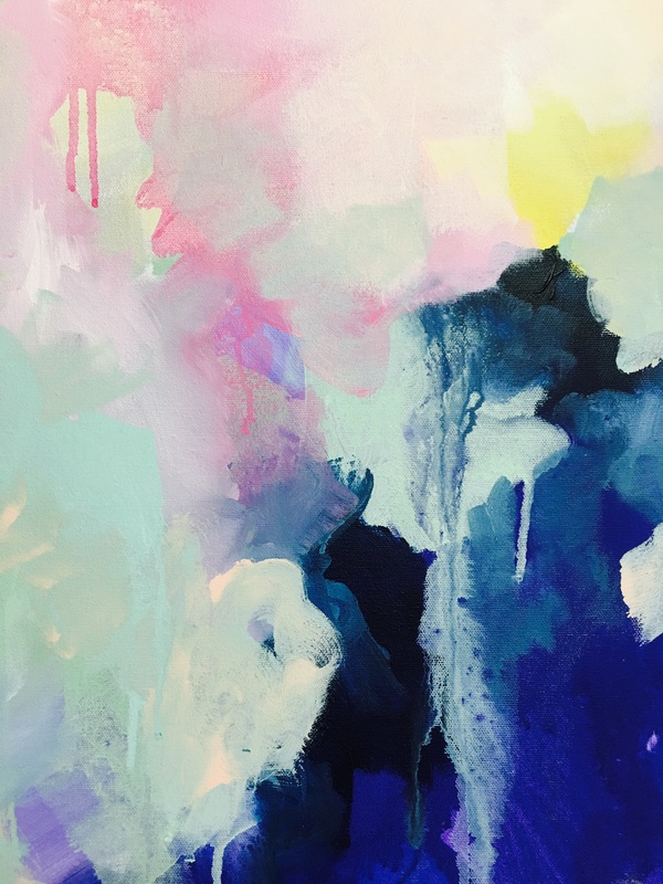 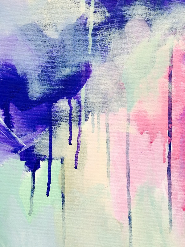 Just been enjoying working with such fun colors over the past couple of days. It feels like I might never be able to go back! Check out the second part of the commission that I've been working on. The image isn't really true to the colors but I loved taking it because of the way the painting caught the light! 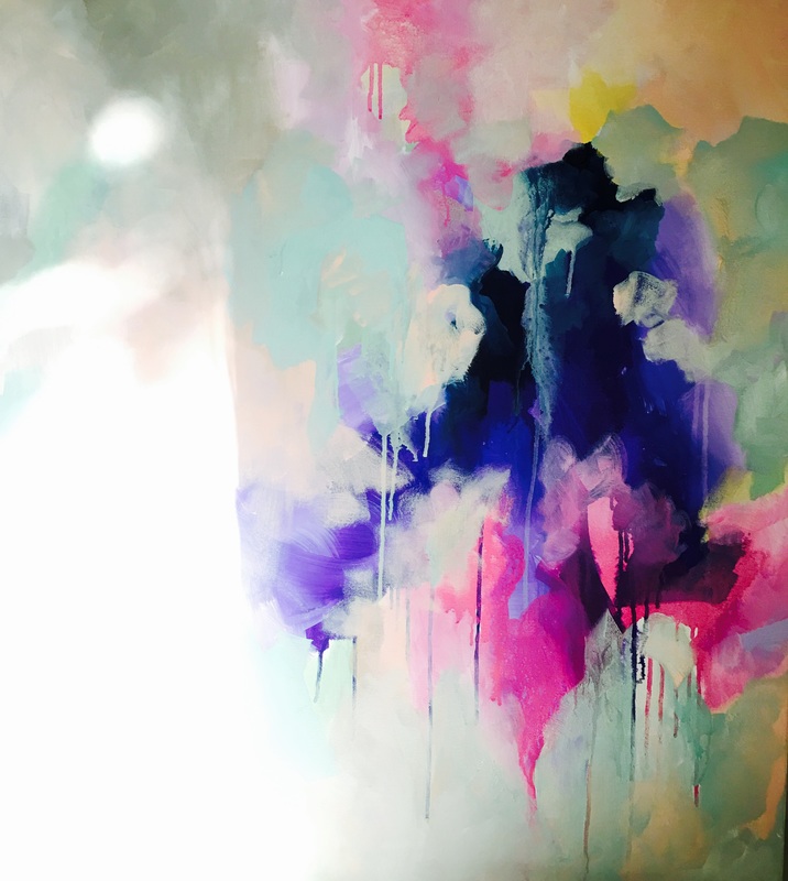 One of the things about using the Montana Marker paint and layering with it is the time it takes to dry is usually pretty long. So there are a lot of pauses between my layers. Some days it bothers me plenty since I just want to get back to the piece, but on other days, it inspires me to work on some awesome side projects. I just made a trip to the store and bought a bunch of different papers, and I'm LOVING it!! It serves as a great way to make smaller pieces during these breaks. Check out my first one. I'm to sure if its done yet but I'm pretty happy with the little guy so far. 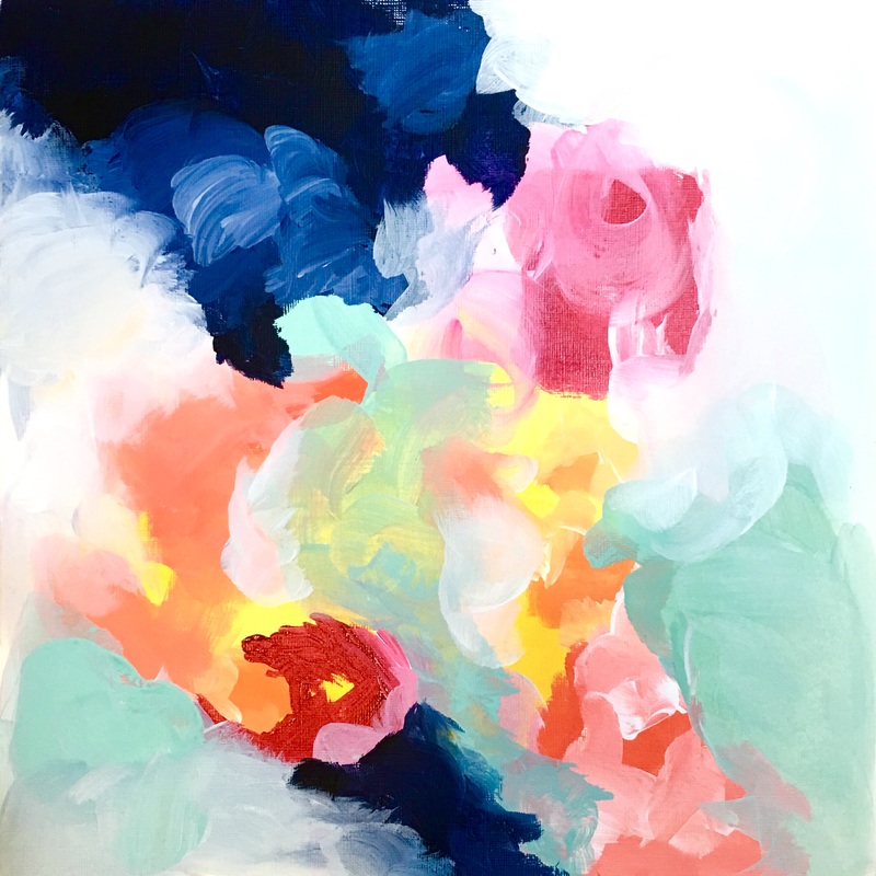 I've been given this sweet dining room wall at a residence in Dubai. Its a medium-sized room, and they're looking for a clean abstract painting for the largest wall. I decided to make two paintings but frame them together in a single floating frame. So I'm going with 2 square canvases (36x36") each. When its done, the total measurements will be 72x36". I was just fooling around with different palettes yesterday. I wanted to incorporate a 'landscape' feeling into the work since the wall is right beside the window and it would only bring the outside in even more. Take a look at what I have so far I'm so excited to have completed the first part of this commission. I guess I work fast when I'm pumped! I started putting some color down for the second piece as well. Take a look at what is done so far. 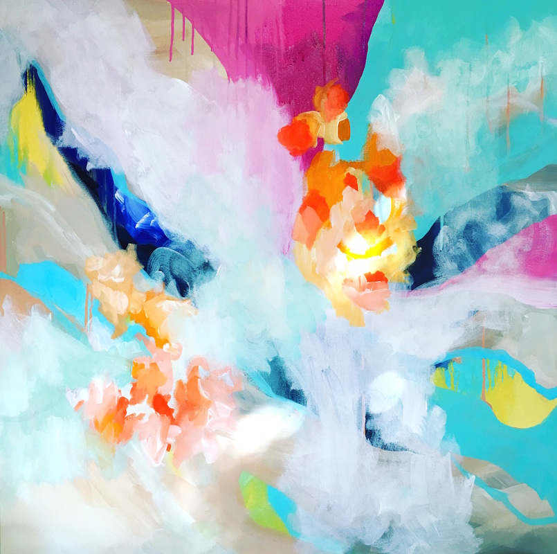 This is the first half of the commission done. 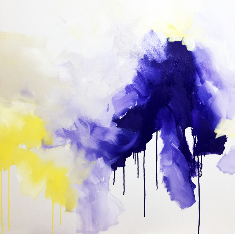 OK, this would be my last piece in situ. For a few days. I've just been loving looking at these amazing interiors and all the various design styles. From modern and eclectic to industrial and farmhouse. Super cool stuff. I particularly enjoy the palettes and fabrics I see. Its kind of putting in the mood to create a few abstract pieces, which I haven't done in at least 6 months. Funnily enough, there are a few interesting commissions coming up and they're all requests for abstract pieces. If I'm lucky, there might be two murals that I could end up doing for a villa in Dubai. I'll keep you posted about that later. For now, here's a burst of color! 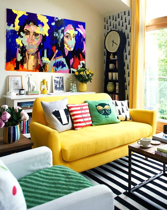 So I'm really enjoying placing these paintings in gorgeous interior photos. Its so wonderful to see my work up on walls even if they're just virtual. It also gives me plenty of ideas for palettes and composition. Most of the photos of artwork photoshopped into interiors I've seen online are of abstract works. I wonder why. I tried photoshopping this piece into several different images but none of them looked as good with this painting. I wonder if its just more difficult for a figurative piece to blend into its environment. Lots to think about 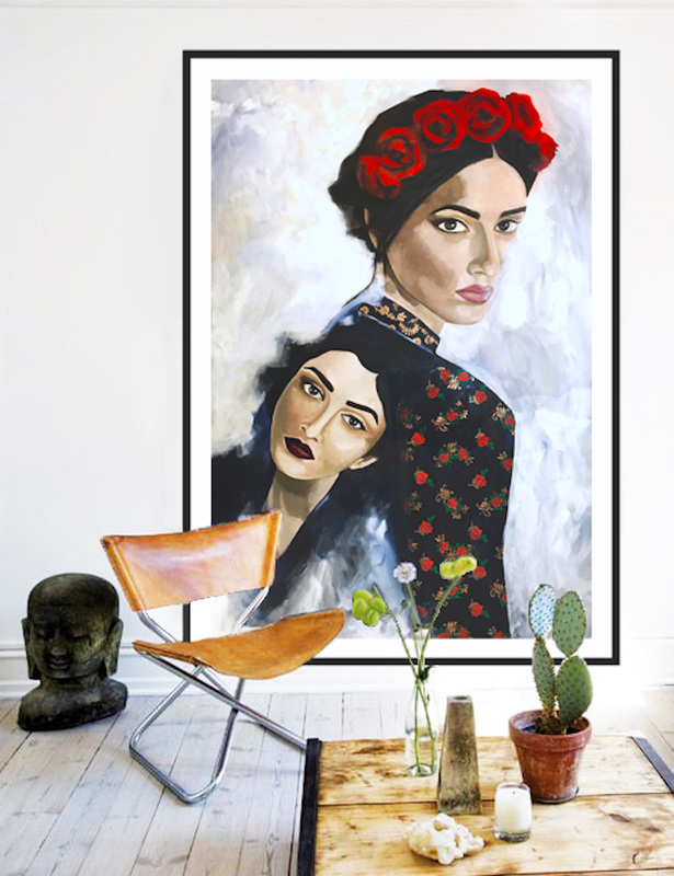 So I've been seeing these gorgeous paintings of some awesome artists on Etsy and they did something super cool by photoshopping their paintings into images of relevant interiors. Loved the idea and decided to try it with my work. Gula, which is a painting from my series titled 'The Seven', has always been a piece close to my heart. The series was an attempt to provide a narrative for each of the 7 Deadly Sins. I chose to give them a face, which told their story. Gula is my interpretation of Gluttony, and here is how she looks inside a home. Note: painting not to scale. 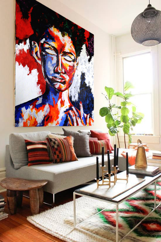 Yesterday, I was frustrated by the Belgian linen I was working on. I spent a day trying to figure out how to make it work in my favor since the acrylic would dry almost instantly and I had no actual work time. What I decided to to do was to use the Montana acrylic paint, which has a more fluid consistency compared to the heavier body paints, such as Golden and Daler Rowney. By layering with thinner paint, whatever was causing my paint to dry immediately was no longer a factor. It gave me more time to work with different color and I actually don't mind the Belgian linen that much any more. Although I'm not sure I would want to spend that kind of money on a surface that wasn't as cooperative. I feel the confidence creeping in as I make progress on this piece. The blocks of color are definitely bolder in the second half as I feel the fear slipping away and I can't wait to finish laying out the composition so I can start working with other materials, such as the brand new super awesome Krink markers sitting pretty in the corner. (so distracting). Here's whats done so far. Now that the first piece has settled down a little, I've been working on the second part of the painting. It involves a profile shot with the same palette. The size of the canvas is slightly different: 36x48 as opposed to 48x48. I felt like it would make the larger picture more interesting after its framed. For this piece, I accidentally used Belgian Linen as my surface and have been regretting it. Maybe I'm not using it correctly or theres something I should do to prep the surface before applying the acrylic but the paint dries almost immediately and doesn't give me a lot of work time. I'm not sure what the end result would be but now that I've begun already, I might as well continue and see where it takes me. (note to self: do a little reading about Belgian Linen tonight). Here's whats going on in the studio |
JournalArchives
March 2019
Categories |
 RSS Feed