|
On June 26th, there was a project posted on Indiewalls. The client was looking for a painting in shades of orange and deep yellow for a high end model apartment home in Newport Beach CA, and the deadline for the pitch was June 28th. My initial reaction was to close the tab and move on because I felt like I couldn't deliver the best possible pitch in such a tight window. I thought about just reading the brief to see what it was about. They mentioned the space was modern with clean lines and then there were pops of glamor inspired by the Hollywood Regency and Kelly Wearstler aesthetic. The color palette of the home was mainly warm oranges and a dusty sky blue and the couple who were to live in it were mature, well-traveled and sophisticated. For design inspiration, the artists were provided with the following images. I was particularly drawn to the painting in the center. The tones were richer and I loved the red. I also found the composition more interesting. Once I made my notes on the brief, I went online to research Kelly Wearstler and her design aesthetic. SO grateful I did because I fell in LOVE with her work, especially her wallpaper!! At this point, I was way too invested not to try to deliver. Keeping the budget of the client in mind, I decided to create a piece that measured 36x36 in. My painting was inspired by Kelly Wearstler and her style, and I paid particular attention to pattern and mark making along with the bold brushwork and high contrasts. The painting took me a day and a half and I'd be lying if I said I didn't feel the frustration creeping up every now and then. There were times when the piece looked flat and disconnected and then came out my super awesome mop top Krink markers. I used these bad boys to make the marks on the canvas and thats when the entire piece took a turn. The keywords used by the client in the brief were 'abstract, bold, colorful, movement, vibrant'. I had already catered to vibrant, abstract, and colorful. This pattern and the gloss finish of the markers added boldness to the piece. Once the pattern was complete, it looked like the whites and oranges were moving under the layer of the pattern. I then photoshopped the painting into an interior space designed by Kelly Wearstler herself so the client could imagine the piece in situ and against that particular design aesthetic. I pitched the piece last night and gratefully met the deadline. Not sure what the end result would be but I'm happy I tried. Here are a few images of the piece. I call him 'Oddball' 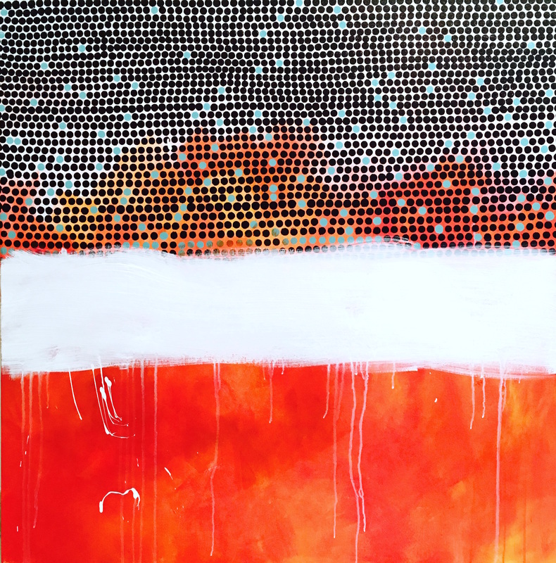 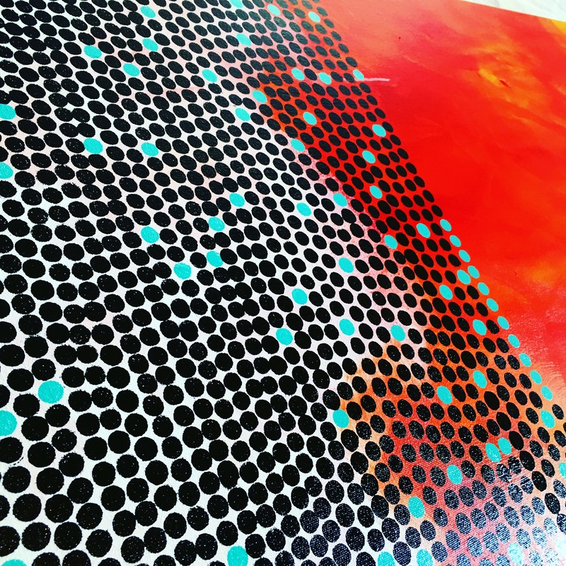 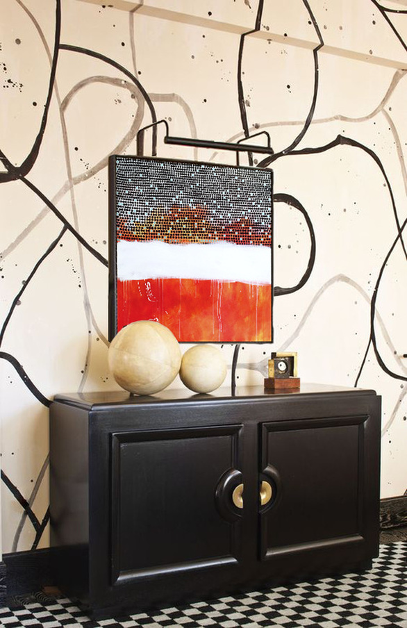
0 Comments
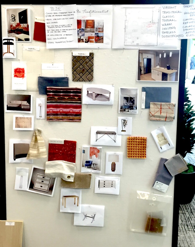
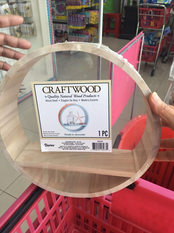
Yesterday, I was working on two projects simultaneously: a brand new art pitch posted on Indiewalls with a tight deadline and looking for new objects to go on the gallery wall in the Family Room. After arranging the items the day before yesterday, I found quite a few gaps in the wall space because certain items didn't sit right (a few of the basswood panels that I was going to paint on looked out of place). I went out and picked up a couple of shelves in various shapes. Here's what they look like I especially love the hexagon shelves. Not sure if I'll actually use the smallest one with the additional shelf in it but the two larger ones will be great for this wall. I'm thinking of giving them a galvanized look to go with the 'R'. Lets see. I also picked up a few wooden arrows in 3 different sizes, and am trying to think of a cool pattern that I can stencil or paint onto them. Once this was done, I started thinking about the custom console that I want to build for behind the couch so I can put the lamps I bought from West Elm on them. Since the console will be pressed between the wall and the couch, I think I could use MDF instead of a more sturdy wood. In terms of design, something very simple and clean that I can paint over in a bright color (maybe even with a chalky finish) or stain it. Here's a design I found on Pinterest that I like for the space.  And here are the lamps that are to go on the console 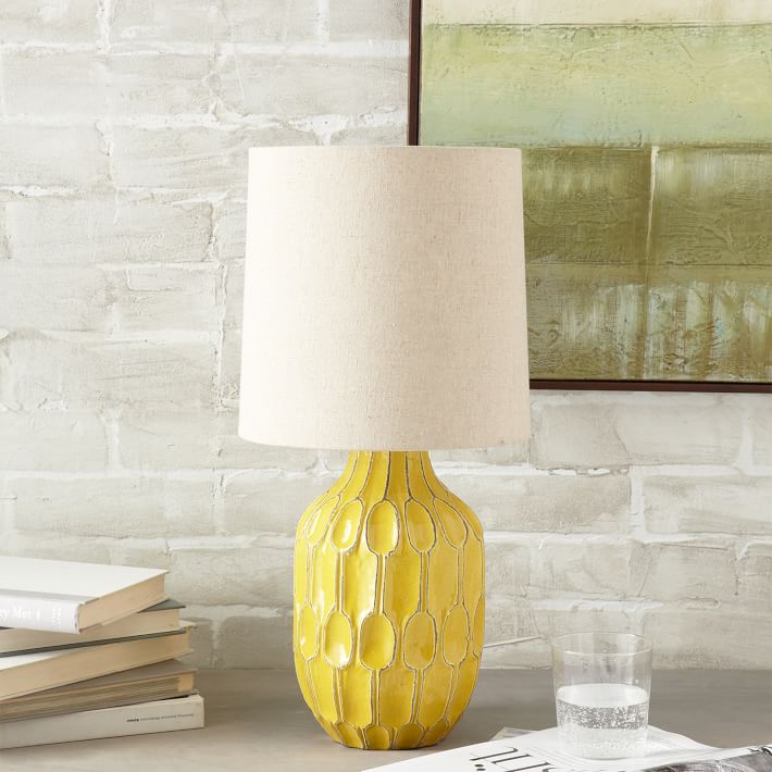 When this was all planned for, I started thinking about the art pitch. Its for a high end condo in Newport Beach. The couple that will be living there is well traveled and mature. The brief said the space is modern/contemporary with touches of traditionalism and glamor. The color palette is comprised of warm oranges (pumpkin/tomato/tumeric) and a dusty sky blue (almost slate grey but with more blue). The artwork they are looking for is bold and contemporary and the inspiration images are both in orange. I absolutely adore color so I put down the first layer of the piece and selected a few Hollywood Regency inspired interior images to photoshop the piece into for my pitch. Today's the last day so I'm hoping I can make an impactful piece. Will write more tomorrow!
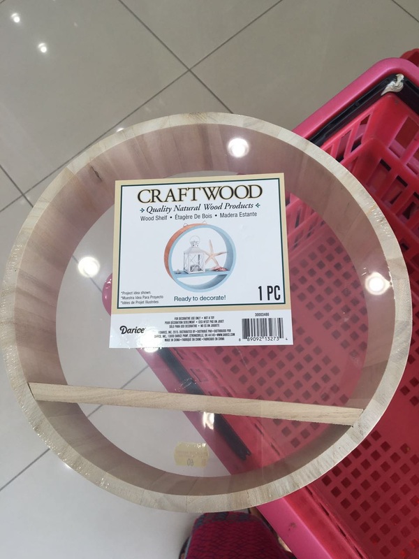
For those who didn't get the chance to read my blogpost from yesterday, I'm going through a little bit of a struggle with my new piece. By the end of the day, I decided to set it aside for now before I manage to mess it up even more. I diverted my attention to two new things: one being the wall behind the second couch in the family room project, and the second is a new project posted on Indiewalls just last night. I've decided to work on both simultaneously since the colors in the artworks required for both projects will be in warmer turmerics, and oranges. Here is what the wall in the family room looks like as of now  For this space, I am thinking of setting up a gallery wall with objects and artwork. I picked up a few items from Big Bear Home and Creative Minds both located on Umm Suqeim Rd in Al Barsha and started to play with placement. 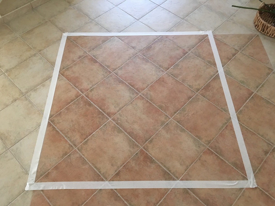 The first thing I did was mark the area (54x54 in) with masking tape on the floor to understand the space I have to work with. 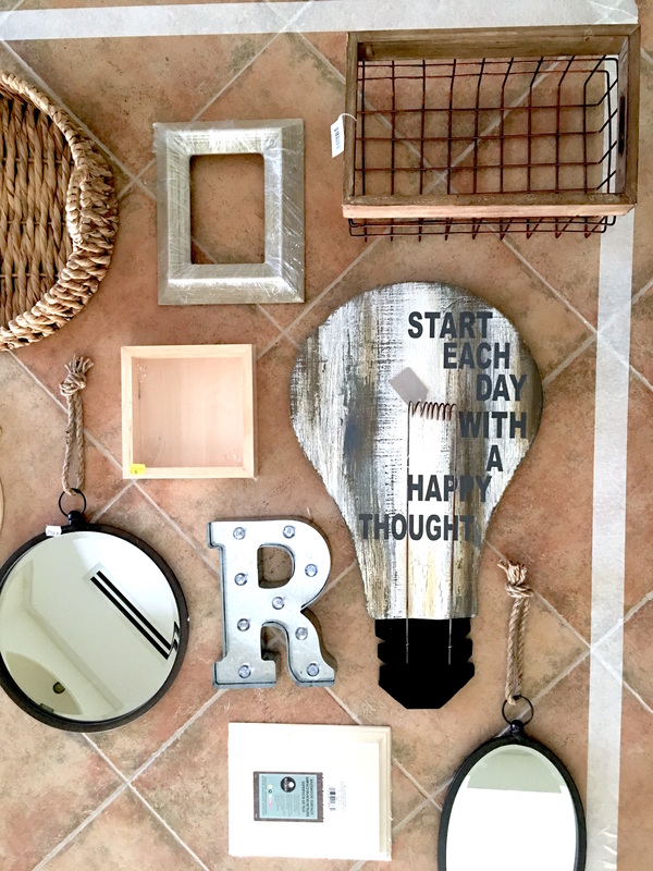 The image above is of the right side of the space. I have two super cool mirrors, a galvanized letter with lights, two basswood panels, a wire copper wire basket and the wooden lightbulb with text. Today's the day I work on the painting that would go with the rest of the objects. Wish me luck!! :D
I can't tell you how many times it seems like nothing works with my art. I still haven't figured out how to to resist fighting it every time it refuses to listen. On days like that, what I feel I should do is take a back seat and either listen to what it has to say, or just not touch it and plan for the next day. What I actually end up doing is wrestling it until I have to start from scratch. Something similar happened yesterday. I started a new piece and it was doing fine until I grew a little restless waiting for the paint to dry because I was running out of daylight (now that the mural is back, and needs to be installed, I had to move back into the small studio space, which isn't very well lit and it makes it very difficult to paint at night). I kept working into it growing more frustrated with each layer until it got to a point where the colors were just plain murky. I'm dreading going to the studio today because I'm not sure what I'll see. I'm not sharing a picture of the piece just yet but I will share a photo of what made me feel better 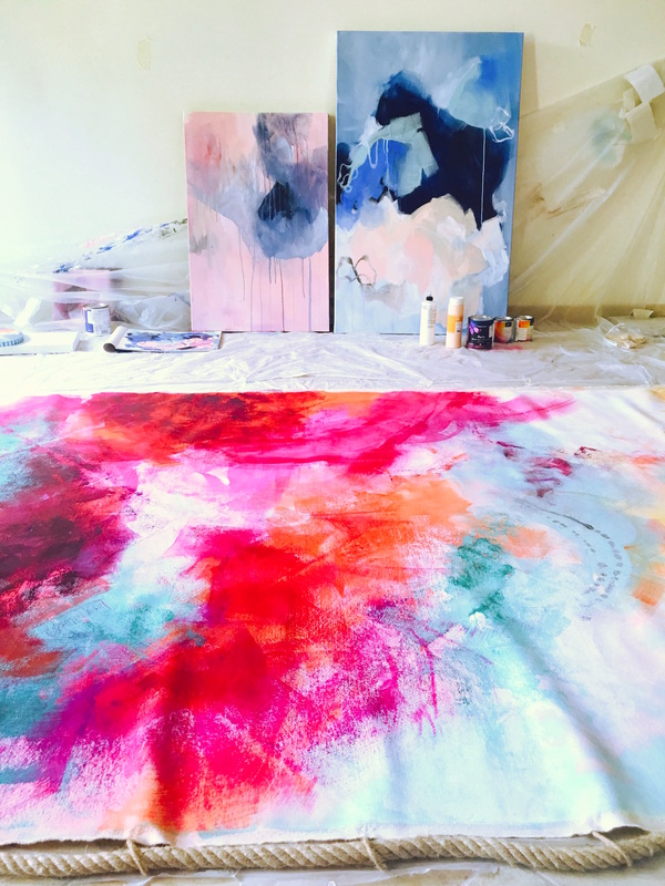 We decided to thread in loops made of twine across the top of the canvas and thread a fat piece of rope through it. I love the texture it adds to the colorful fabric. Lets see how it looks when its up!
I created a second pitch for a project posted on Indiewalls yesterday. It was a piece that taught me some very important things, the most important lesson being to own a rejection, learn from it, allow yourself to be disappointed and then turn that disappointment into a challenge and try again. The piece I created was for a beachfront hotel where the keywords used by the client were 'beachy, black & white, floral, landscape and organic'. I browsed some of the other artwork that was pitched and liked by the client and decided to go with the 'beachy' theme or my interpretation of it. Here are a couple of inspiration images provided by the client. 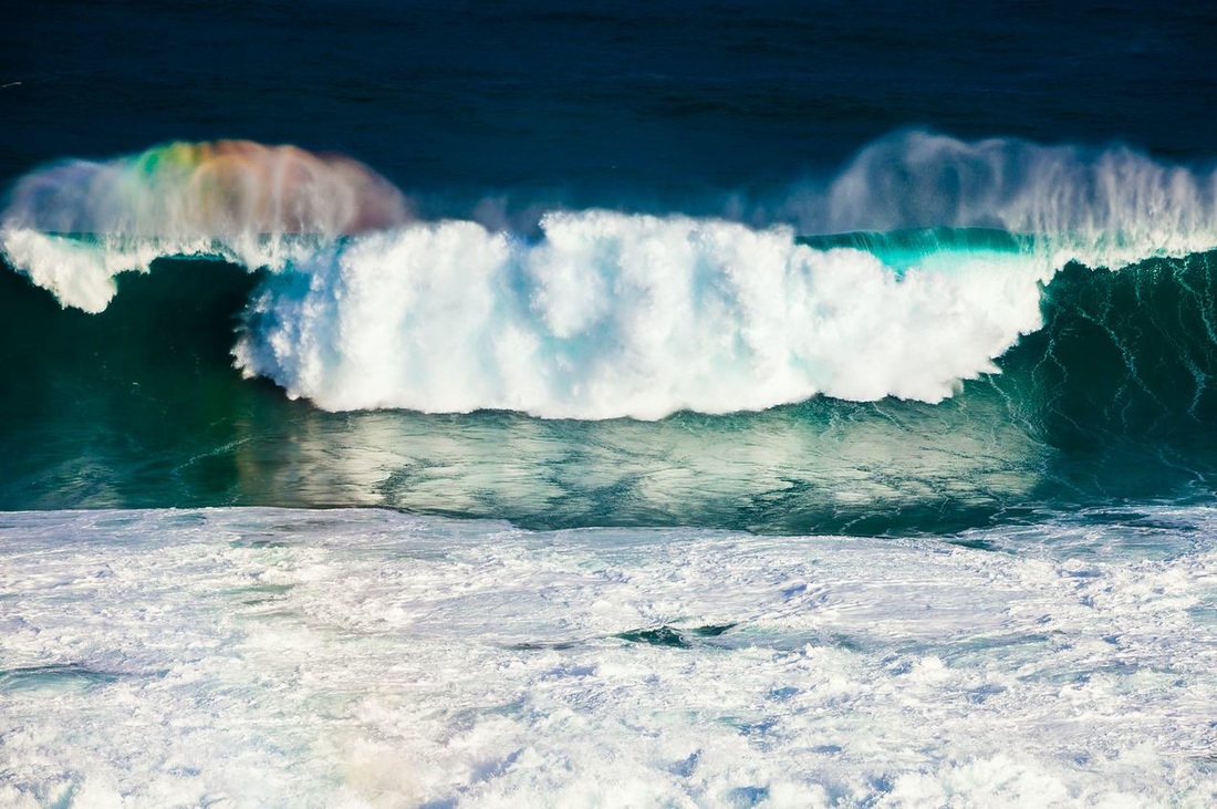  What I took from this inspiration was that the client wasn't afraid of experimenting with composition and color. An abstract piece inspired by the coast would work. I created the painting and enjoyed the process to bits. Here is the piece that I created 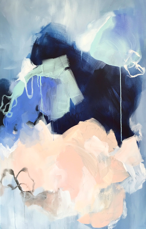 The painting is titled 'Memoirs of Pebble Beach' and is inspired by the movement of the Pacific Ocean. 20 minutes after the painting was pitched, it was rejected. There were a lot of things that raced through my head, and at the forefront was 'Why?'. When I calmed down a little (because who takes rejection well?) I went over the brief and the pitched artwork again, and this time, decided to be less selective of what I took from it, which in turn allowed me to see more. The first thing I noticed was that artists who pitched work around the 'beach, waves, and ocean theme' (the ones that the client liked), went with very light and serene colors. The blues were warmer and in a lot of the photographs and paintings, you could see the horizon, the waves coming in and the actually ocean against the sky. End result: a calm image. I compared that concept to what I had pitched and realized that the mood set by my piece was very different. Here's what I'm going to do: create a few other pieces with a different approach focusing on what the client has liked so far and cross all my fingers and toes. Wish me luck!!! PS I totally photoshopped the piece into two different interior aesthetics to make myself feel better. Take a look 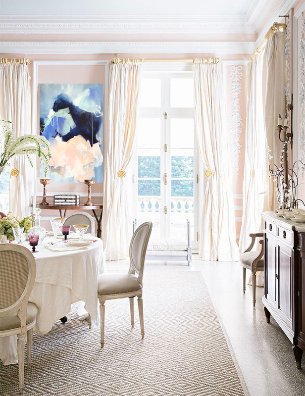 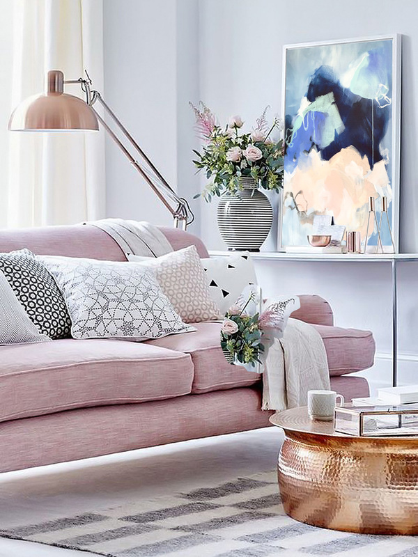 I have been working on this villa in Green Community and am breaking down the Before and Afters by each room to discuss how I approached each space and why I chose to do the things I did. Within each space, there are several 'mini projects' that I will write about to offer home décor ideas along with stores at which people can find the items I used. One of the first spaces I decided to work on was the family room on the second floor. Its a large, bright and cheerful space, which looked amazing even without doing anything to it, and the clients would end up spending all their time in this room. With wall-to-wall windows and a large balcony overlooking the fountain, this room has to be my most favorite in the entire house. Here are a couple of images of the space before we applied the paint to the walls. 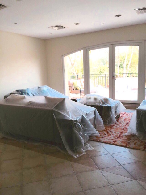 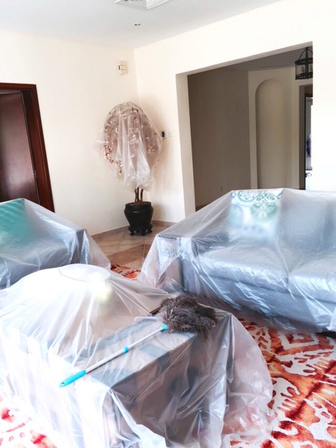 The room has doors on opposite sides both leading to ensuite bedrooms, and an archway on the third wall which comes from the landing on the second floor. When I first first saw the room (and immediately fell with it), I decided to go with a colorful design. We bought the modular sofa from Bassett Furniture in a blue gray fabric and the contrasting rug from Feizy in flaming shades of orange. The ceiling in the room hangs pretty low so I decided not to go with any light fixtures. The clients have always wanted a trunk in their home so I thought of putting one as a coffee table in the family room so they could use it frequently and it would sit well with the rest of the room. Around 6 months ago, while I was in California, I started reading about darker walls and moody eclectic rooms or homes. It was just something that I thought was stunning and if I were to do one room in that style, it would have to be this room because of all the natural light. I searched for the right color for around a month and tried several swatches of paint (you can read about the swatches by clicking here). Finally, we ended up using Teal in the Eggshell finish from Benjamin Moore. The room took a gallon of paint and when it was done, boy it was worth both the risk and the wait! At the moment, I have one complete painting for the wall that will get the most light, and a few objects with which I want to create a gallery styled wall behind one of the couches. Here is what the room looks like now that the paint is up. We still haven't drilled to hang the painting as I want to do it all together. 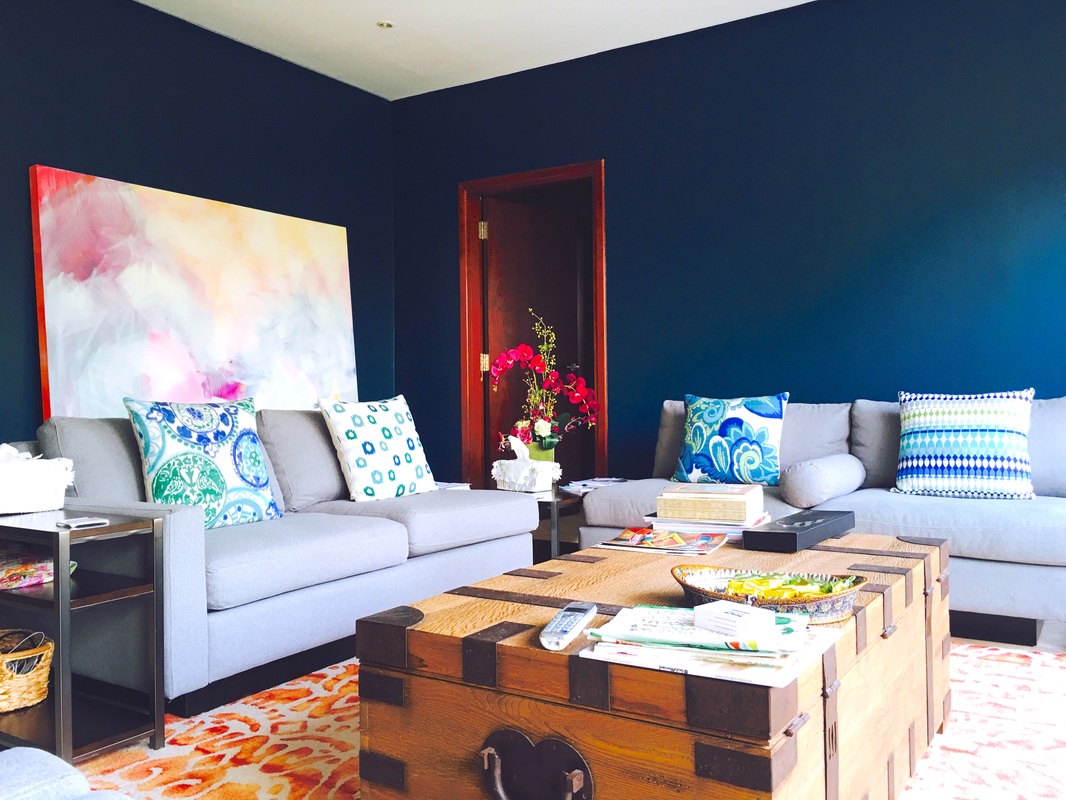 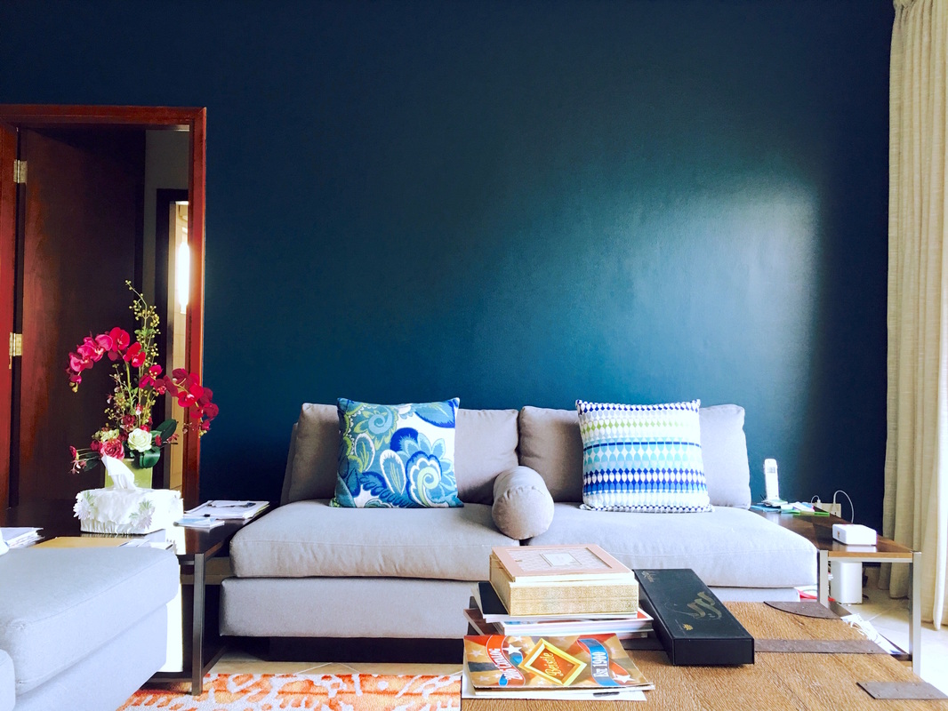 This is the couch behind which I'll be setting up a salon style wall filled with objects, and artwork. I've bought the objects already. Now its time to paint those pieces! Wish me luck!!
I got a notification in my inbox that the artwork I pitched was favorited by the client. I was so pumped. I immediately logged into my account on Indiewalls to check out some of the other artwork that was favorited and what I was up against, and boy was I blown away. There was some other work that was equally suitable if not more than the piece I had pitched. Something interesting that I noticed once I began to look into the other work was that there is a lot of efficiency with art pitches, and that is something I did not exhibit myself. A really good artist had pitched 5-6 pieces for the same project and I just couldn't fathom how she had so much relevant work in a span of 4 days, especially since the size required was relatively large. I then realized that they were small pieces that she had prepared as drafts for the client to get a sense of color, mood and composition that the client is drawn towards. In the description of the pitch, she had mentioned that the size of the pieces were approximately 16x20 in and that if the client were to select a certain piece, she would then go on to creating one in the appropriate size (approx 4x6ft) (!!!) Thats pretty smart. And thats probably what you're supposed to do. I clearly didn't. So now I have a 4x6 ft painting sitting in my tiny studio space, which is definitely ready to ship but not likely to ship. BOO. Anyhow, I decided not to give up and try to do something similar myself. I grabbed another canvas that was smaller in size and of a similar ratio (2:3). Started working on my second pitch but this time, just to challenge myself I'm working with cooler tones of blue and grey. Almost like silver. Here's what I've come up with so far. 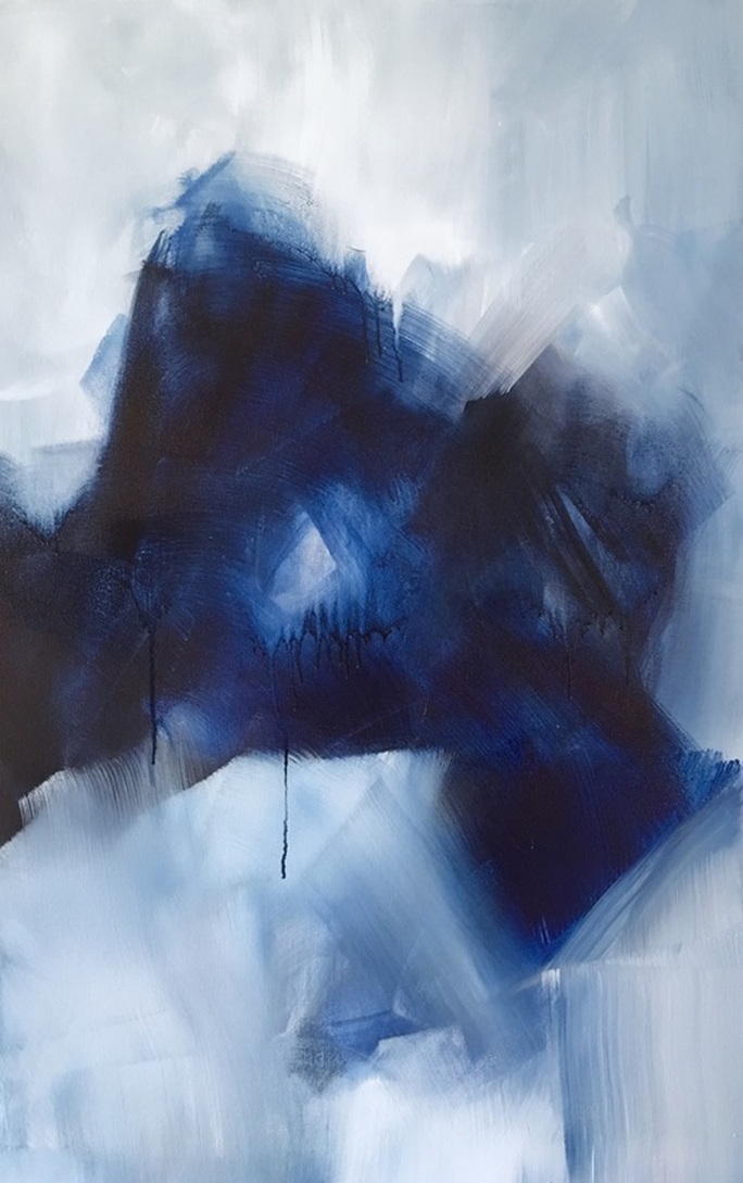 Here's what the piece looks like in its environment. (I secretly still like the warmer Prussian more than this palette for the space. But in the brief, the painting that the client had provided the artists as inspiration was in similar tones. I'm going to give myself another day with this palette and if I still feel like its not suitable for the environment its being pitched for, I'll make the colors warmer. 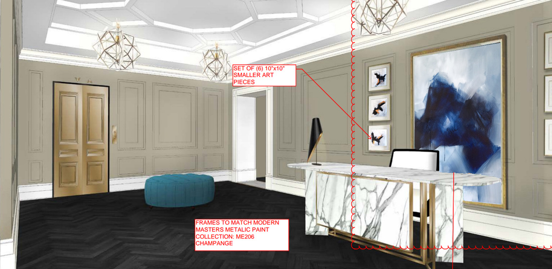 I got to the studio a little late yesterday since I was running errands all day for the family room project. I worked a little more on Maroon 1 and it got to a point when I had to force myself to stop because the color was so mesmerizing. Just couldn't get enough of it so I began an inverse color study. They're really adorable the two of them together and I can't wait to make prints of these guys to see how they turn out. Take a look 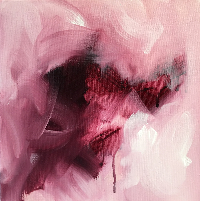 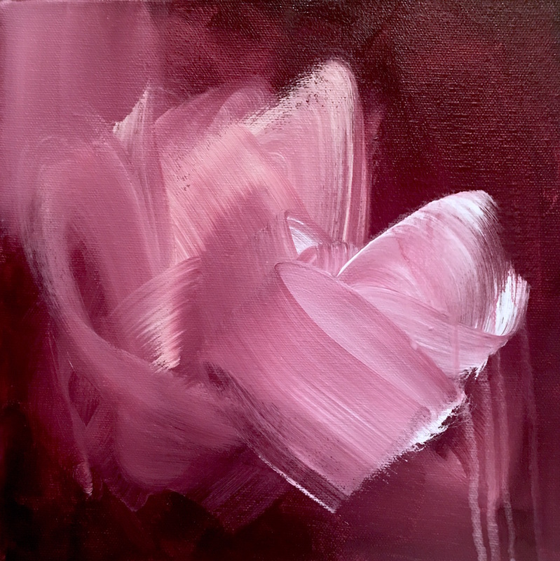 Oh boy. I am in love with them. Here's what they look like beside each other. 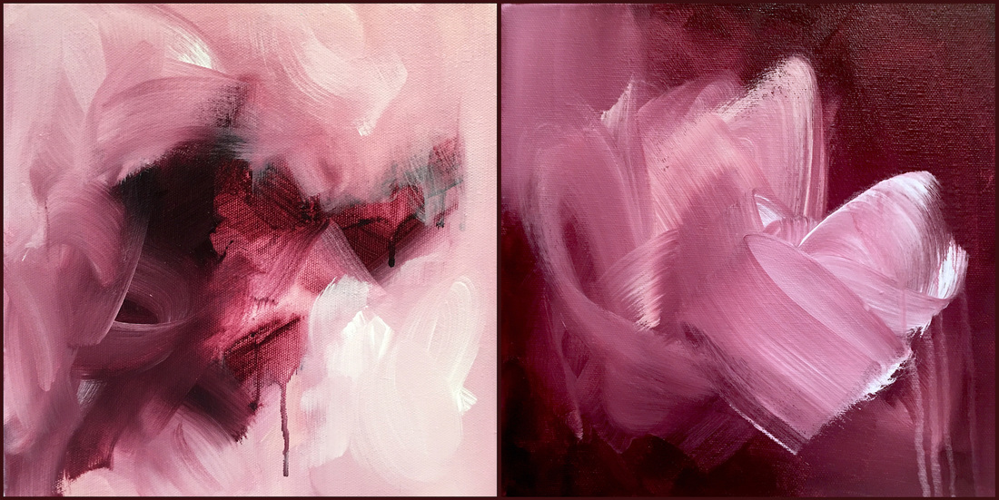 Yesterday, I was working on a new piece measuring 24x36 in and the goal in mind was to focus on a strong palette and brush work. I'm trying to work with minimal brush strokes so I can make each stroke count. I feel that will lead to a stronger composition and will help me understand my own work and thought process better. I also wanted to change my palette a little and move away from an array of colors to a wide range of hues within the same color: from its darkest to its lightest point. I'm not I succeeded at achieving what I wanted to do just yet but am definitely on the right path. The highlight of the day, however, was this absolutely STUNNING color I tried for the first time. Its called Permanent Maroon and its by Golden paints. At its darkest point, it looks like a rich burgundy. Its mid range is similar to a dusty rose and the lightest point is a mauvey pink. Just take a look at this 10x10 in color study I did with leftover paint. It rocked my world and I think there is an entire series of color studies coming up :D 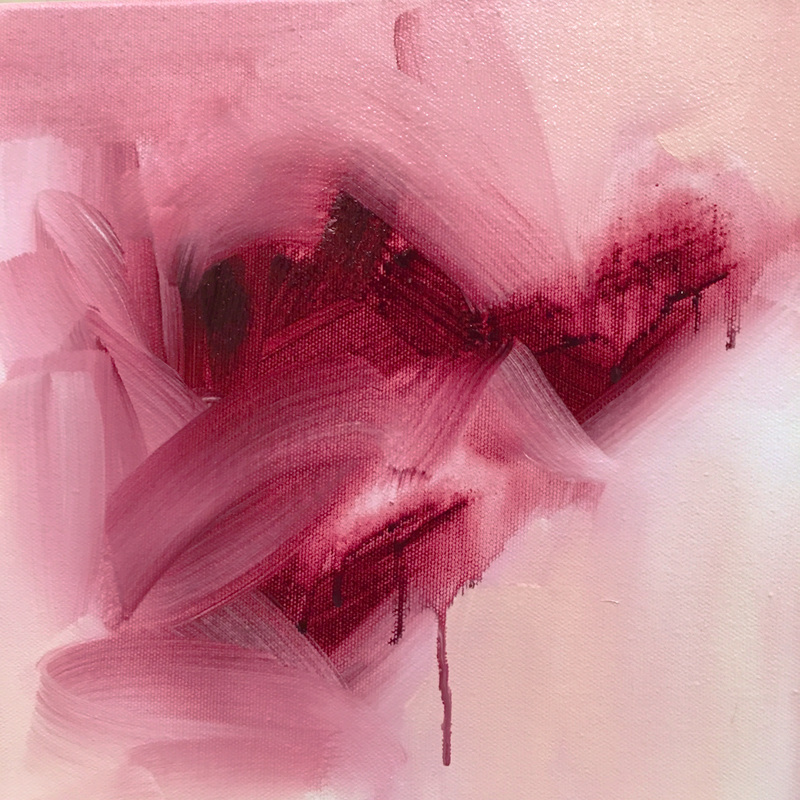 I finally pitched my artwork to the client yesterday and am waiting for a response (fingers crossed)! It was quite a journey and it left me wondering if this really is my thing: the concept of tailoring a piece to the needs of a client. I realized that just the thought of not having as much creative freedom as I usually do curtailed my abilities. I developed a tremendous amount of respect for creative individuals who are able to respond to a brief. It isn't easy. The end piece is beautiful in person and the images I'm about to post don't do the depth and movement justice at all. Something about that Prussian! I think there will be quite a few blue pieces coming up. While creating the piece in line with client requests, I began to wonder how the painting would sit with different palettes and interior styles. It was very pleasing to see the end result. Take a look at the images below 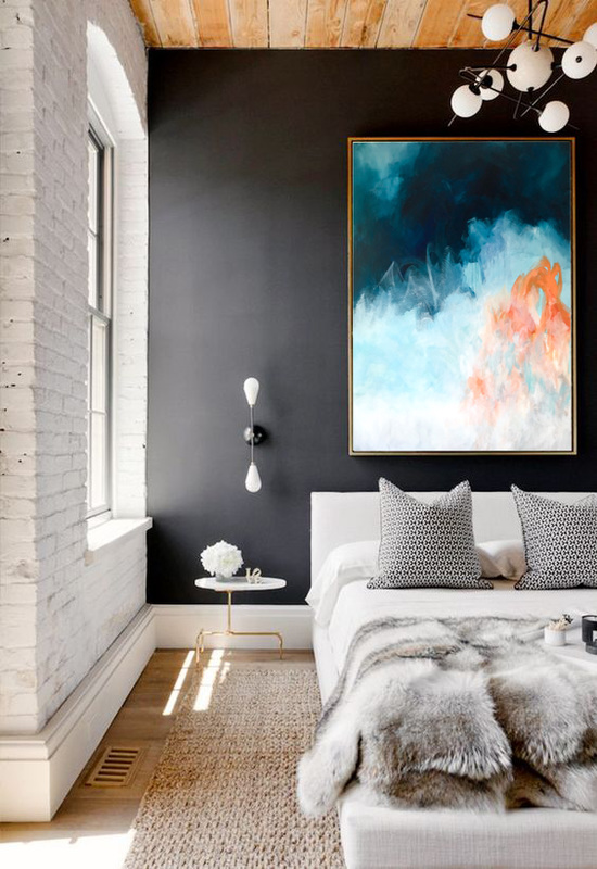 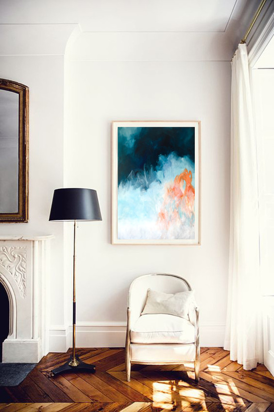 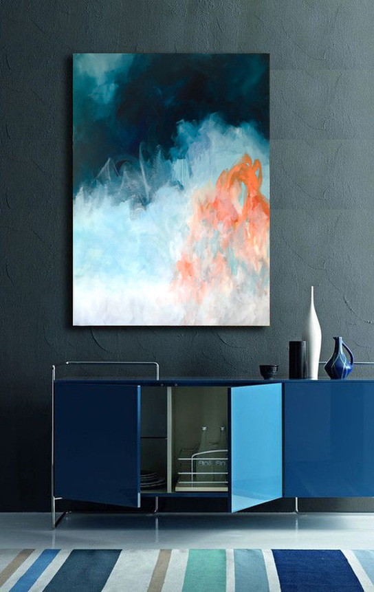 |
JournalArchives
March 2019
Categories |


 RSS Feed