|
On June 26th, there was a project posted on Indiewalls. The client was looking for a painting in shades of orange and deep yellow for a high end model apartment home in Newport Beach CA, and the deadline for the pitch was June 28th. My initial reaction was to close the tab and move on because I felt like I couldn't deliver the best possible pitch in such a tight window. I thought about just reading the brief to see what it was about. They mentioned the space was modern with clean lines and then there were pops of glamor inspired by the Hollywood Regency and Kelly Wearstler aesthetic. The color palette of the home was mainly warm oranges and a dusty sky blue and the couple who were to live in it were mature, well-traveled and sophisticated. For design inspiration, the artists were provided with the following images. I was particularly drawn to the painting in the center. The tones were richer and I loved the red. I also found the composition more interesting. Once I made my notes on the brief, I went online to research Kelly Wearstler and her design aesthetic. SO grateful I did because I fell in LOVE with her work, especially her wallpaper!! At this point, I was way too invested not to try to deliver. Keeping the budget of the client in mind, I decided to create a piece that measured 36x36 in. My painting was inspired by Kelly Wearstler and her style, and I paid particular attention to pattern and mark making along with the bold brushwork and high contrasts. The painting took me a day and a half and I'd be lying if I said I didn't feel the frustration creeping up every now and then. There were times when the piece looked flat and disconnected and then came out my super awesome mop top Krink markers. I used these bad boys to make the marks on the canvas and thats when the entire piece took a turn. The keywords used by the client in the brief were 'abstract, bold, colorful, movement, vibrant'. I had already catered to vibrant, abstract, and colorful. This pattern and the gloss finish of the markers added boldness to the piece. Once the pattern was complete, it looked like the whites and oranges were moving under the layer of the pattern. I then photoshopped the painting into an interior space designed by Kelly Wearstler herself so the client could imagine the piece in situ and against that particular design aesthetic. I pitched the piece last night and gratefully met the deadline. Not sure what the end result would be but I'm happy I tried. Here are a few images of the piece. I call him 'Oddball' 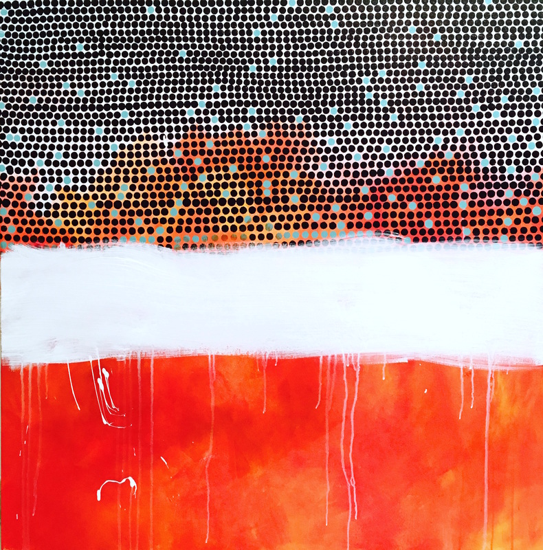 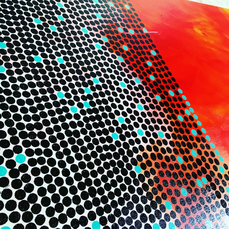 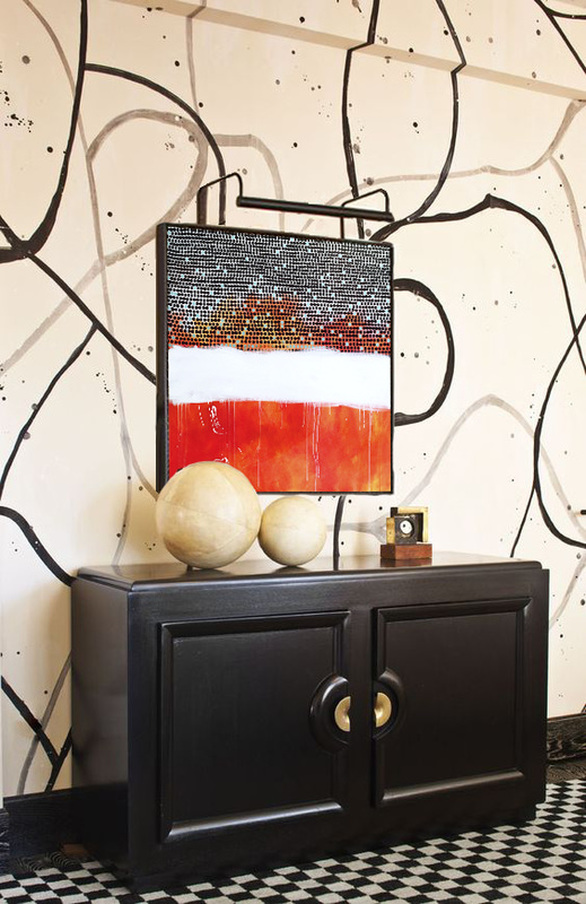
0 Comments
Leave a Reply. |
JournalArchives
March 2019
Categories |


 RSS Feed