|
After a long game of tug of war, 'Lets Go Back' is finally complete. The painting was inspired by vintage Chinese scrolls and landscape paintings and I used a 14 karat gold spray paint for the bottom half of the piece to add elegance and a sense of luxury. The palette is very neutral and it was pitched for the main space in a suite. I still have to make its counterpart since the client is looking for 2 coordinating pieces but I will wait to hear feedback first. When I started the painting, no matter what I did just refused to work. Something simple like turning the canvas upside down gave me a fresh perspective and allowed me to work into the newly found composition. I like how the drips look like they're defying gravity and the lines offer something valuable to the entire piece. I mixed my two favorite blues: Payne's Gray and Prussian and they sit well with the blush and sand tones. Here is what the piece looks like now and I photoshopped it into two separate rooms to provide a sense of size and what it could look like in situ. I think it just needs a simple black floating frame to complete it. 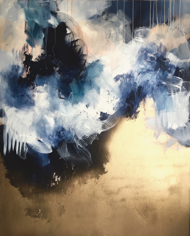 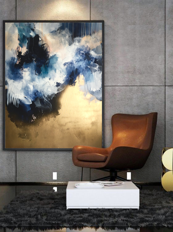 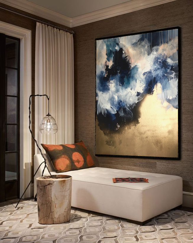
0 Comments
Leave a Reply. |
JournalArchives
March 2019
Categories |
 RSS Feed