|
Yesterday was one of the longest days in the studio as I struggled with the green round canvas. Originally, I wanted to use the painting as an art pitch for a restaurant in a hotel in Chicago, but I was advised that its far more difficult to sell irregular shaped pieces as opposed to standard squares and rectangles for commercial spaces. I had dropped the idea but I kept staring at that round canvas and I had already applied my first coat of green. So I thought I'll go ahead and make it any way even if I don't pitch it this time around. Yesterday, however, once I started moving forward with the piece, and even enjoying it, I tried photoshopping it in a rendering of the restaurant, and I felt like it fit the brief perfectly. In the brief, the client listed that they want a green floral painting, so I had decided to create a diptych on round canvases to be displayed one above the other. I'm almost done with the first piece and have laid down the first coat in the second. In the rendering below, I've photoshopped the same piece twice but at the end, the paintings will have different compositions in the same color palette. Here is the rendering  What I enjoyed after taking a look at the rendering above was how the peaches and blushes complemented the seating and bar area on the right side of the image. There's a copper/blush palette (which I've always loved) and I liked how they reflect the palette in the paintings. Also, I decided to go with a deeper green as opposed to a vibrant Emerald like in the left hand side of the rendering. I felt like the dark green was richer and sexier and would help the floral composition pop. Below is an image of the work in progress where details are clearer. 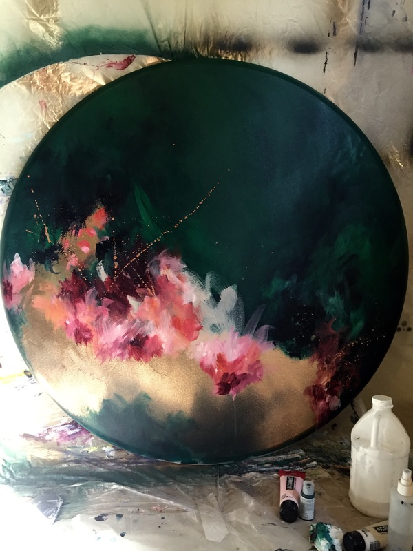
0 Comments
Leave a Reply. |
JournalArchives
March 2019
Categories |
 RSS Feed