|
I can't remember the last time a piece of artwork hasn't driven me to the brink of insanity. The extreme highs and lows, nausea, restlessness, frustration, adrenaline and then pure joy have become part of a routine but something I still can't get used to. I suppose thats the point. The journey. Welcome to my roller coaster. For those who haven't read my post from yesterday, I'm working on a pitch for an open call. The piece is supposed to be a large-scale painting for the lobby of a condominium project. The clients want the painting to be blue and abstract. I started off my piece very strong with the most vibrant and stunning blue and started experimenting with Benjamin Moore wall paint on my canvas. No regrets there. The direction the painting was going in was fabulous. I photoshopped the piece into the rendering of the lobby and it was stunning. But I realized that the painting was straying from the actual brief. I had incorporated too many elements that I'm guessing the client wouldn't want. 1. the blue was so dark that it was almost black. A photograph wouldn't be able to do justice to the movement of the color and its depth. 2. I needed a contrast color to keep the piece from looking flat and adding an elegance and luxury to the aesthetic. I decided to go with a deep peach, which looked fabulous against the blue. 3. the inspiration image provided by the client had cooler tones of blues and grays layered on top of one another. My tones were far warmer because I felt that they would complement the marble console, the black herringbone wooden floor and the gold trims far better. Once the painting had reached its peak in terms of what I wanted it to look like, I realized that all the factors above could potentially result in the painting being overlooked by the clients since its not what they had asked for. That led to a breakdown and destruction of the painting. I tried to bring down the blue so two thirds of the painting would be in blue and peach would take up less area on the canvas. End result: disastrous. I took the evening off (as difficult as it was) and am headed to the studio in a couple of hours. Hopefully, its still at a point where it can be redeemed. I'll keep you posted on the progress. For now, here is the roller coaster ride in pictures 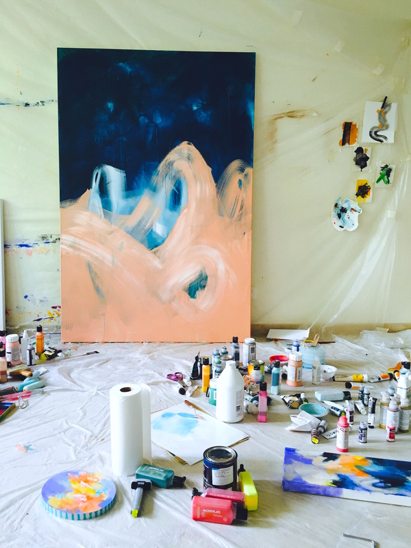 It almost looked like peach waves against a blue night. I adored it. 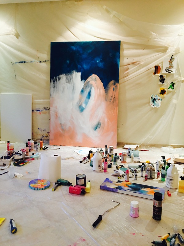 I added the white because the peach looked too flat in the bottom right corner. Until this point, I was extremely happy. 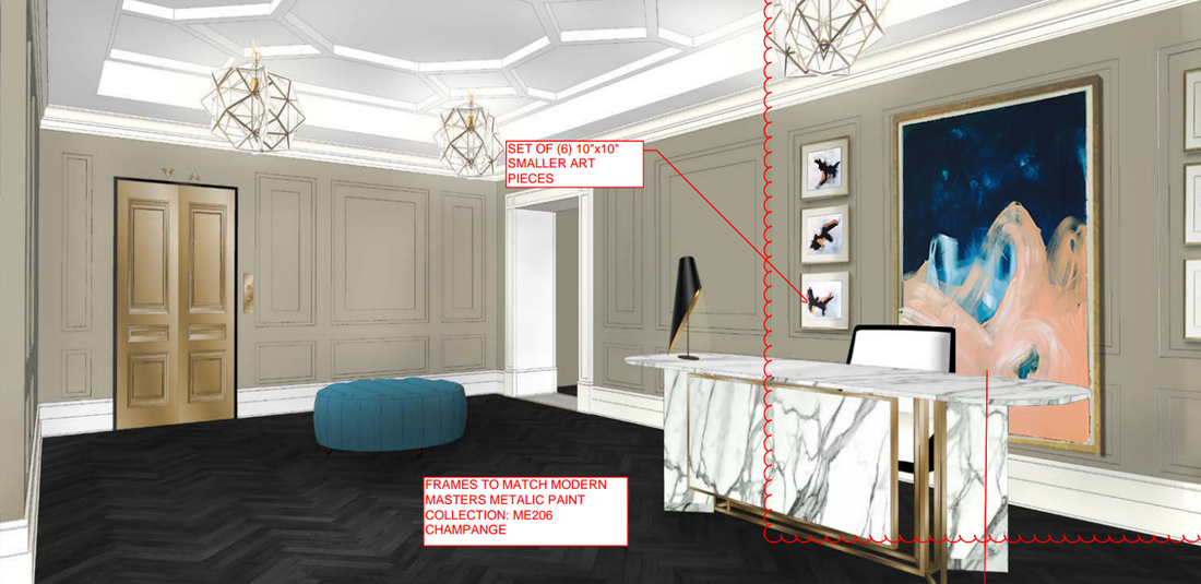 Here's the piece photoshopped into the rendering of the lobby. The peach looks stunning against the deep blue, gold trims and the Carrara marble console. I couldn't have been happier. But of course I had to mess about a little more. Check out what it looks like now 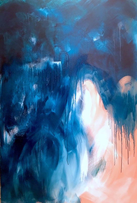 Gross. Fingers crossed for today.
0 Comments
Leave a Reply. |
JournalArchives
March 2019
Categories |
 RSS Feed