|
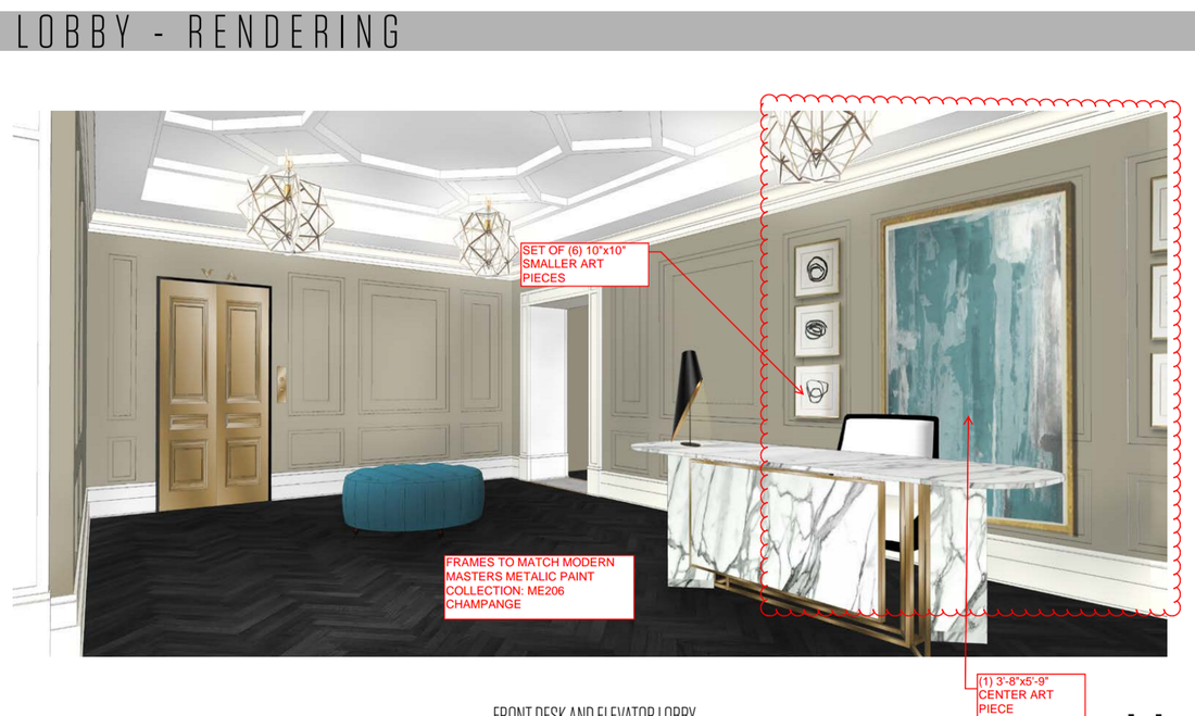
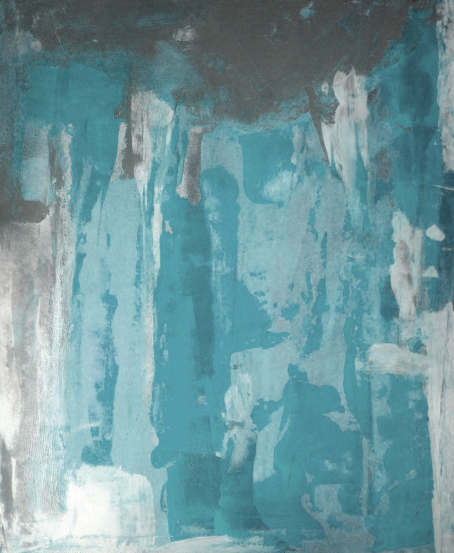
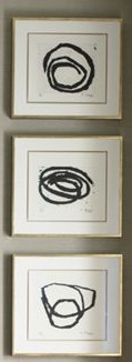
There's this super cool platform called Indie Walls. Its where people in search of art can lay out their requirements and write up a brief, and artists such as myself can respond with a pitch. Earlier, when my work was mainly figurative, it was difficult for me to pitch my work to anyone since abstract seemed like what everyone wanted. Right now, however, my work has taken a slight turn in terms of style and subject matter so its definitely more feasible to pitch to these projects. I was on their website yesterday taking a look at newly published projects. There's one in particular that caught my eye. Its for the lobby area of a condominium project in Boston, MA. The designer is looking for 7 pieces of artwork. One large blue painting measuring approximately 44x69 inches and 6 small black and white pieces (3 to go on either side of the large blue piece) measuring 10x10 inches. They gave us a mood board and inspiration for the work along with furniture and finishing to understand the aesthetics of the area. Here is some of the info we received The lobby has a very luxurious feel. The materials and palette are equally gorgeous. Black, white, gold and teal look stunning together and I was excited to begin my work. For the blue piece, I noticed they were attracted to layers of paint and are enjoying the texture in the piece. The sheer size of the painting would definitely have high impact at the entrance and teal would look wonderful behind the marble console. The only characteristics I felt the piece lacked were a focal point and contrast. Lack of contrast translates into lack of depth in this painting and the fact that the painting looks like its covered in an abstract pattern made the piece look even flatter to me. I'm hoping I can work to this brief and add richer colors, higher contrasts, and better composition. When I was working on my previous project (The Blue Family Room), I had picked up several samples of blue from Benjamin Moore paints. There was this one color called 'Hidden Sapphire' which didn't work well on the walls of the room (the tone of the color just wasn't right) but the actually pigment and hue was absolutely stunning. Its a water based paint so I could most definitely use it on canvas. Decided to give it a try. Just the color and the quality of paint creates tremendous depth and working with water alongside allows the painting to have wonderful movement. I applied the paint when it was dark outside so I'm looking forward to seeing it in natural light. Here is what the first layer looks like 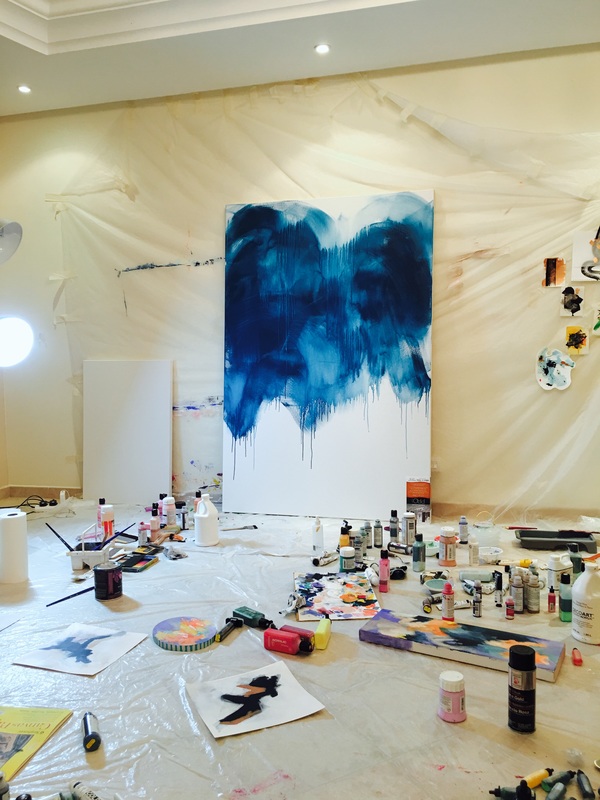 Moving onto the black and white pieces. Judging from the inspiration provided, they're looking to frame the pieces and the frames would probably be gold to match the light fixtures in the room. The compositions in the inspiration images are simple. I'm not sure how I wanted to approach these so I started with making studies on acrylic paper using spray paint, acrylic and markers. I added a touch of copper to the pieces since I felt like the pinkish gold would look gorgeous against the warm gray paint on the wall and would also complement the rich blues in the large painting. Here's what I came up with 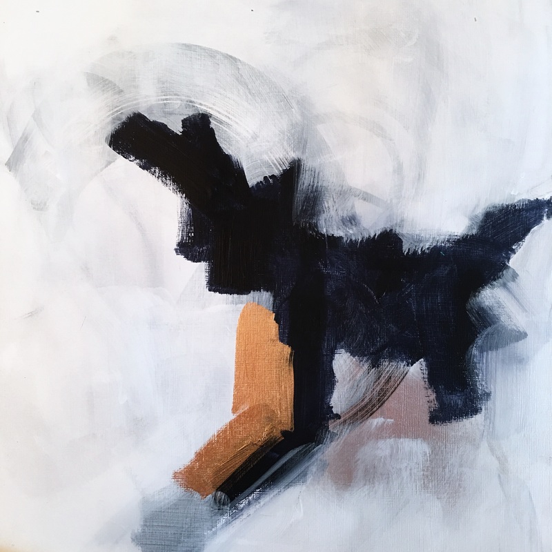 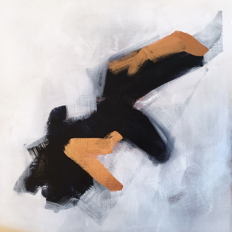 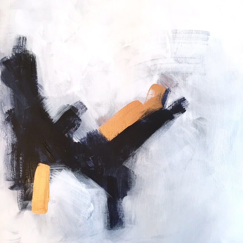 I tried photoshopping the pieces into one of their renderings. I think they look pretty good for the brief but lets see what else I can come up after this blue painting is complete. I feel like I will be able to apply new things which I learnt while creating the larger piece onto the smaller studies. 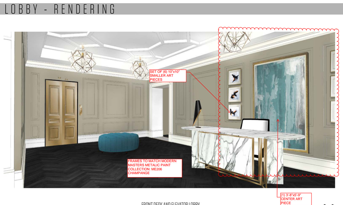
0 Comments
Leave a Reply. |
JournalArchives
March 2019
Categories |


 RSS Feed