|
I cleaned up the piece for the last art pitch inspired by Yves Klein and submitted it just yesterday. Fingers crossed! There was a new project posted. Something that is definitely more of a challenge for me since I have troubles with a monochromatic and neutral palette. The brief states that the palette of the hotel is comprised of taupes and beige contrasted with rich, dark browns and metallic gold accents. The furniture and architectural elements have linear shapes and crisp clean lines, and all of these design elements are represented in a minimalistic, modern, and sophisticated manner. I could go down the same road as I did earlier and work with ink on paper but I feel like I want to try something a little different. The deadline for submissions is July 21st so I feel like I have some time to pitch a few different ideas and see what works. For now, I'm working on a piece with a more modern neutral palette. I've decided to go with a deeper gold and blush with a contrasting dark gray. The piece will have texture (plenty of it) and I feel like these colors would complement the browns, taupes and beige in the interiors. I put down the first layer yesterday and that gold looked incredible against the blush. Lets see how it develops today. 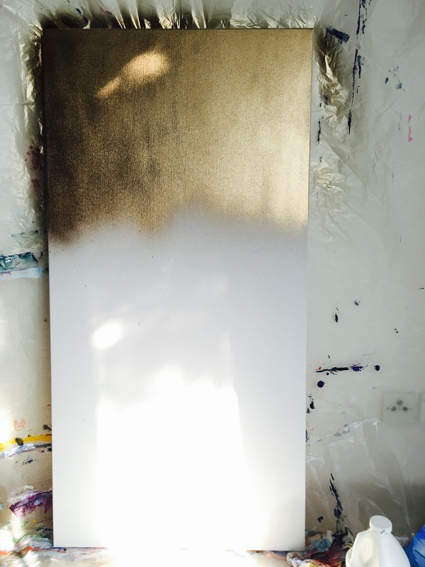 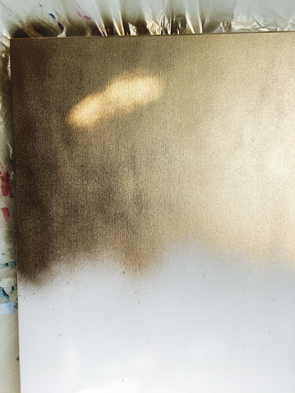 I couldn't resist taking the photos above. The lighting in the studio was pure perfection at the time and it made the gold almost look bronze . Here is what the piece looks like now. 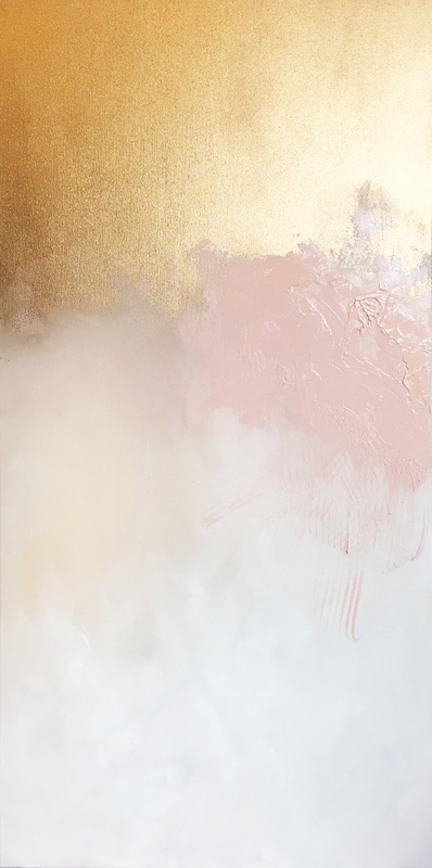 I like how the texture of the blush contrasts so heavily with the smoothness of the gold. I don't know how I will build the momentum with the darker color or if I want to add even more texture to the bottom two thirds of the painting. I'm even debating the use of encaustic at the moment. So excited!!
0 Comments
Leave a Reply. |
JournalArchives
March 2019
Categories |
 RSS Feed