|
I began experimenting with this pitch a couple of days ago but now that the rest of my work is wrapped up, I'll be spending the next few days focusing solely on this project. The client is looking for 4 different pieces for the guests rooms of this hotel. As you can see in the image below, the room is very neutral with a pop of color from the chair, which is a very rich blue inspired by Yves Klein. There is an ornate light fixture and the lamp is in a contrasting gold. The trims and moldings add glamor to the clean lines in the rest of the room. What I personally take from this aesthetic is glamor through simplicity. 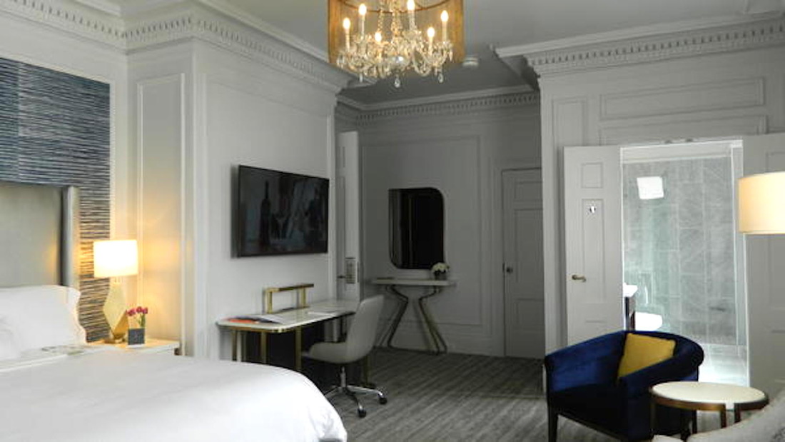 The clients initial brief was for artwork inspired by Yves Klein for the guest rooms and corridors of the hotel. They would like to see Klein's blue, pink and gold in the artworks and the maximum dimensions for the guest room artwork could not exceed 40" at its longest dimension. A few days later, there was an update in the brief where the client mentioned that they wanted to see more black and white photography and artwork with regional relevance to the area (San Francisco). The first thing that came to mind was the bridge. After thinking of several ways of presenting the idea, I realized that nothing sounded or looking original enough. It was time to move on. Today, I'm going to try to create compositions with ink and acrylic on paper in the colors the client is looking for but the outline of the composition would be in the shape of the city. I'm also going to try to play around with the shapes created by the Bart. I think the lines, the colors and the way they would intersect and overlap could make for an interesting composition. Will post images of progress tomorrow. In the mean time, check out the quill pitch in different environments with different frames and lighting. In the first image, the blue looks more saturated and the placement beside the gold light fixtures adds glamor to the piece. In the second image, the piece looks far more relaxed and with the light wood frame, the painting has a more coastal vibe. I found that crazy. 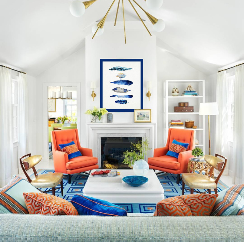 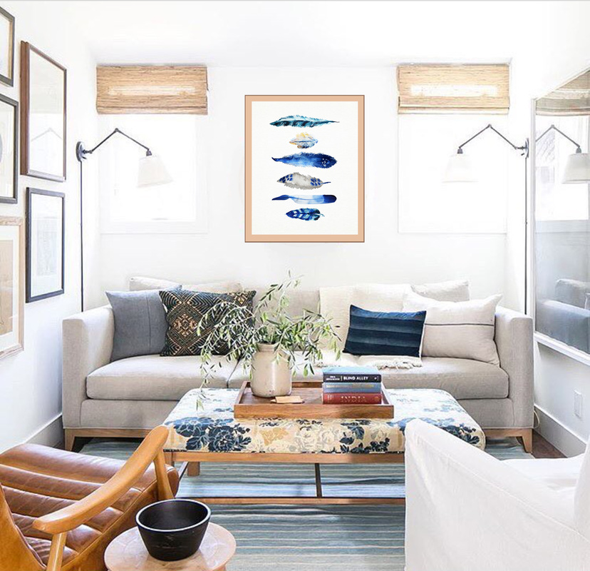
0 Comments
Leave a Reply. |
JournalArchives
March 2019
Categories |
 RSS Feed