|
I'm so excited that this piece is done. Decided to top her off with some serious gold leaf. I used around 6 sheets on the canvas (well I started with 2 and then had to go back in with another 4!) because of the scale. The pieces were larger too in order maintain proportion. There's something about this artwork that makes it super dreamy. I'm not sure what it is although part of me feels like it could just be that Cobalt Violet. Its driving me crazy and might end up becoming my most favorite color. Cobalt Violet and Peach = my own little paradise. Here's the complete piece along with some detail shots and one of my favorite in situ images. 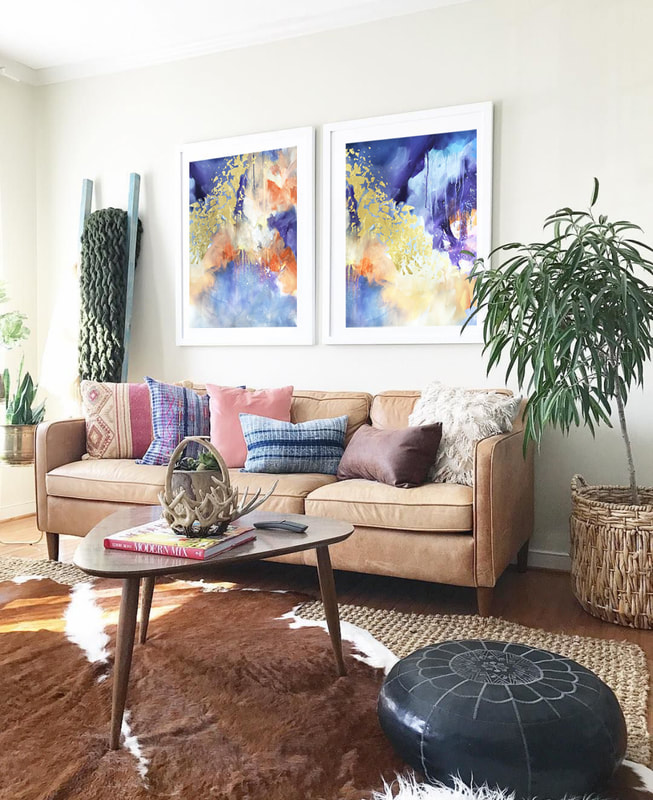 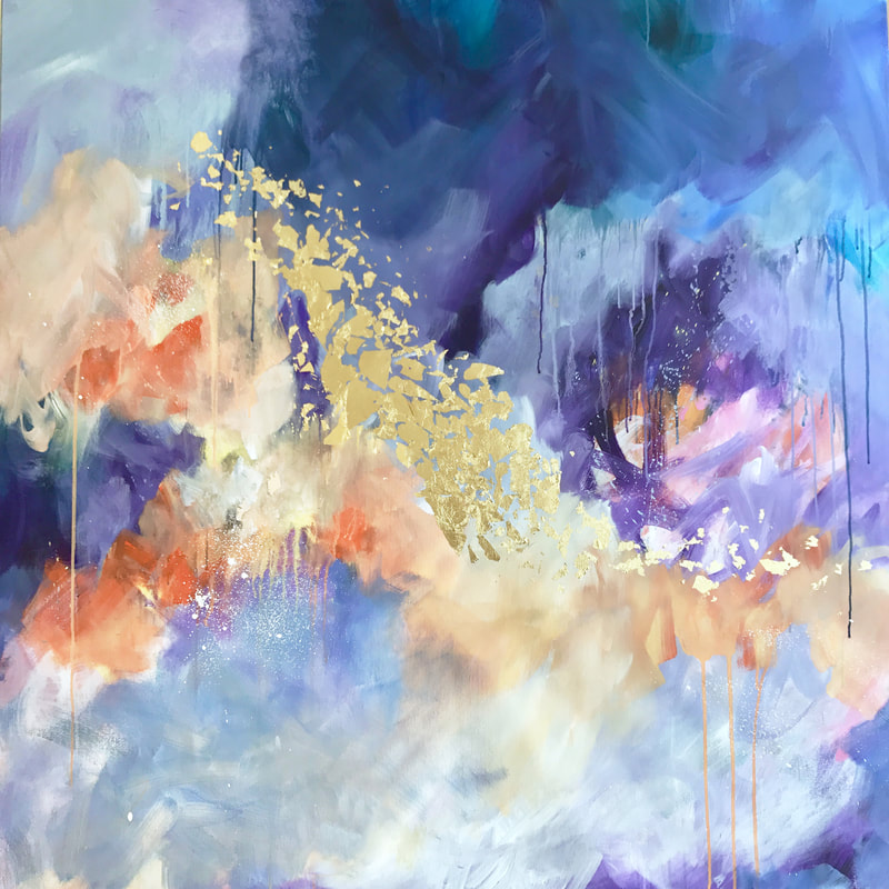 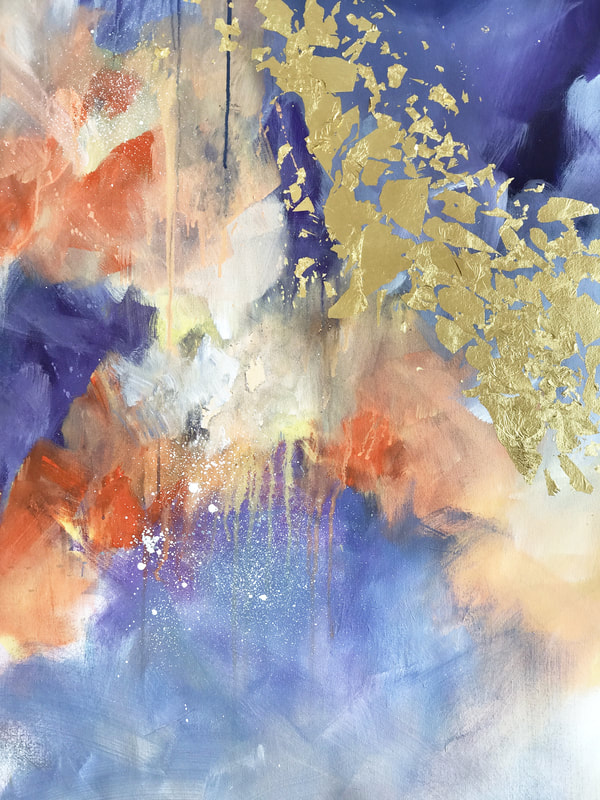 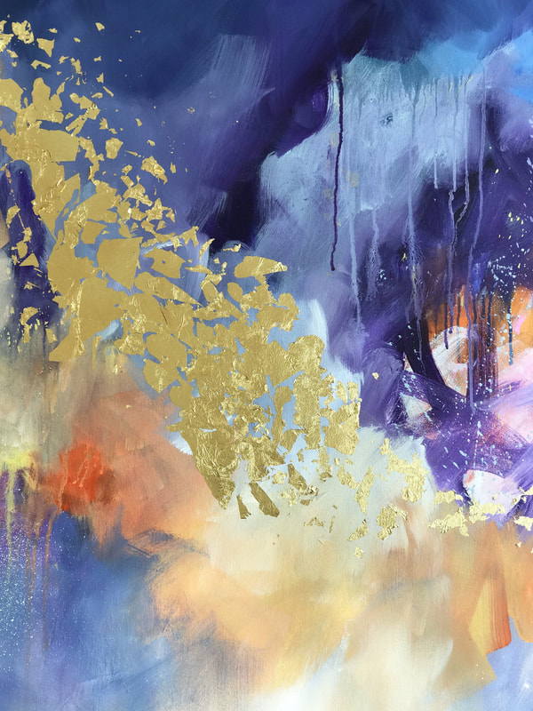
0 Comments
I'm currently working on a 40in square canvas and decided to move forward with an abstract inspired by seascapes at sunset so I'll be focusing on a more gold/orange/Cobalt Violet palette instead of blue. Its nice to be working with cooler shades especially since I'm immediately drawn to warmer tones. There's definitely a struggle with composition since its been a while that I've worked on a large piece. Most of the recent work has been 36in (on the longest side) so the scale is a challenge too at the moment. Here's what it looks like as of now 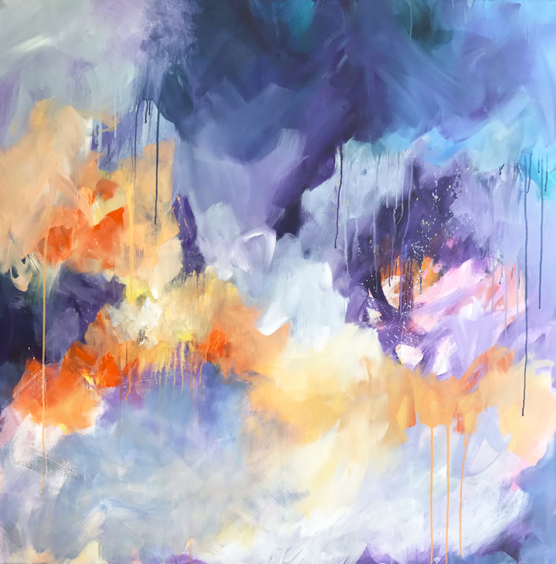 Here's a detail shot, which I'm particularly drawn to. 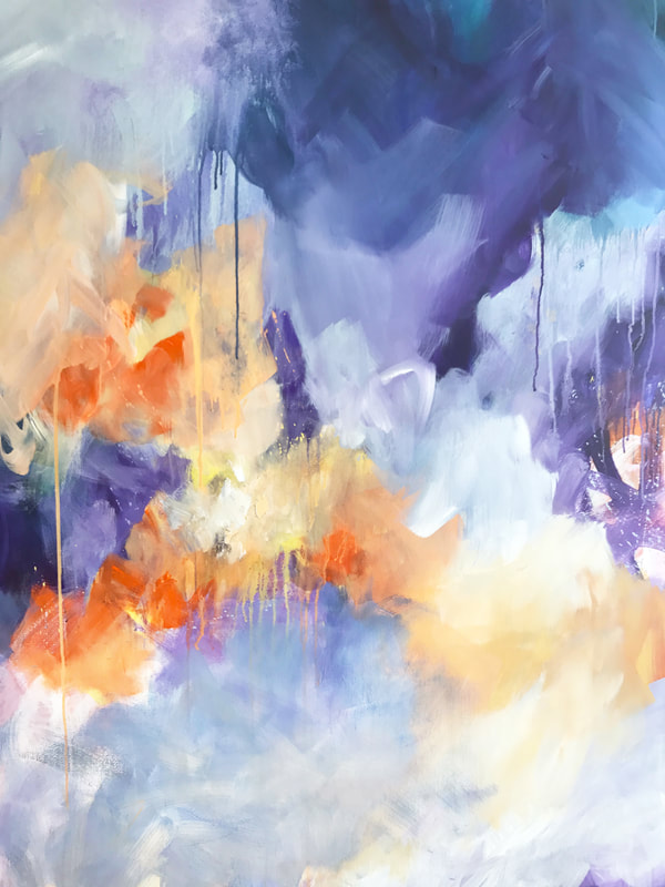 I'm so happy to say that the floral worked out really well for me. It was a nice break from the usual stuff and I felt like putting myself outside my comfort zone injected something positive. And honestly, even made me miss what I do more. Working on the floral was challenging though. First challenge was composition. I had absolutely no idea how to approach it in terms of placement, scale, proportions or anything else. I literally had to draw out shapes on the canvas to see how to place things. Decided to go with roses since I felt like they were probably a good starter. In terms of color, I don't think I know how to work with anything but loads of it so that worked out pretty well. Now that the piece is done and I'm so pumped that it is, I'm unsure as to whether I would want to try my hand at a few more. As beautiful as they are, I feel like I'm aching to go back to my abstracts and play around with them a little. See how I can push myself there. Here's the complete piece and you know I have to photoshop it into this awesome space :) 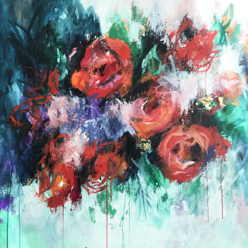 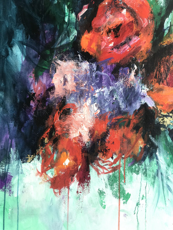 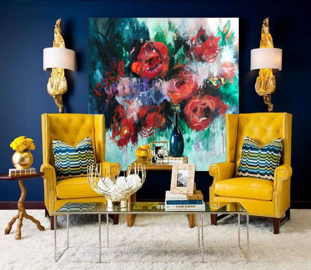 Anyone who has read my past couple of posts is aware that I've been struggling to find meaning in my work and am feeling a little lost. I was throwing myself a little pity party the other day when I got a call to let me know that a client bought 3 paintings for her new home! If that wouldn't have lit a fire in my belly, nothing would. And good news: it totally did! That immediately pushed me to the studio and I started thinking about how to challenge myself. Started going over images of my work dating back to 2010 and realized that I've never given florals a chance. I don't know what it is but painting them was never something I felt like I wanted to do. Its a little crazy since I'm a certified florist and love being around flowers. So I took a look at the sad canvas I was working on and decided to challenge myself a little. Laid down my first layer of paint and am still working on composition. I'll tell you this, its bloody difficult working on an abstract floral piece. Nevertheless, I'm back to having a blast in the studio and here is what she looks like right now. 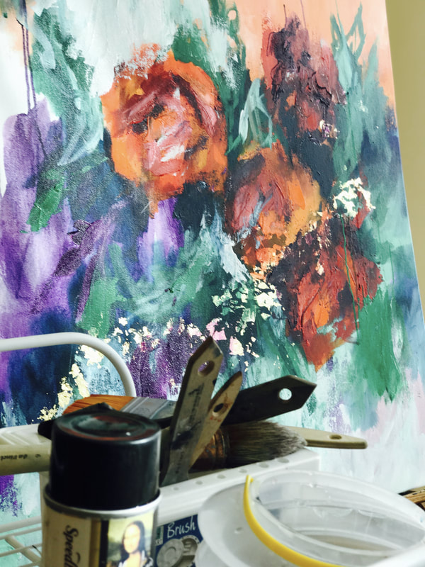 I had already put down paint before I decided to turn it into a floral piece so my main challenge, I guess, has been to restructure the composition. Its usually hard for me to work with anything but a blank canvas, so I guess let's double up the challenge! Will surely post more on this piece soon.
There have been so many gaps in my art and that has been excruciating for me. I've been feeling kind of lost and unable to find my bearings. Sometimes I feel like I'm unsure as to what I want to achieve with each painting and we all know that most of the time, the artworks have minds of their own and never seem to listen. I've been struggling with this piece for months and ended up abandoning it for almost an entire month. Just 3 days ago, I sat myself down and refused to give up, and decided to have another go at it. Once it was complete, I realized that it entirely reflected how I feel about where I am today. Its moody, darker than a lot of the other work I create and is trying to find meaning of its own. I named her 'Making Sense of It' and here she is :) 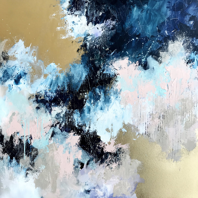 There are so many areas of interest in this piece. I have layered tirelessly and I couldn't be happier with the result. Here are a few detail shots where you can see the textures, marks and layers better. 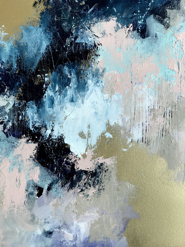 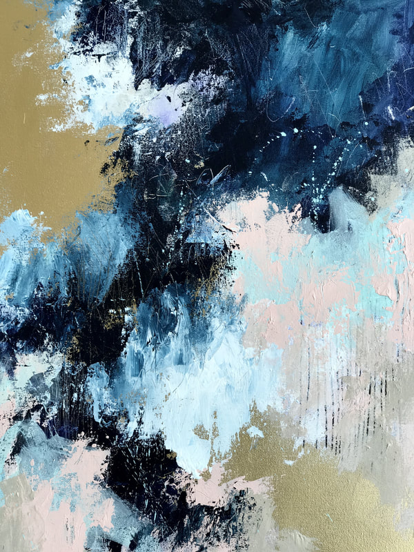 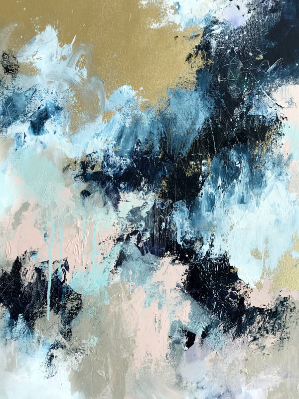 With this new piece comes new challenges. Before I began the painting, I set aside a handful of paints, and decided that I wanted to work with just those colors and not lean on some of my favorite hues for support and comfort. This has almost driven me mad. Although the palette is enjoyable and I have a feeling that I'm moving in the right direction, I catch myself wanting to add that Cadmium Orange or Coral, or darker blues so badly. Here is a detail shot and a shot of the entire canvas. Wish me luck! 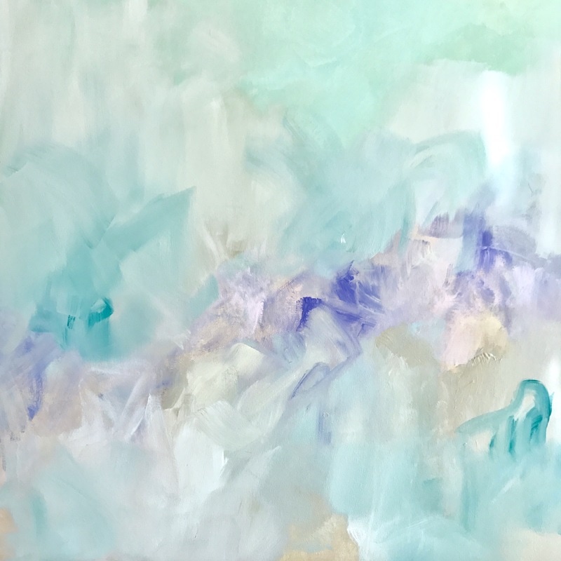 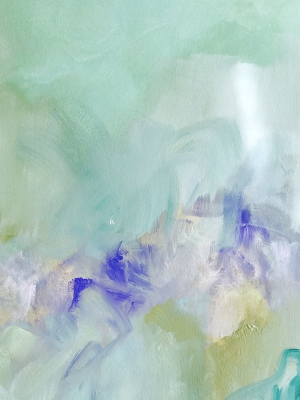 After almost a week of struggling with the new painting, she's finally done! Orange has become such a safe color for me and it bothers me slightly since I do want to fight it and try newer palettes. The Prussian was another color I reached out to for comfort but mixing the lavender and peach was what defined the painting for me. Here is what she looks like. Titled: The Beginning and the End. 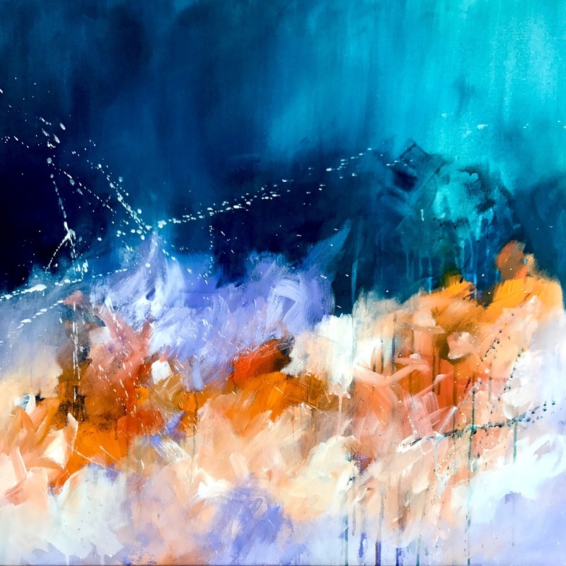 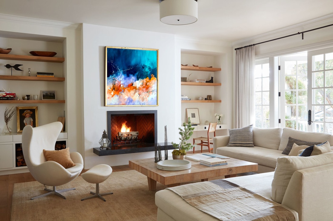 The past month or so has been so hectic. I just moved into a new house and the move really got the best of me for over 2 weeks. It was a strange experience to see a place I called home slowly become a foreign space. I remember the last time I visited the apartment to collect a few things, I could hear an echo that made me feel so strange. I just finished setting up my studio in the new house and gave a 30in square canvas a shot today after so long. I don't think I've used lilac in such a long time and there's something about this orange that I can't get out of my head. I definitely want to add more drama and I would like to work a little more on composition but I like where its going so far. Here's where it stands right now. 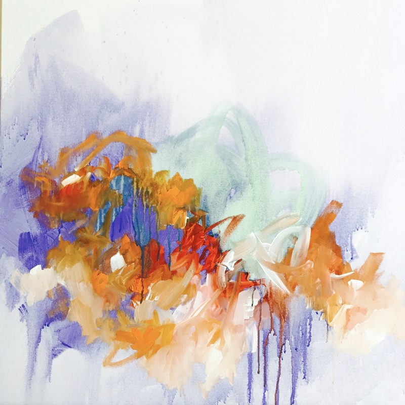 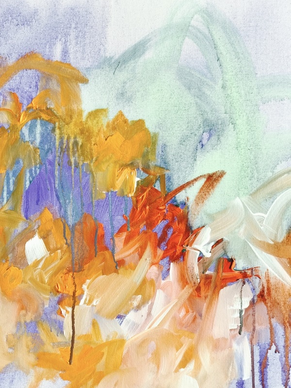 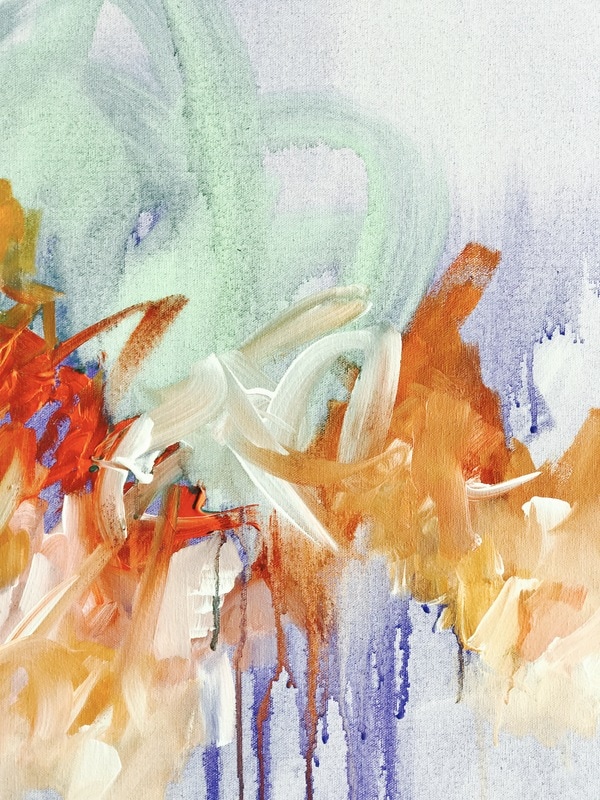 A few weeks ago there was an interesting open call for a pattern or artwork to be printed on vinyl for these limited edition golf carts as part of a resort project in Dubai. I saw the open call just two days before the deadline but decided to give it a shot any way. According to the brief, the artworks were required to draw inspiration from Emirati culture, the city of Dubai or contain Arabic calligraphy. Having grown up in this city, I felt like I could bring something personal to the table by incorporating childhood memories. One of such memories was driving by the Ras Al Khor sanctuary on the way to and back from school and being mesmerized by all the flamingos flocked together in the wetlands. Watching them for a few seconds every day made them a huge part of my daily journey and I decided to make them the subject of my artwork. To complement the pinks from the flamingos, I decided to include palm leaves in cool tones of green and went with two color themes. Here's what the patterns look like 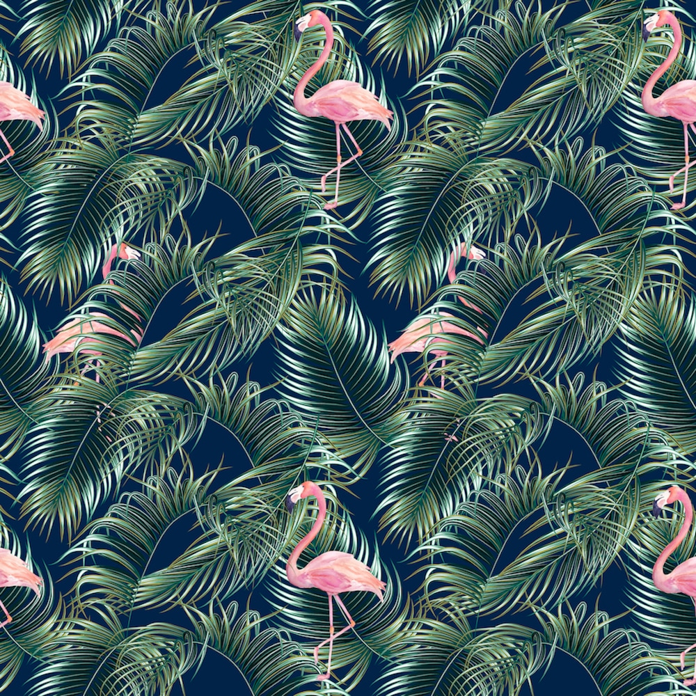 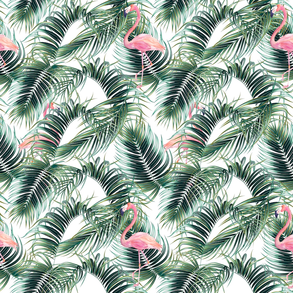 There was this super cool project on Indiewalls where the clients are looking for a huge mug shot of a woman wearing sunglasses to cover the entire back wall of al elevator. They wanted to add a perforated metal sheet in front of the artwork (which I love) and it was to be a digital piece so i whipped out my iPad Pro. I created the piece in Procreate and decided to give her bright Kaleidoscopic sunglasses and a bold red lip so it would stand out from behind the perforated metal sheet. Here's what she would look like with the metal sheet and I've photoshopped her into the rendering of the elevator. :D The piece measures 60in x 84in 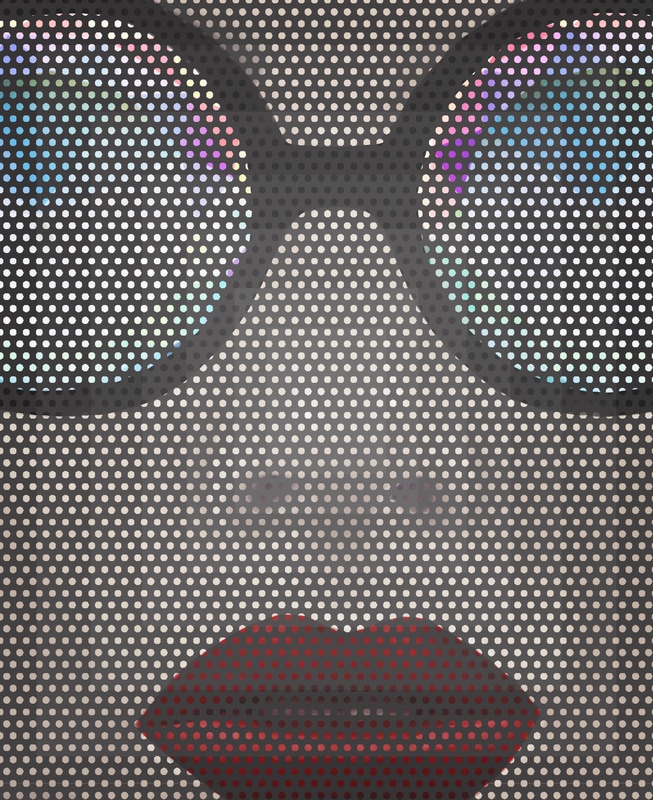 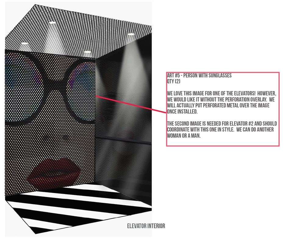 |
JournalArchives
March 2019
Categories |
 RSS Feed