|
There's this exciting new project posted on Indiewalls for a hotel in Boston. The client is looking for artwork for the 400 guest rooms in the hotel, and they would like the artwork to be inspired by the writers that hail from the beautiful city and Paul Revere's Midnight Ride. It would exciting for me mainly because I haven't worked in neutral tones for a very long time. All my work is a burst of color and to go back and work with a monochromatic and neutral palette is a challenge. I decided to create as many pieces on paper using ink, acrylic and charcoal and take it from there. Here's the first piece I've come up with. 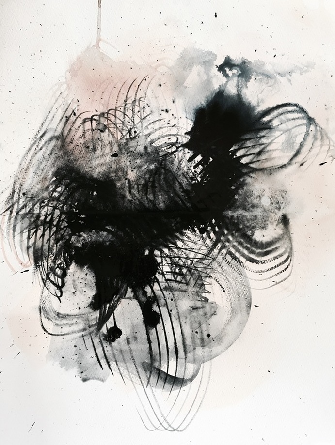 
0 Comments
I've spent the last month staring at this large-scale painting on un-stretched canvas trying to create a cohesive piece for a living room wall. And its been a nightmare. The piece measures 12ft wide x 6ft tall and I've only been able to work on it on the floor since I haven't had wall space that large. The frustration mainly stemmed from the inability to view the entire piece at one time. Even photographing it had to be done in 4 parts and then Photoshopping it together. But its finally done, and what helped was an alteration in my approach. Somewhere during the process, I realized that treating the surface like textured wallpaper made the composition more comprehensive. Here's the piece in situ. SO PUMPED. PS totally did the interiors for this room too :D 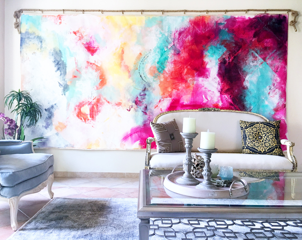 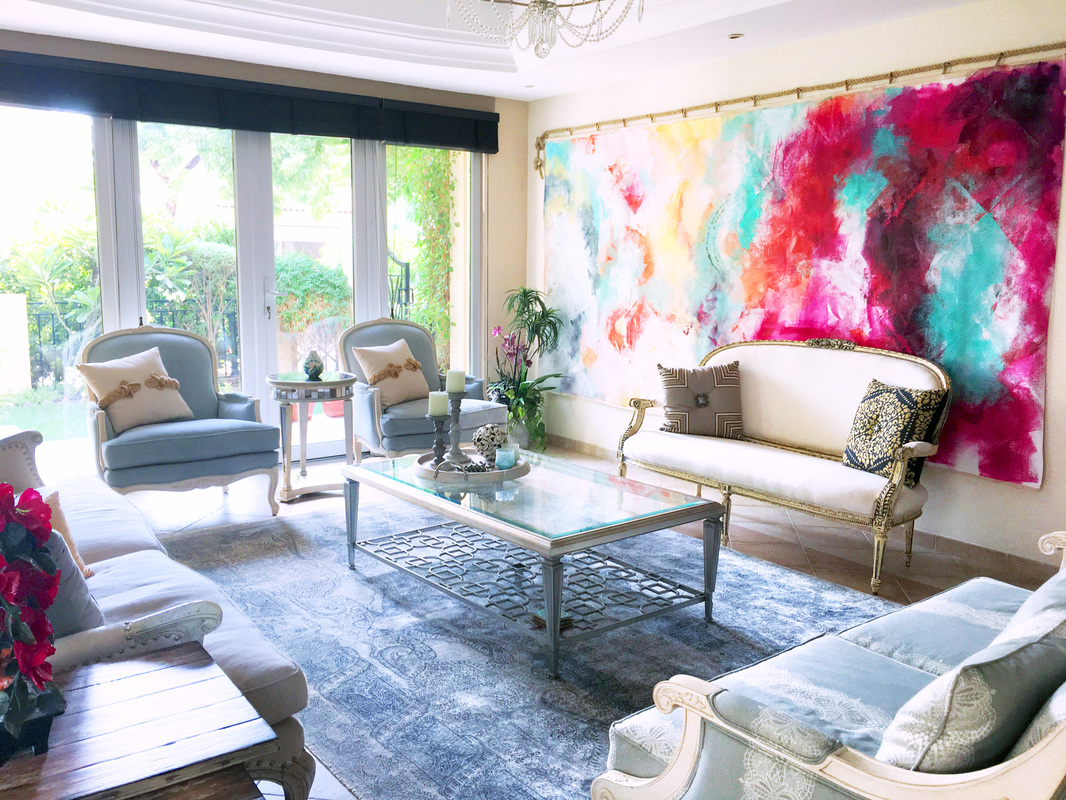 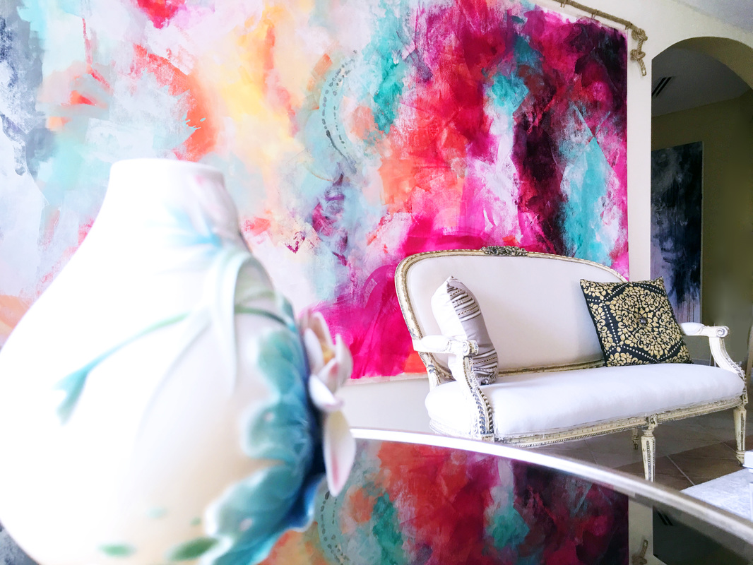 Yesterday while I was staring at the wall I'm designing with all these objects, I wasn't feeling a thing. I had picked out some super fun stuff to go on this wall but they were still missing energy and character. As the day went by, I started picking out drawings and color studies, which I have been working on just to see how they might look against the dark blue paint. I grabbed some masking tape and started arranging the work beside each other in no particular order. The minute I stepped back, it immediately clicked. There were bursts of color against the dark blue, and the energy and movement I was waiting for was finally in the room! Here is what I realized the problem was: when you give yourself minimum flexibility, you kind of clog the flow of creativity. Give yourself more wiggle room and don't be afraid to change your approach just because you've invested too much time building one approach. You never know what happens. Sometimes, its pure magic :) I'm thinking of arranging these drawings and color studies in a more flattering way and spacing them better too. Also thinking of maintaining the fun, ,youthful nature of the room by adhering them to the wall using Washi tape. That gives us more flexibility in case we want to move things around and an overall casual aesthetic for the family room. Going shopping for that tape today and am probably going to make more of these drawings. 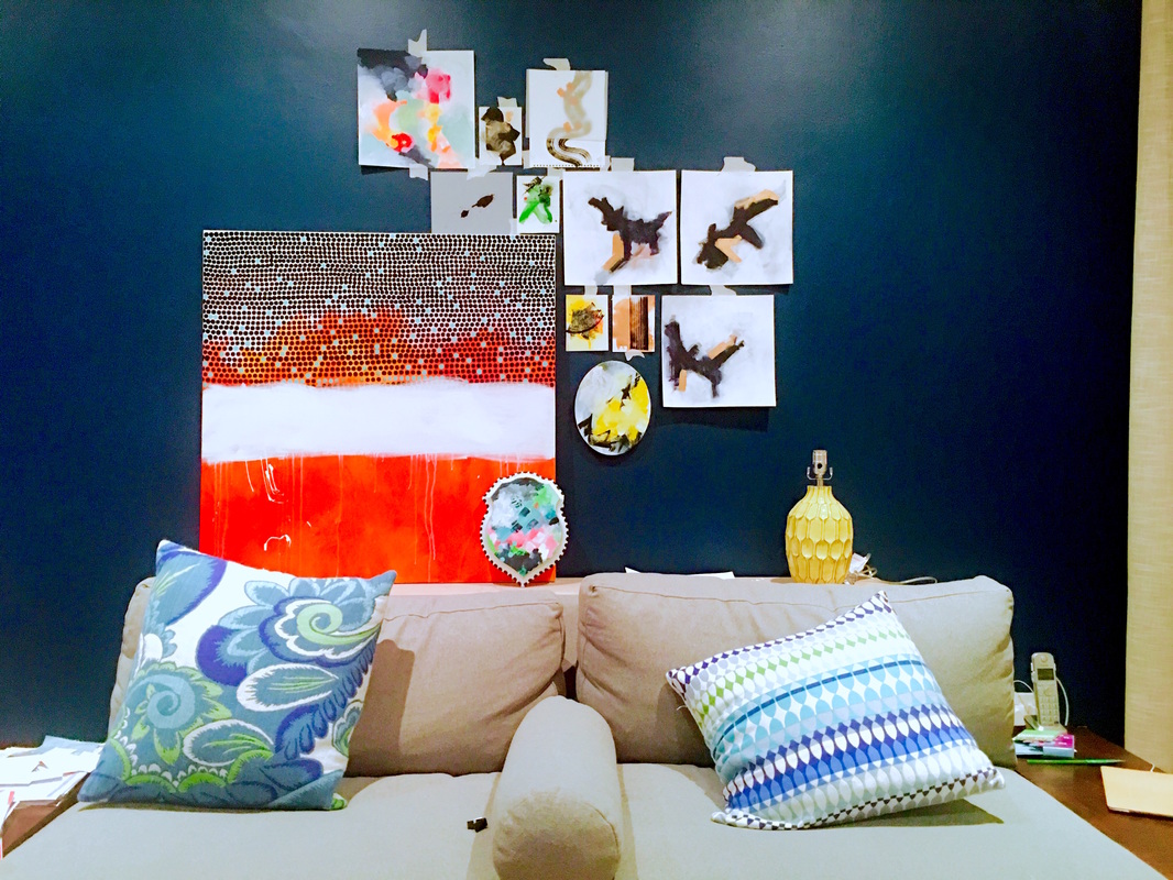 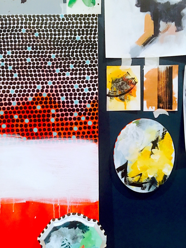 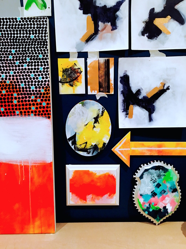 So I've been thinking about this gallery wall I've been trying to arrange and have bought lots of different things to go up on it. The more I looked at the setup though, the less I liked it. I felt like there were too many items that were too small and that only made the space busy. What I needed was a focal point, and then I could build around it. It took me two days to realize that the orange painting I had just pitched to the Newport Beach client, was actually perfect against the blue walls. The orange was mesmerizing against that backdrop and it could easily be the focal point I was looking for. Here's a picture from when I saw it against that wall for the first time 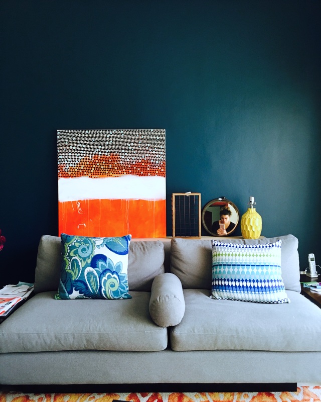 Since the painting was larger than the other products I was going to put up, I had to increase the size of area I was working with. Initially, the gallery wall was going to be centered to the sofa and measure 54x54 inches. This time, I've increased the area to 70x54 inches. I decided to place a couple of trendy items in wood above the canvas, and went with a feather and arrow. Here's what they look like placed. 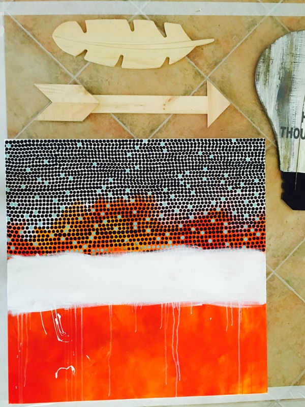 The wood shapes are large in size but the surface area still isn't that big. If I were to paint a pattern on the pieces, I was afraid it would become too busy, especially since I have a busy pattern on the top half of the painting. The colors had to complement the orange, stand out against the dark blue and still not dominate. I used the acrylic fluid inks by Montana, which are highly pigmented after gessoing the shapes. This is what I ended up with. Fingers crossed for the rest of the stuff today!! 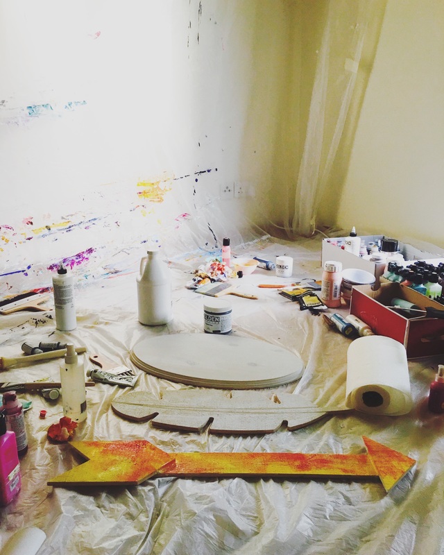 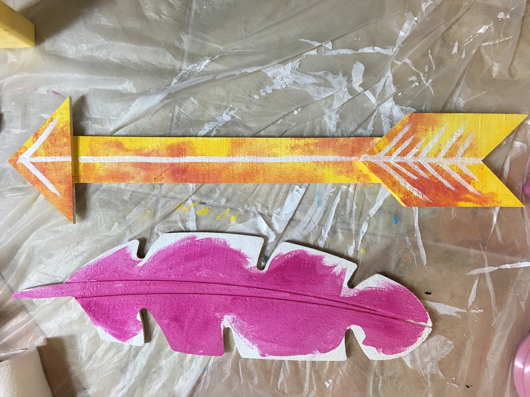 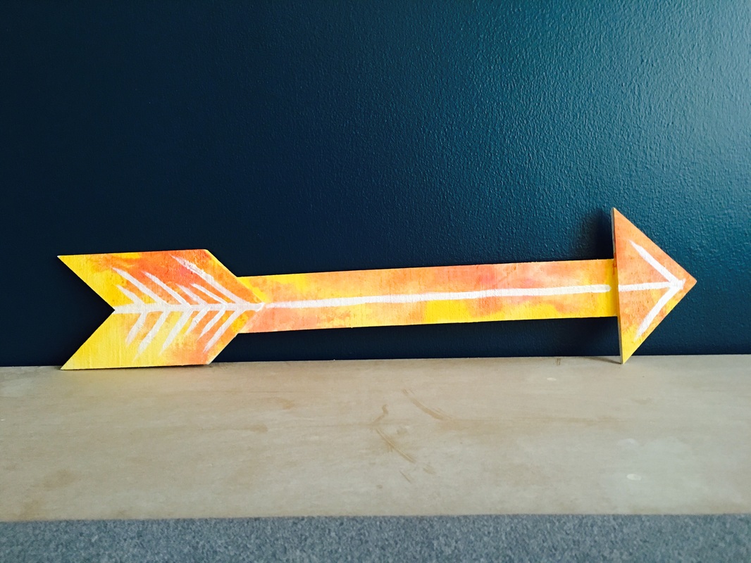 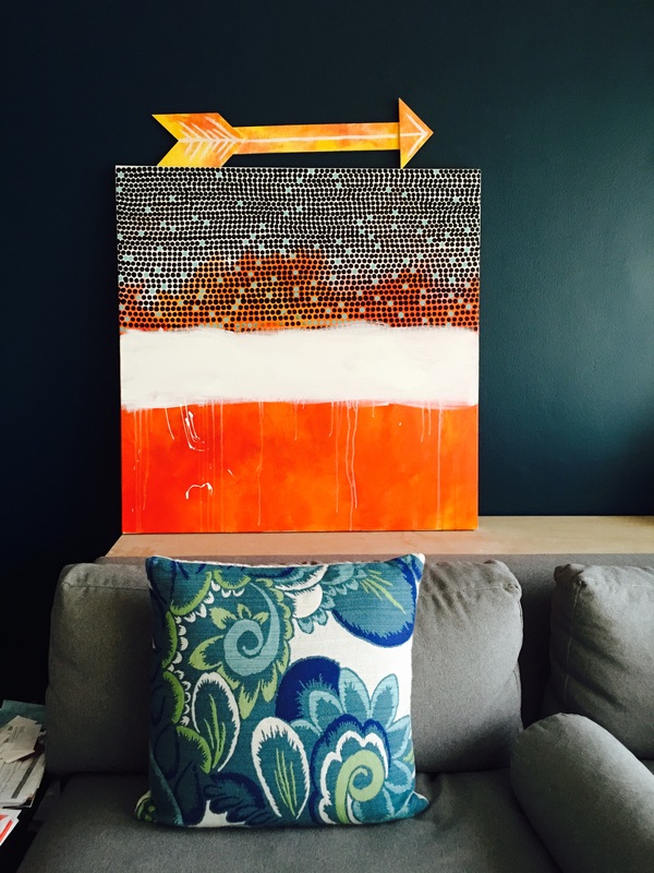 |
JournalArchives
March 2019
Categories |
 RSS Feed